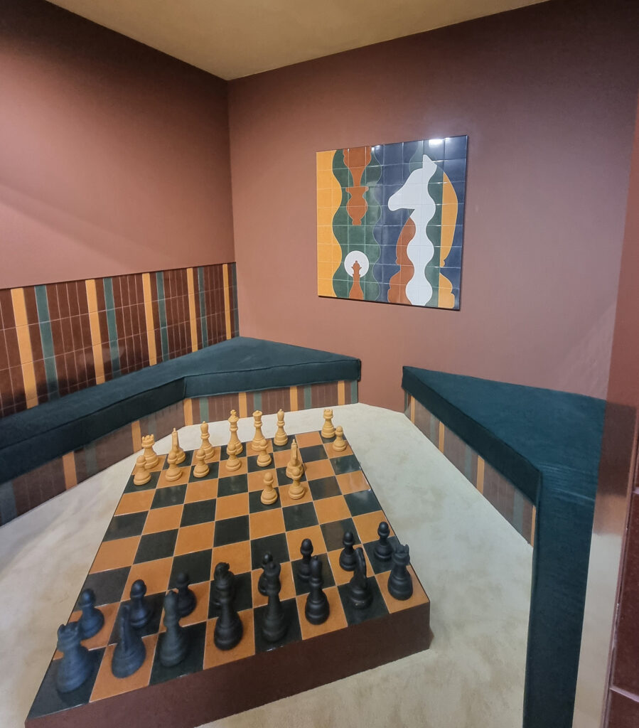
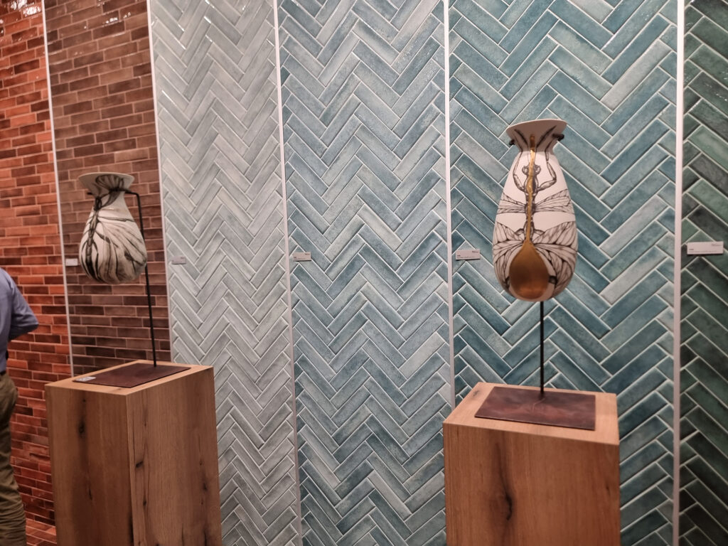
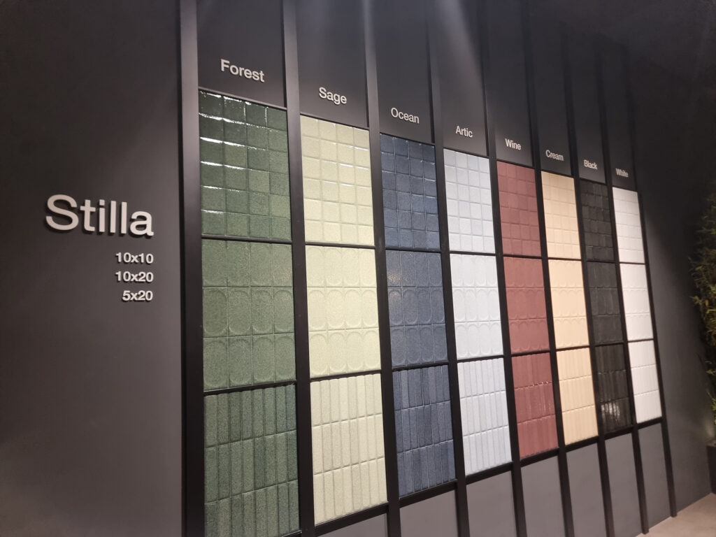
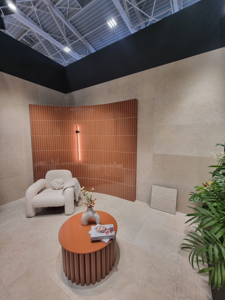
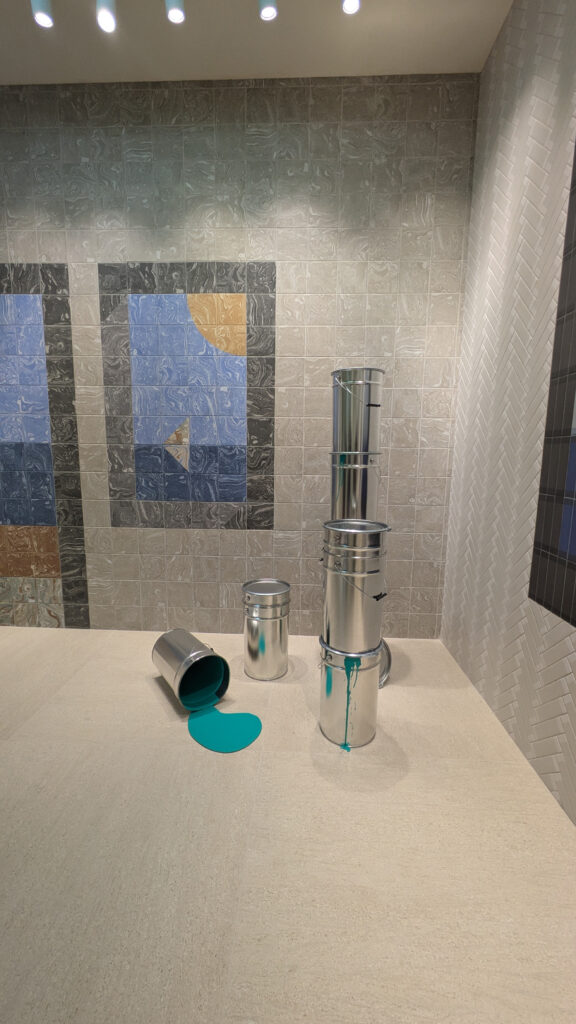
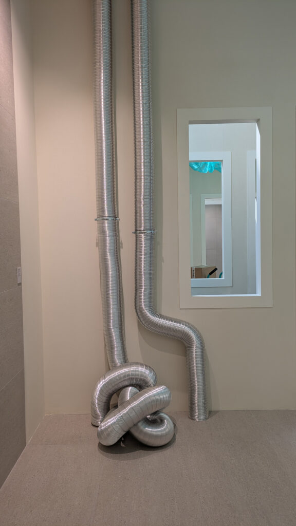
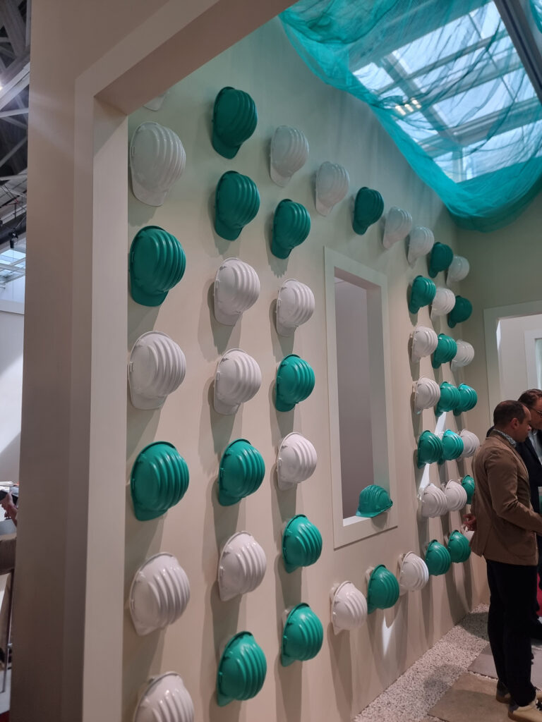
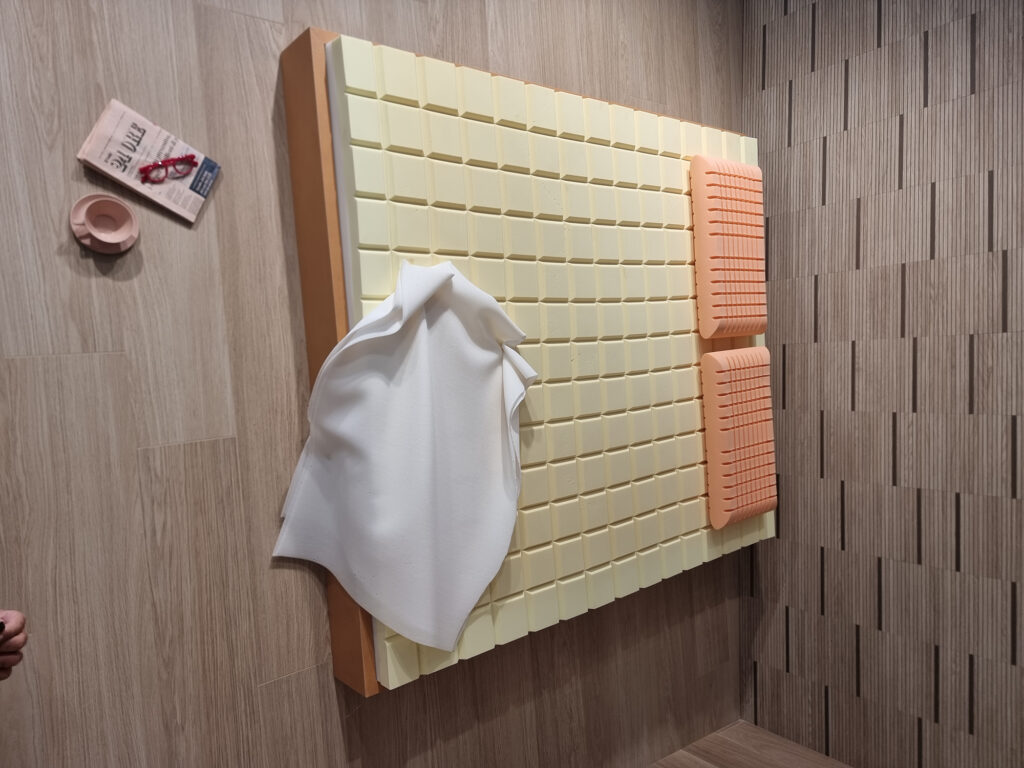
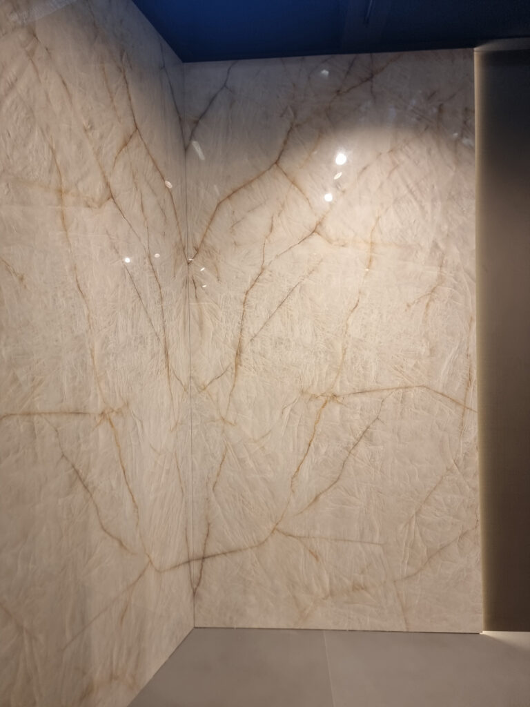
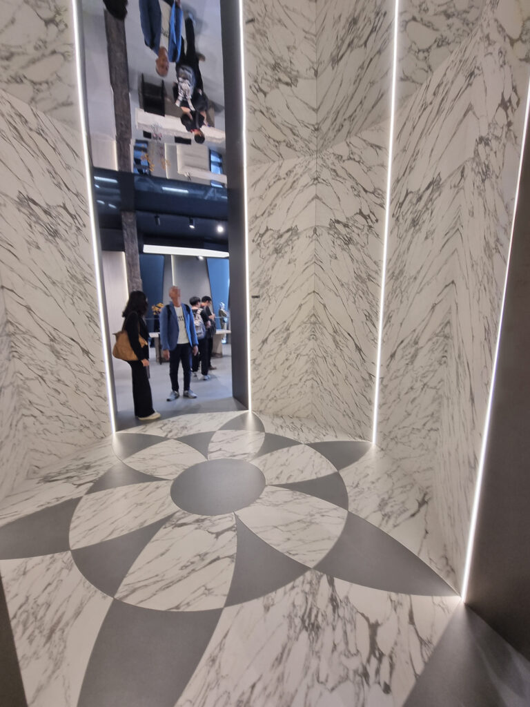
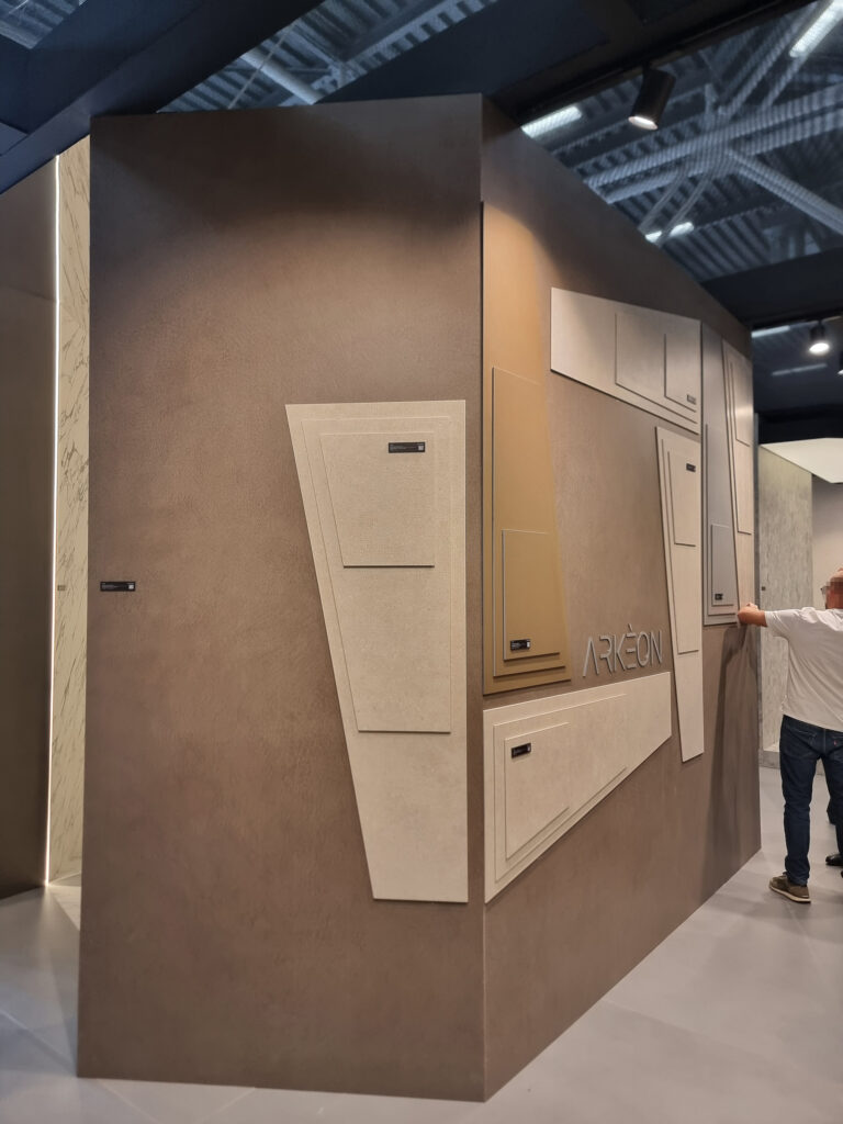
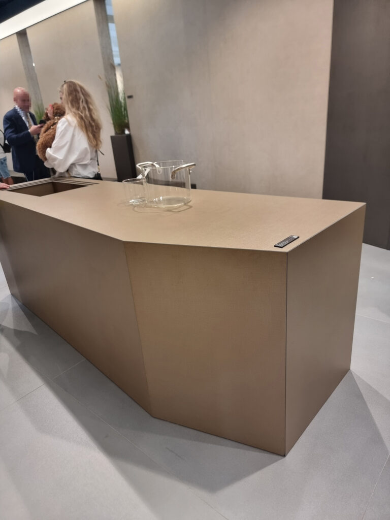
Part A > A Bird’s-Eye View Part B > Beautiful! (What Beautiful Things Did You See?) Part C > Chatter from the Show Floor
Reading time: 11 minutes
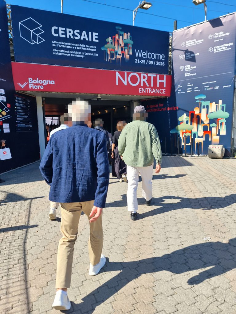
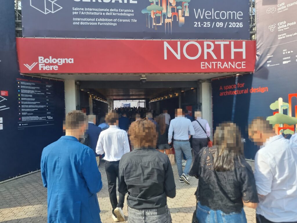
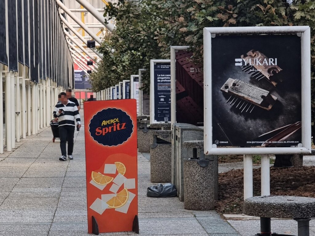
Part A. A Bird’s-Eye View 1 THE SHOW MUST GO ON At the end of the fair, the organizers called it “un Cersaie solido” …a “solid” Cersaie. And so it is. It gives up a little bit, but it alwaysholds up at all costs (steep ones): the show must go on. In our classic report, we look back together at the fair’s lineup and the show in the pavilions.
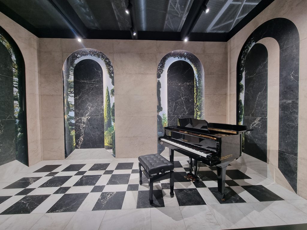
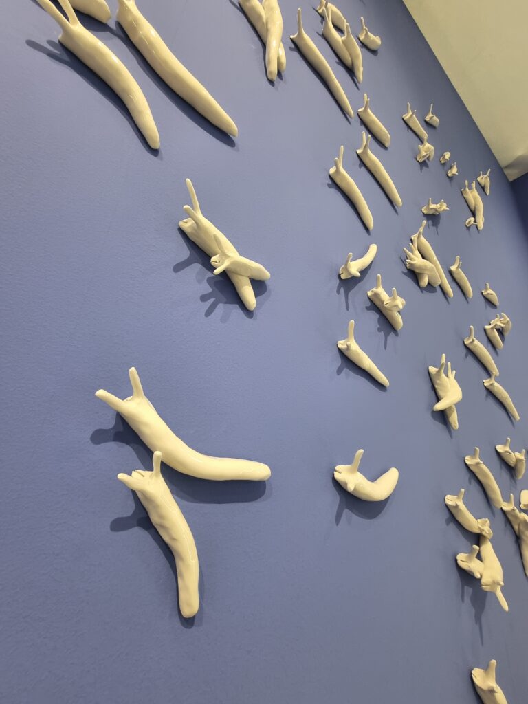
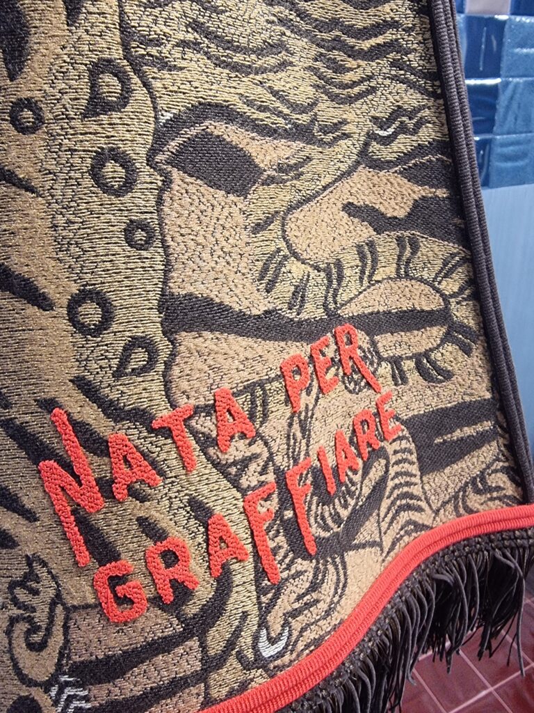
Suonare
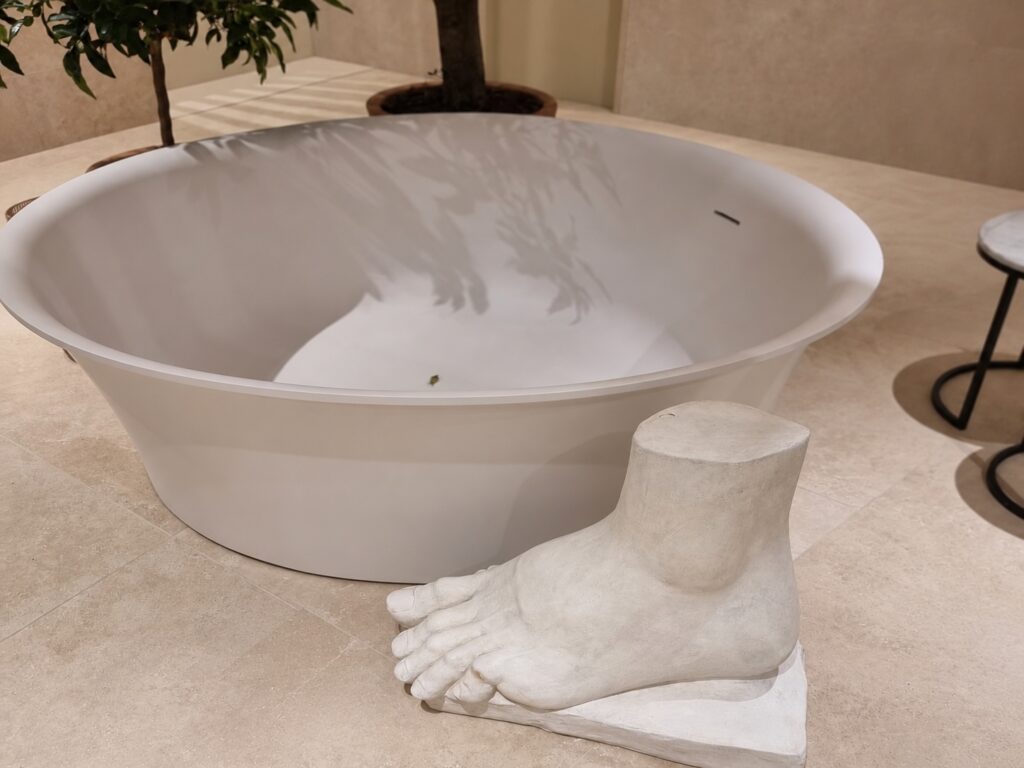
Stupire
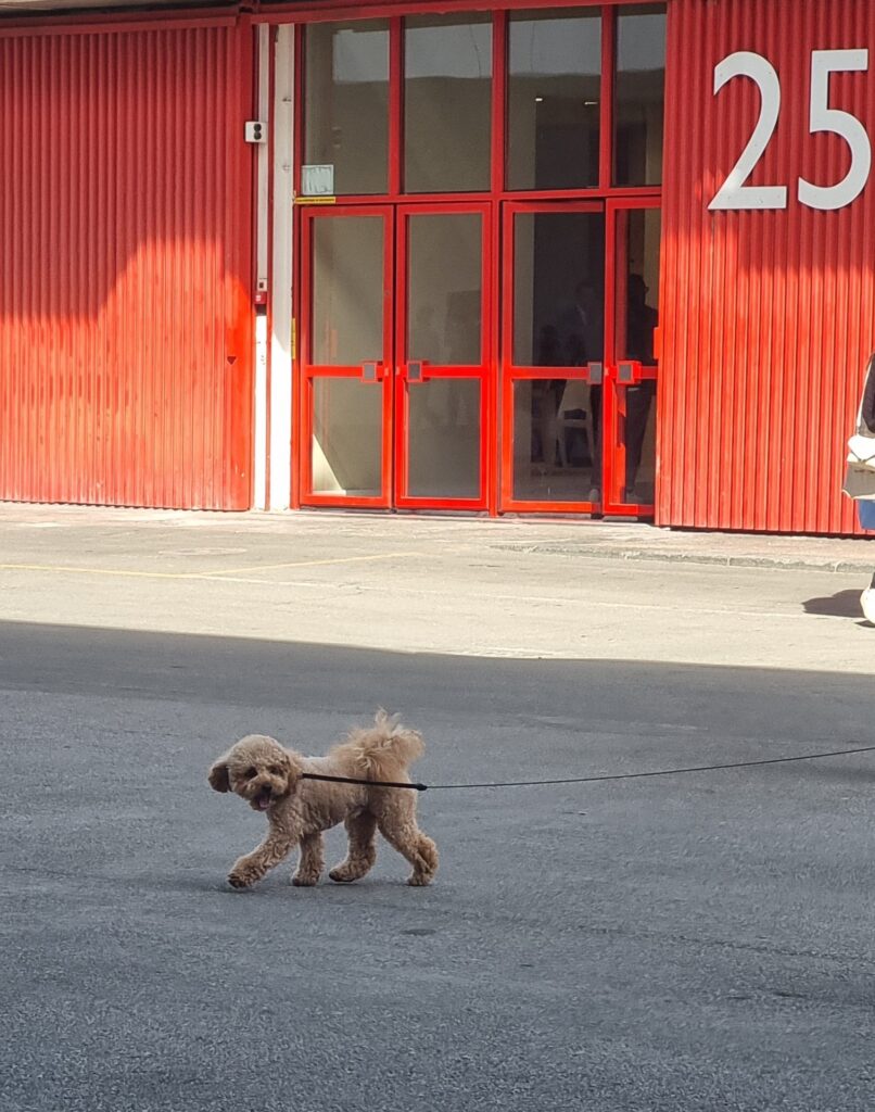
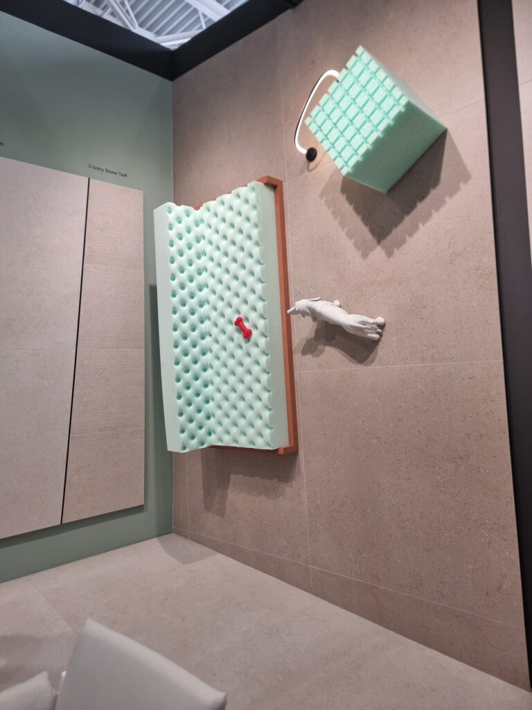
Portar fuori il cane
Spiegare
Pellegrinare
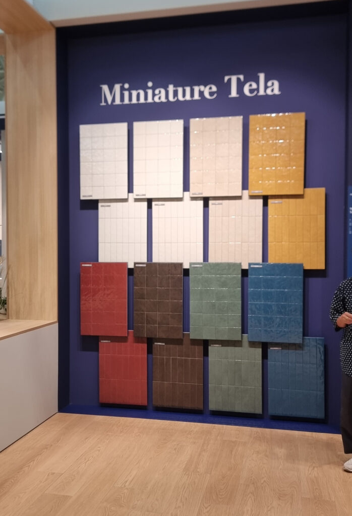
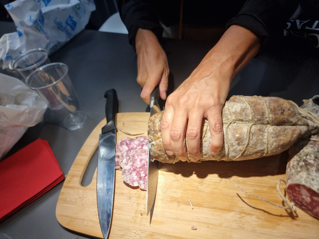
Degustare
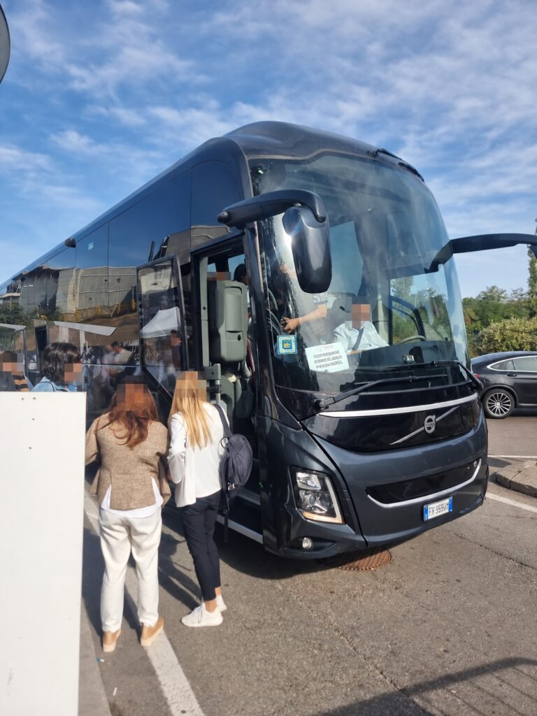
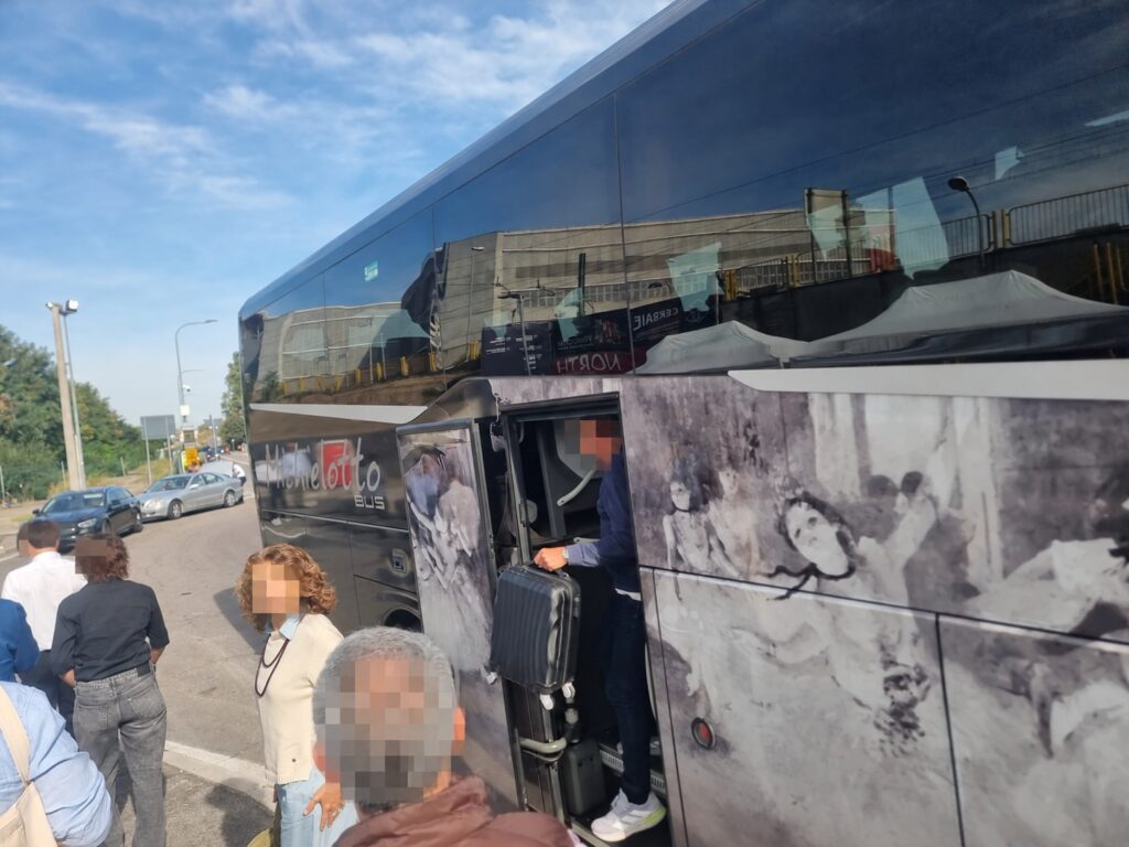
Arrivare e partecipare
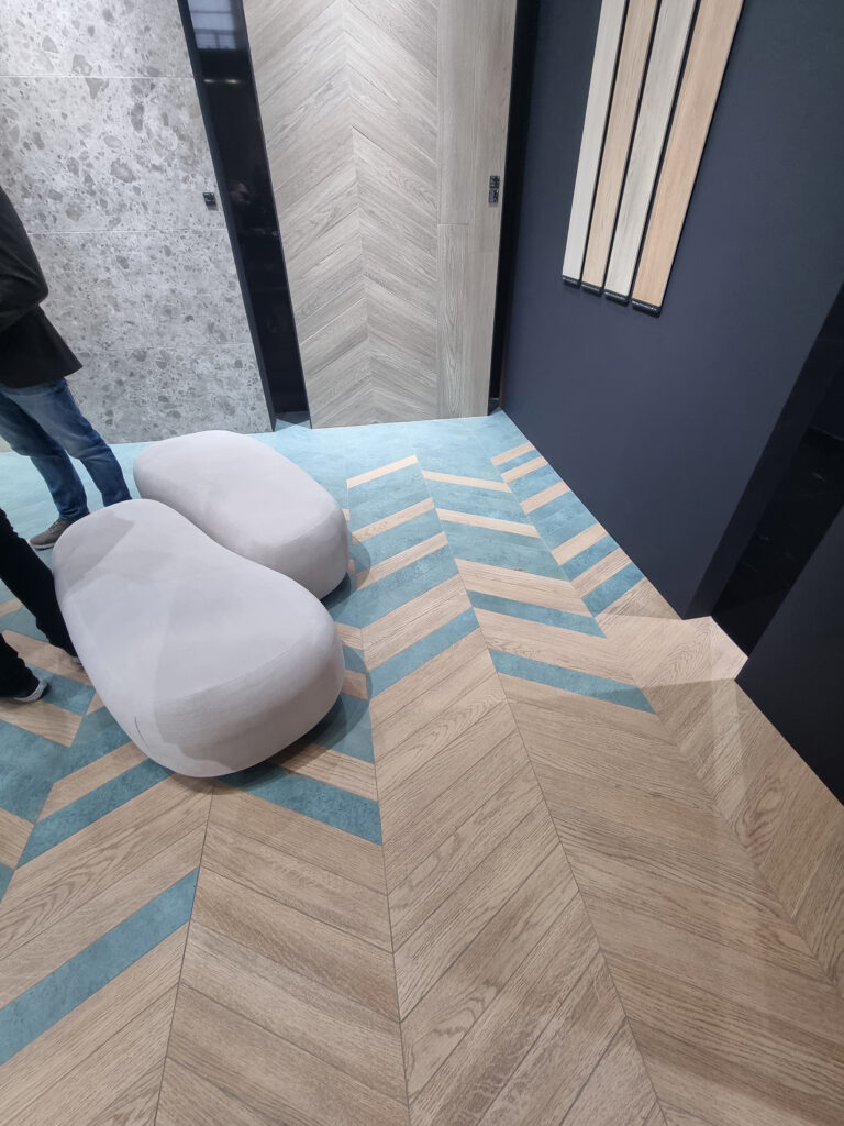
Lavasciugare
Igienizzare
Arrotolare
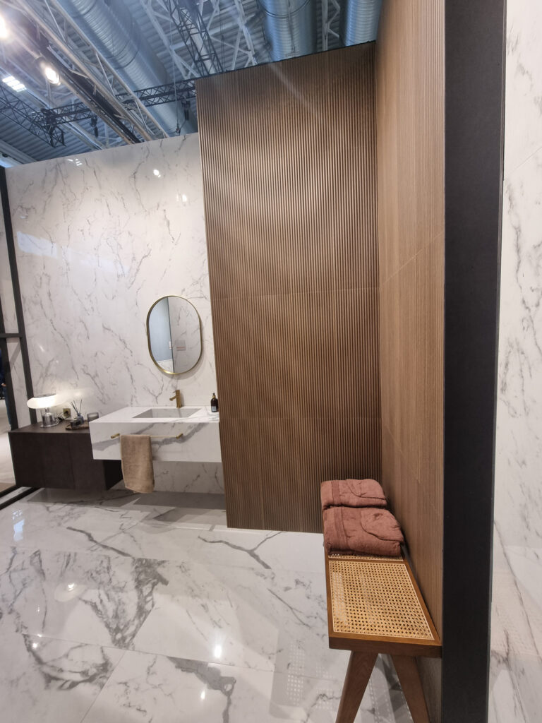
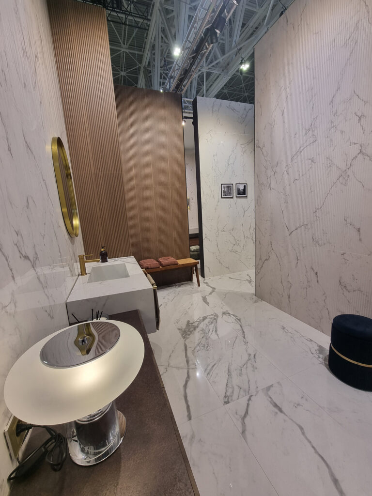
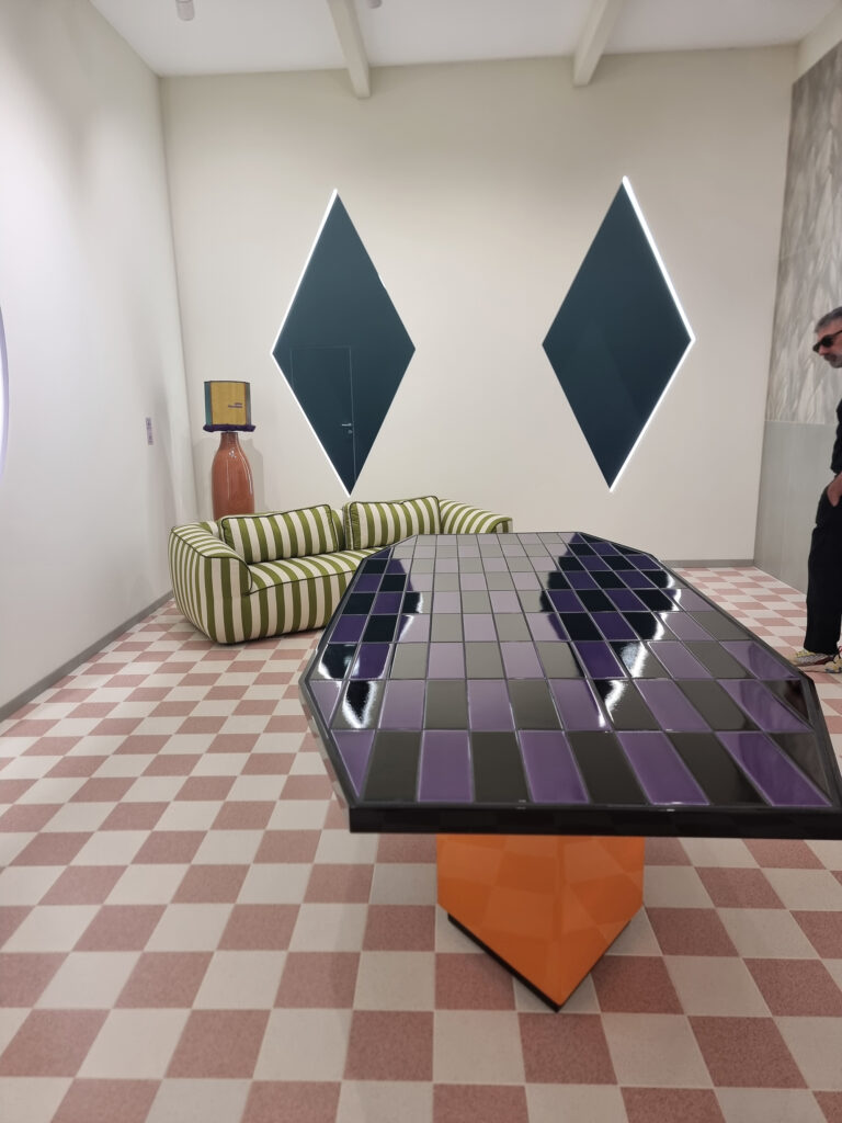
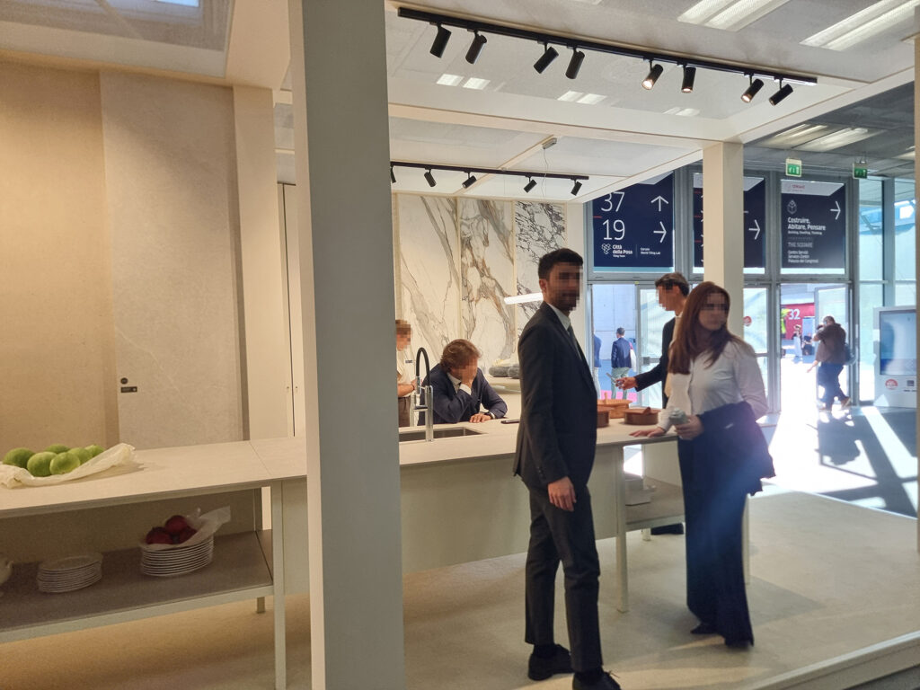
Incontrare
2 SAME OLD, SAME OLD (THE USUAL DISCLAIMER) We’re repeating our usual disclaimer. This is a tongue-in-cheek, informal account for clients and friends of what we saw and heard at the fair, with photos snapped on the fly. Apologies in advance for any mistakes, or if anyone feels offended. We guarantee zero A.I. in the text and images, not even for spelling: here, wemake mistakes like heroes.
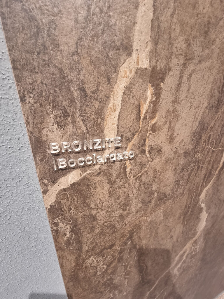
3 WEATHER OR NOT We’re out in the storm alone. It seems the whole world is having fun picking on our district. Ukraine in flames is cutting off our clay. America slaps tariffs on us and takes away our friendship. Diesel costs more than prosecco, gas follows right behind, and the ETS (Emission Trading system) is stealing our bread. Flights to the East take the long way around, and we’re the ones losing out. But the district is like Rocky: it takes the punches, staggers, but stands still. We keep going with our eyes on the future. Rocky 2 and Rocky 3 are ready, and so is Rocky 24×48 bush-hammered, trade-show discount.
4 FRIENDS (DEAL OR NO DEAL?) In the district it’s easy to declare yourselves friends in interviews: come on, let’s pull together and support Made in Italy! We are all on the same side! You tell me we’re friends, but biz-ness is biz-ness: you do everything at your own place and don’t exhibit at the fair. So I’m left going to the fair on my own. You can come to the fair and see my products on display, but I’m not invited to yours. Another “heavyweight” manufacturer has pulled out of the fair, while fleets of black shuttles drain visitors away from Bologna. If this kind of “fair play” goes on, in the long run it won’t be very fair.
5 BEASTS The CFO, CMO, and CCO are tigers in a cage. They’ve signed off on spending worth a kidney and three-quarters. We have to look good, no penny-pinching. The bosses buzz nervously around the booth, sneak peeks at their smartphones waiting for the jackpot deal, and trade a few words with a tight little smile. They need to bring in revenue, to prop up the EBITDA, and maybe their reserved parking spot too. What beast do they feel like? The cunning weasel, the purring tomcat, the hawk swooping down on its prey to close the order. Either way … it’ll be a success.
Part B > Beautiful! (What Beautiful Things Did You See?)
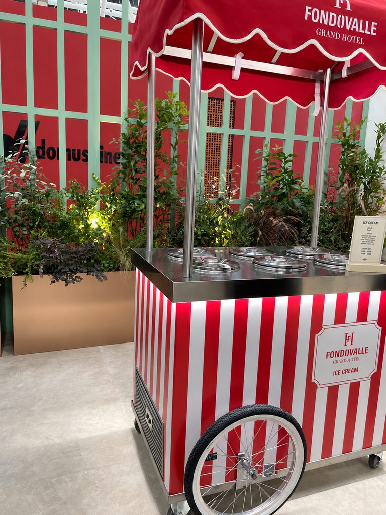
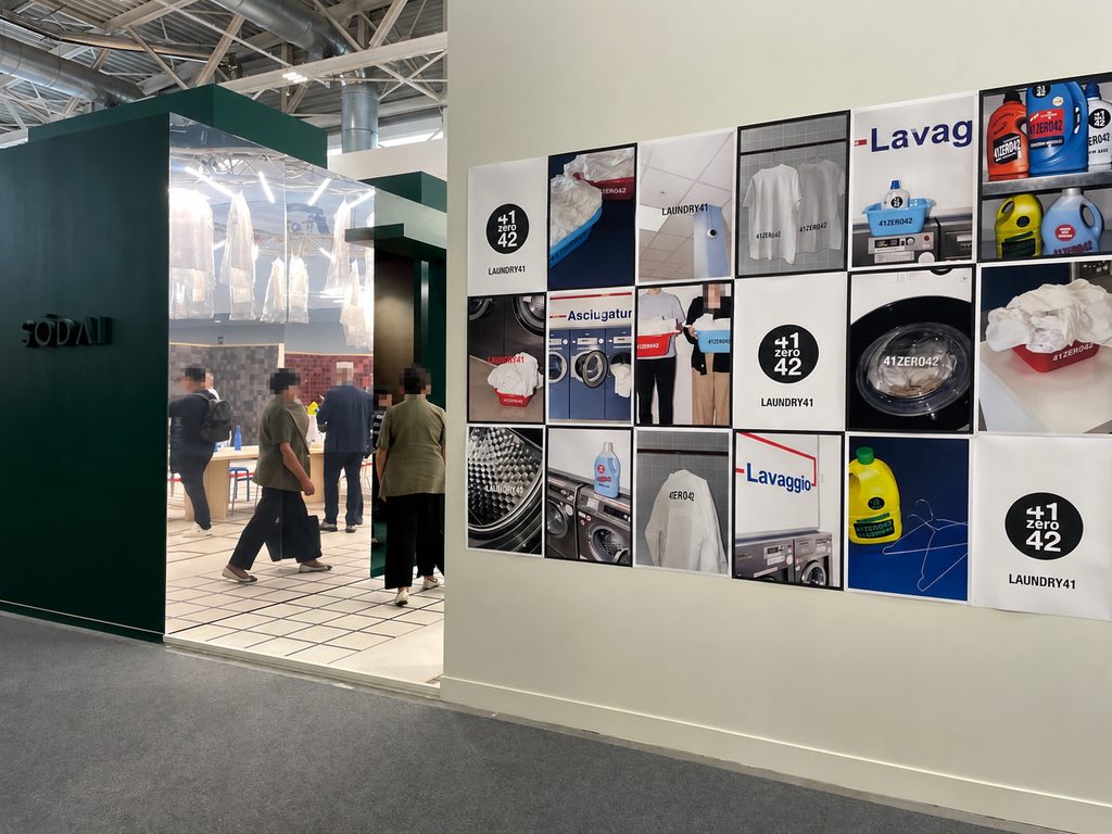
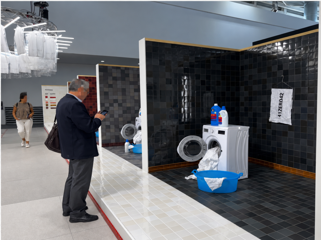
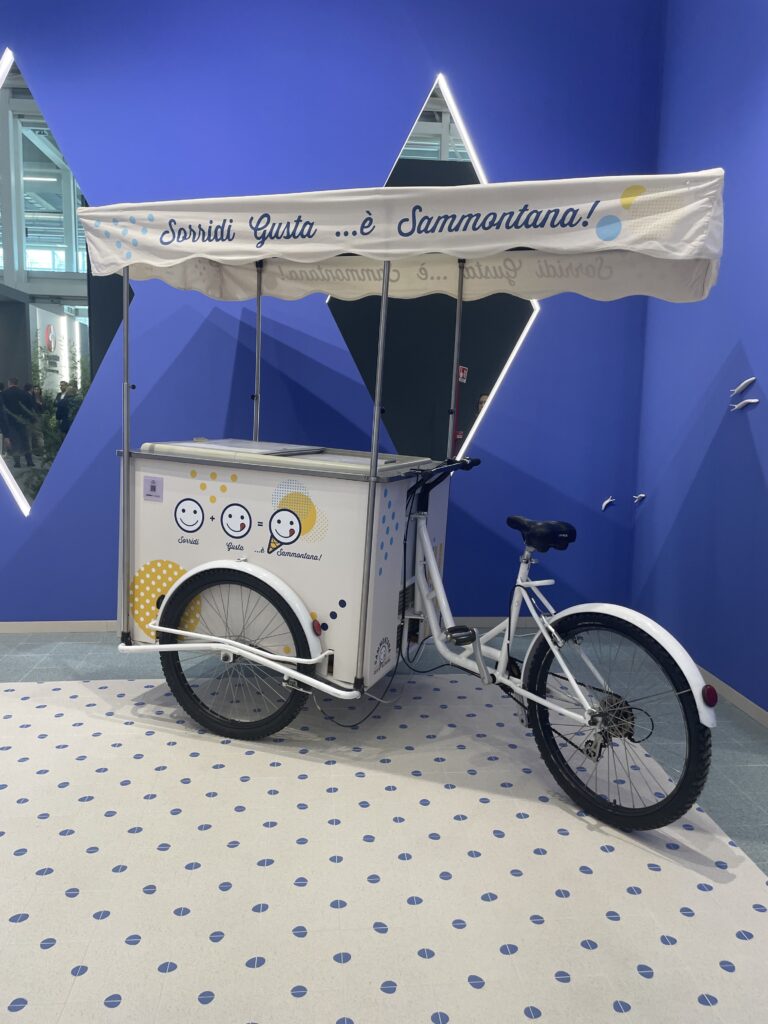
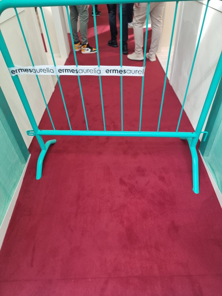
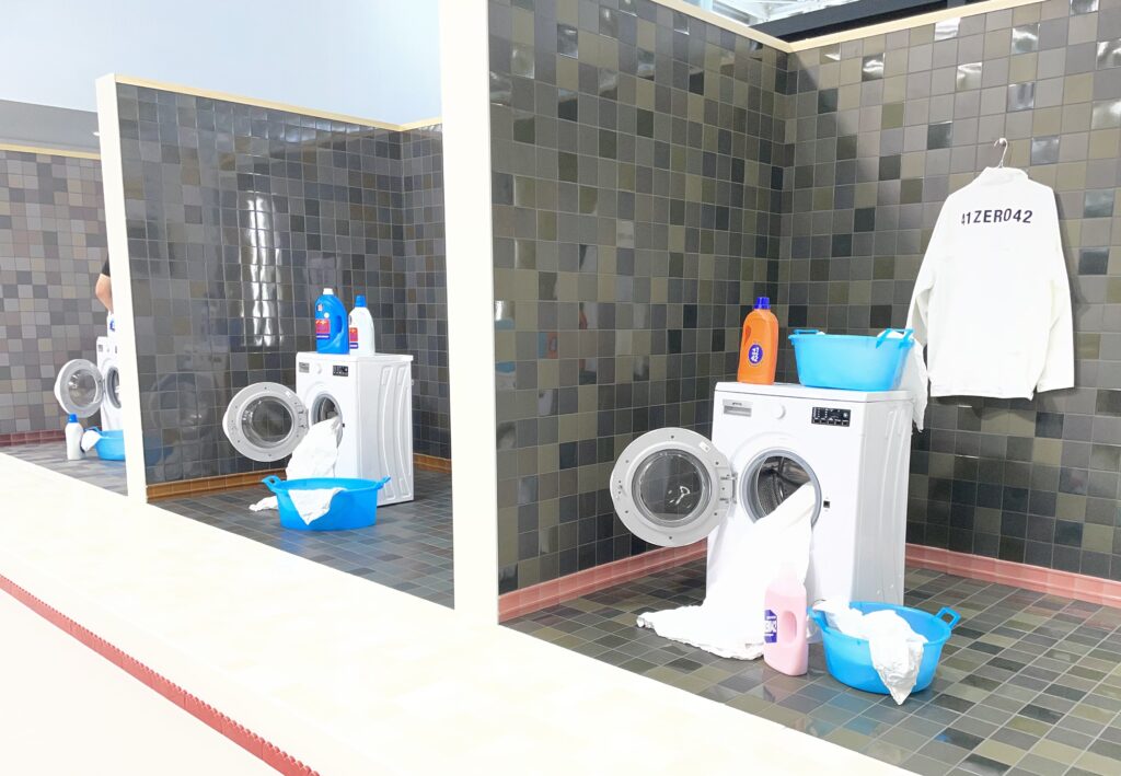
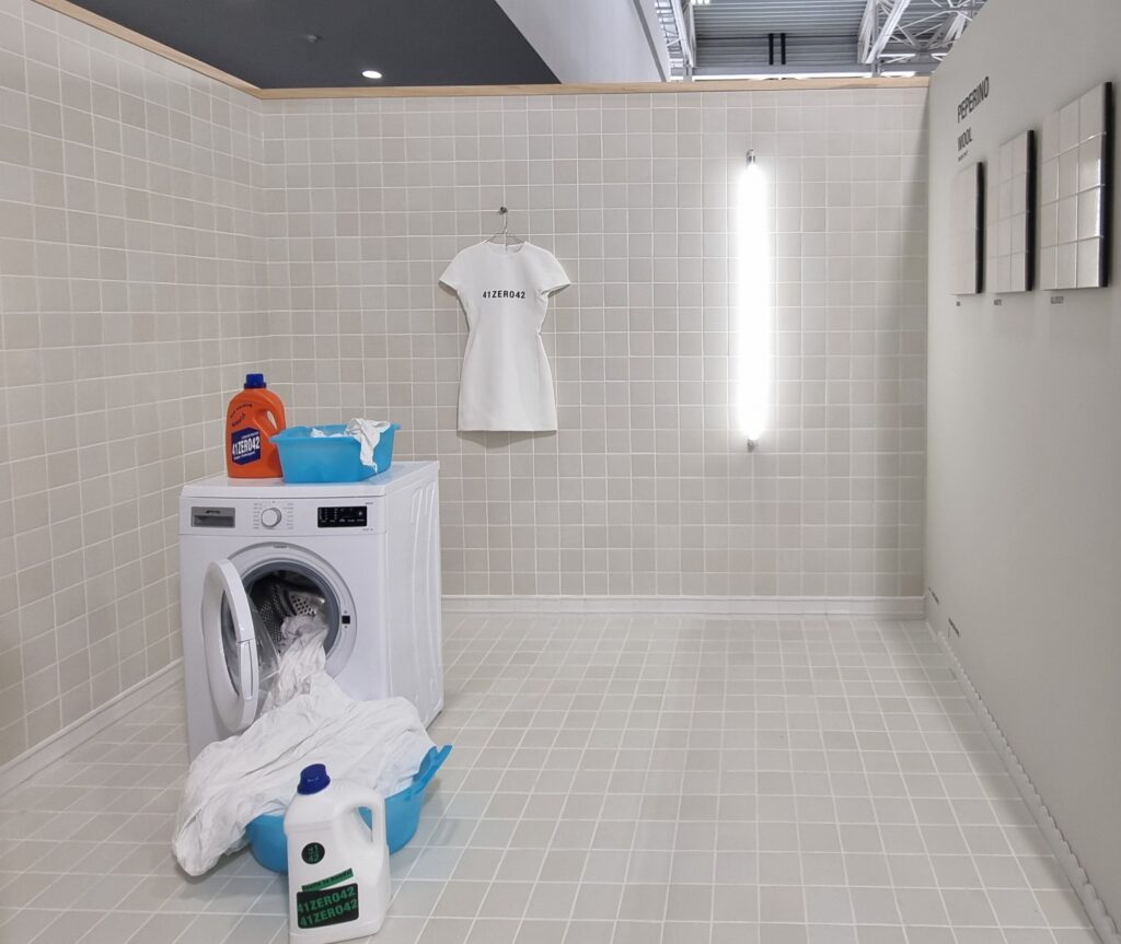
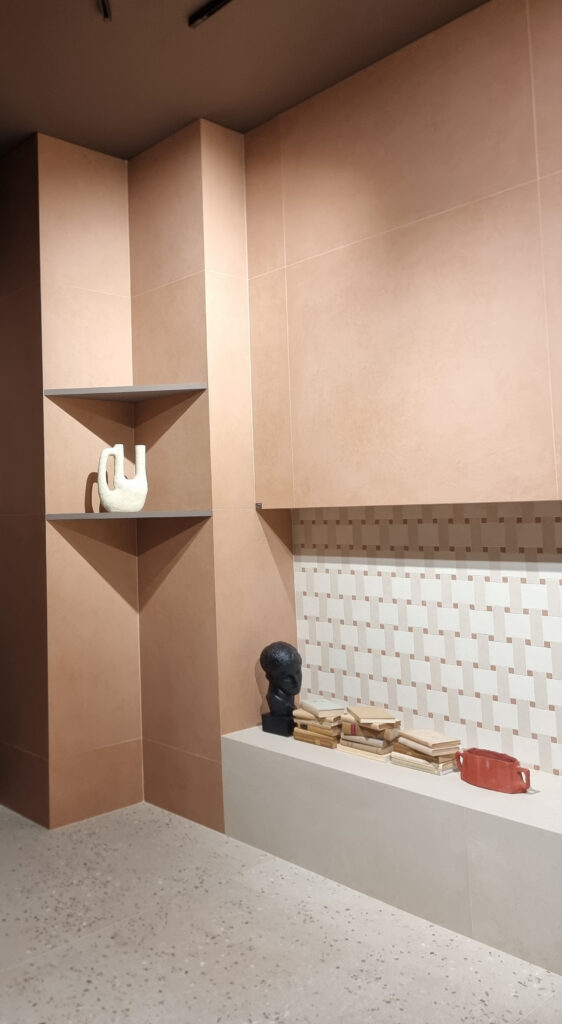
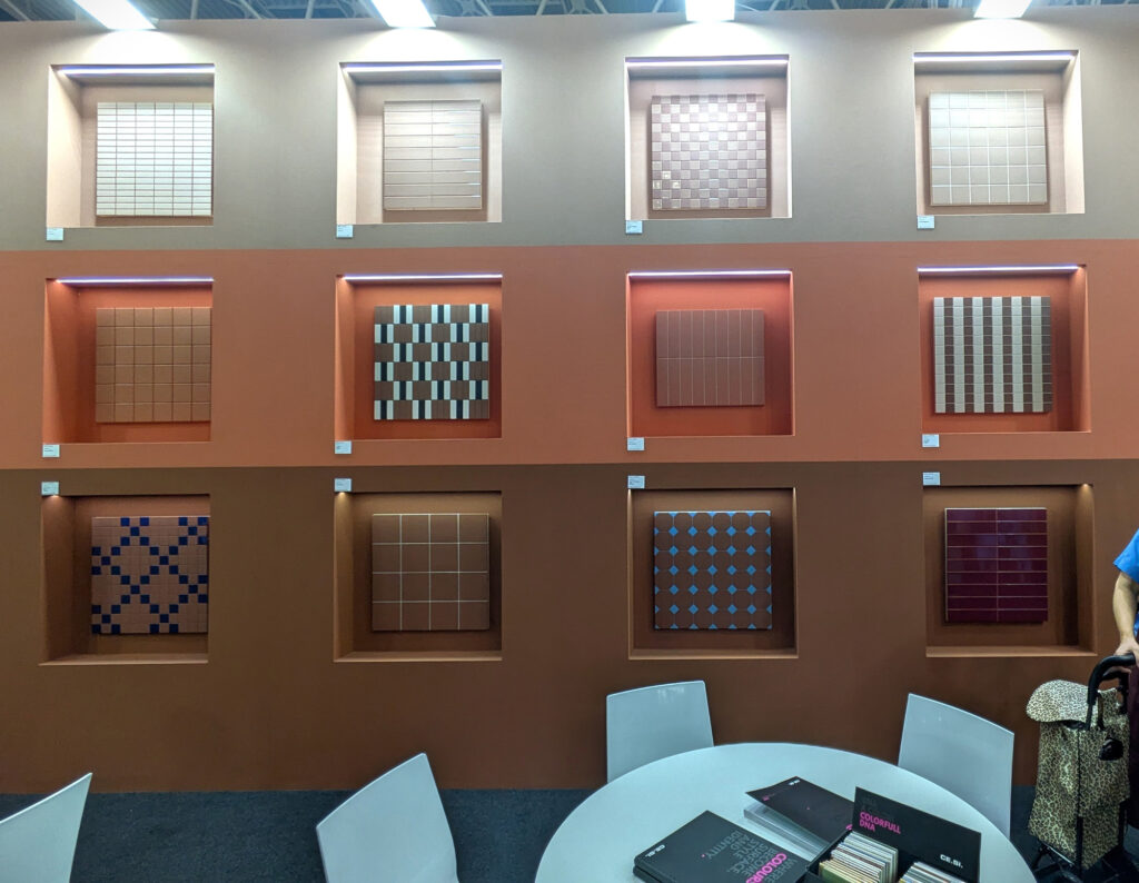
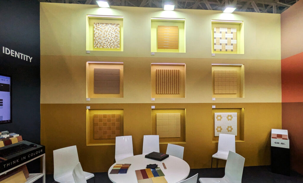
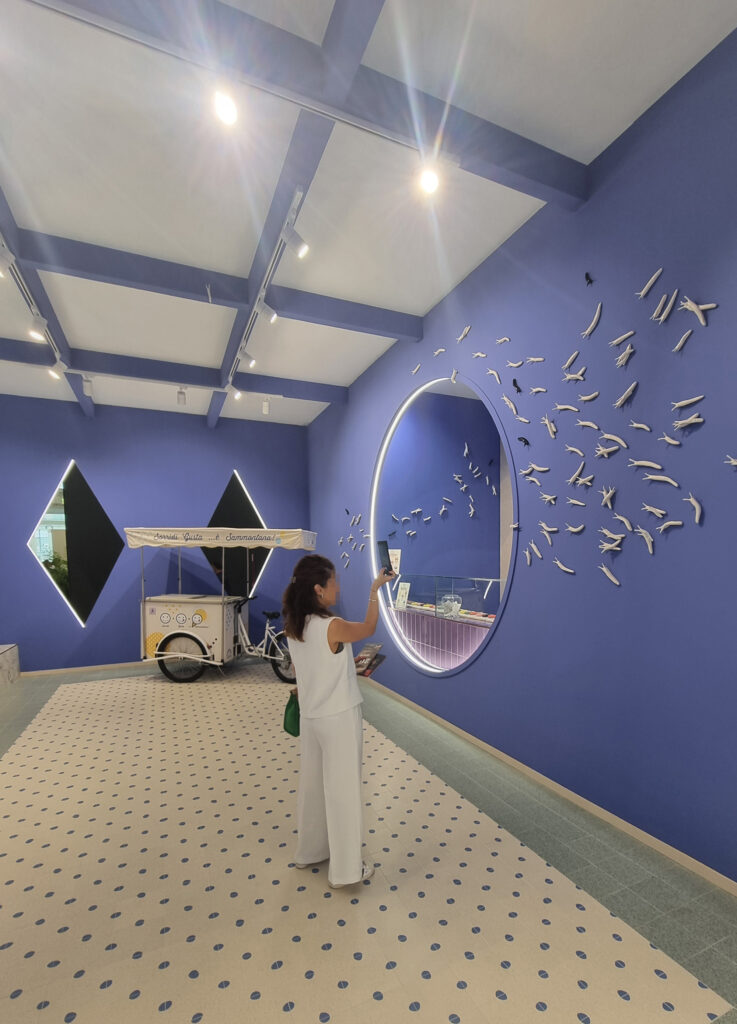
6 SURPRISE, SURPRISE! The mantra of fair chatter is “What good stuff did you see? The same old things.” Not quite. This time, Cersaie 2026 springs a few surprises on us, with some sharp turns against the wind. First: there’s a catch-all product that turns up in every single booth like parsley: the colorful little brick. Second: two of the big-five effects (formerly untouchable) are in retreat: white marble and wood. Third, cement-resin look seems to be joining the line. Three out of five would be a big bang. Fourth: the most Instagrammed booths are showing washing machines and ice cream. Well, well. Fifth: carpet is now an acceptable flooring for booths. An exorcism.
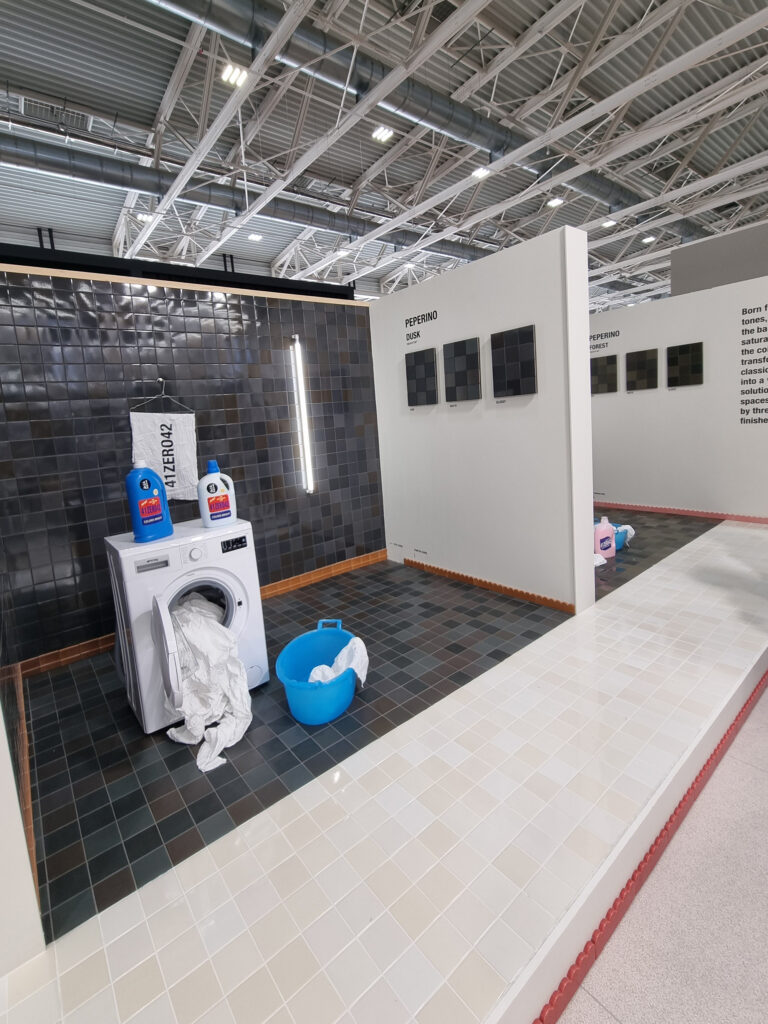
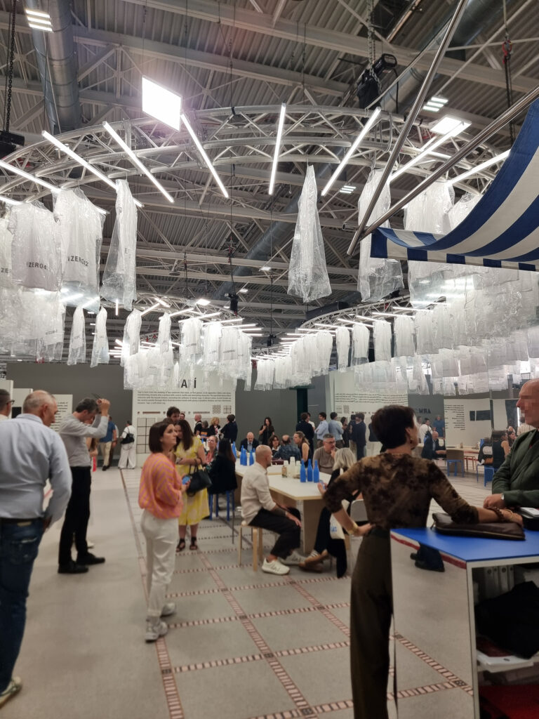
Wash machine, 41zero42
Wash machine, 41zero42
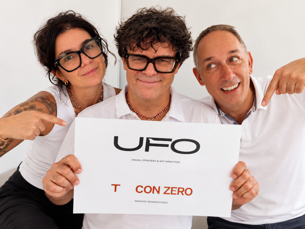
7 A WORD FROM OUR SPONSOR Public service announcement: there’s a change at UFO. Starting this year, the agency is updating itself by creating two (2) distinct, complementary teams. UFO Visual Strategy & Art Direction specializes in product presentation: 3D rendering, video, photography, styling, and display. T CON ZERO STUDIO is the new arrival: it designs visual identities, brands, and communication systems for all channels, led by new creative director Salvatore Verazzo. The corporate entity remains Un Format Originale srl, with Mirko, Michela, and Carlo not budging a single pixel. To learn more, let’s connect on LinkedIn (you know we’d love that).
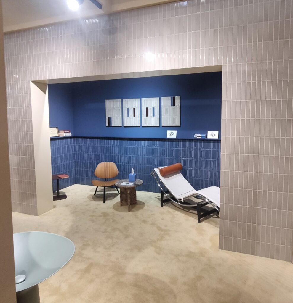
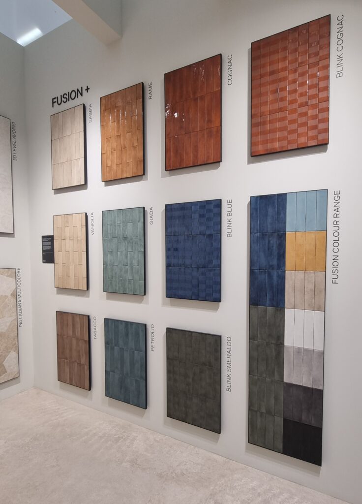
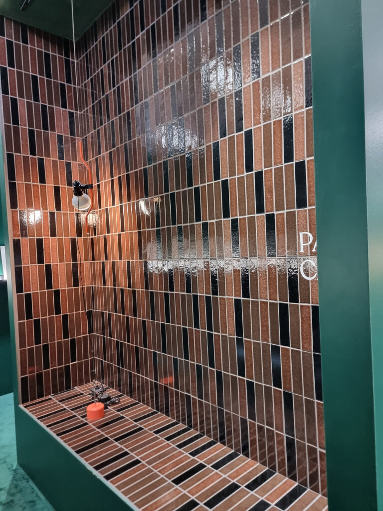
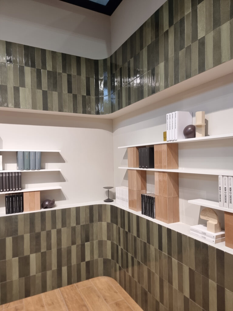
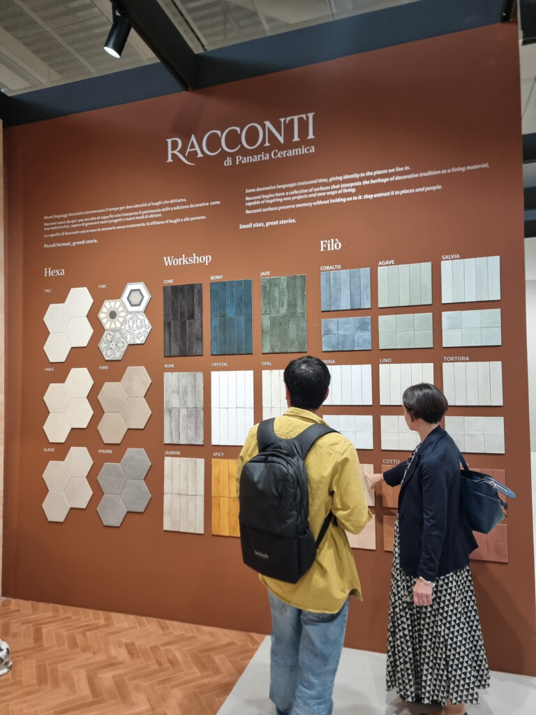
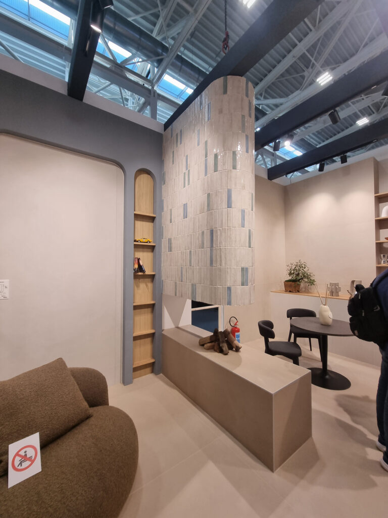
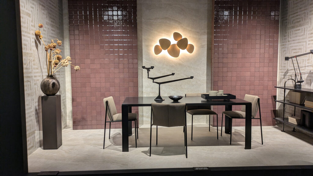
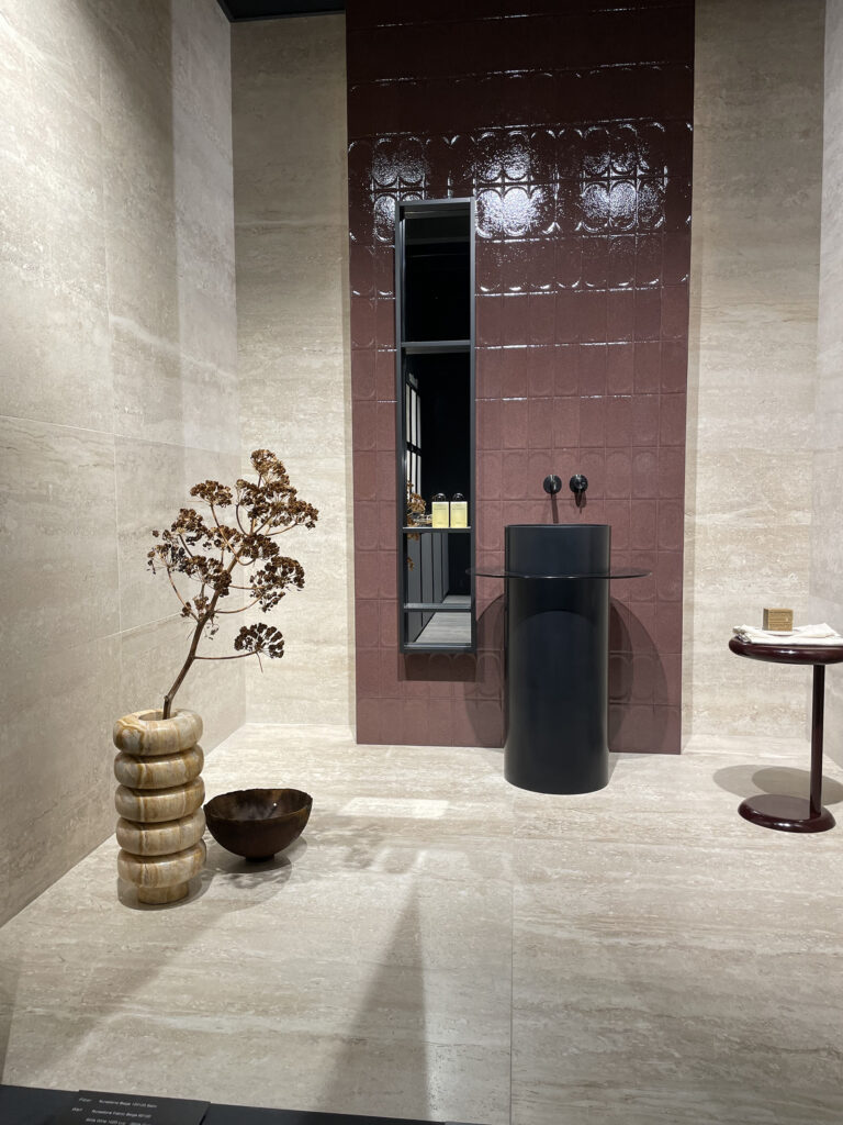
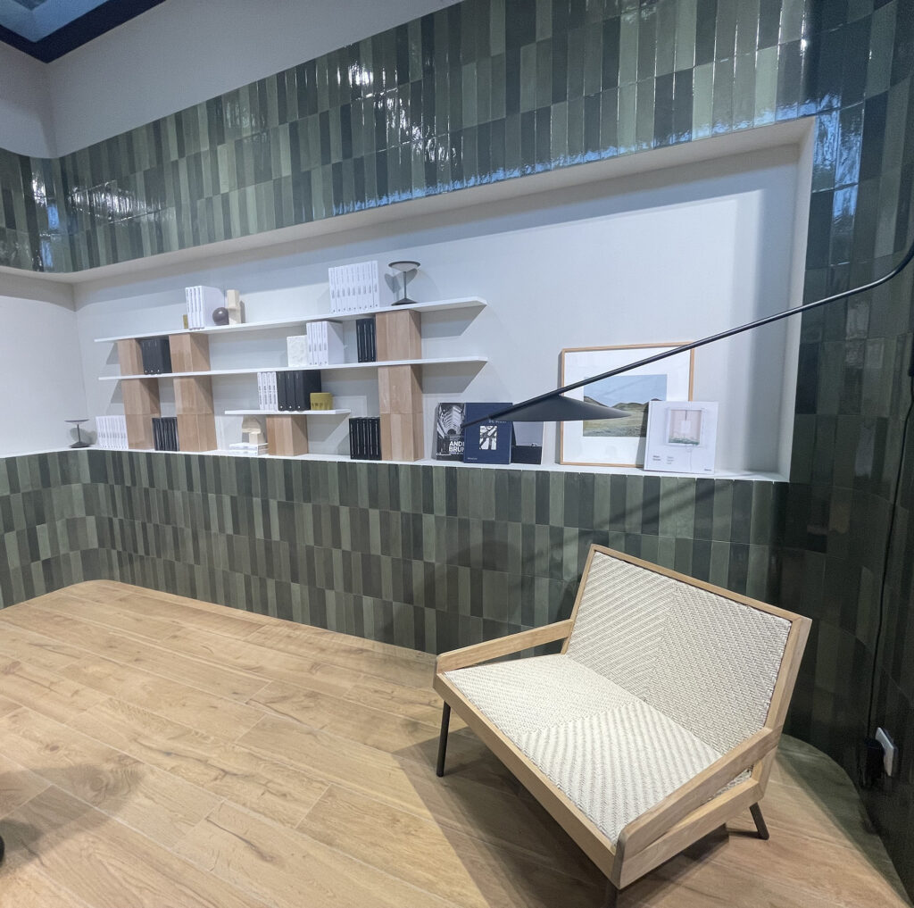
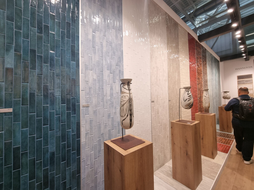
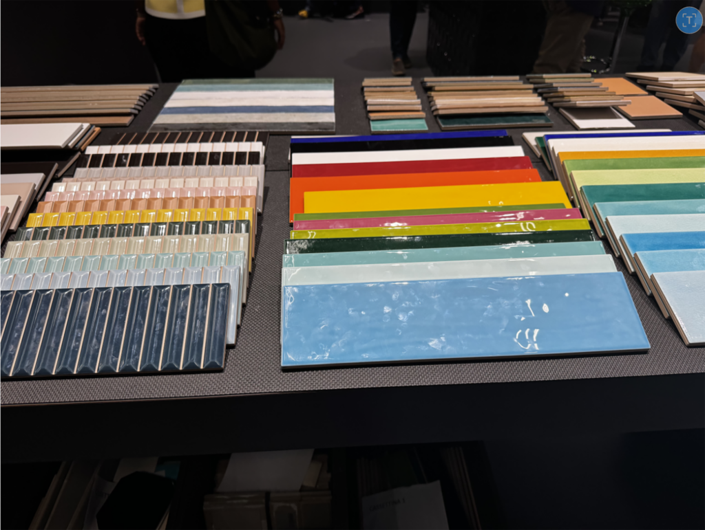
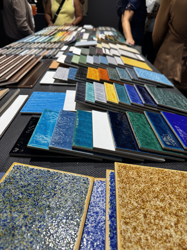
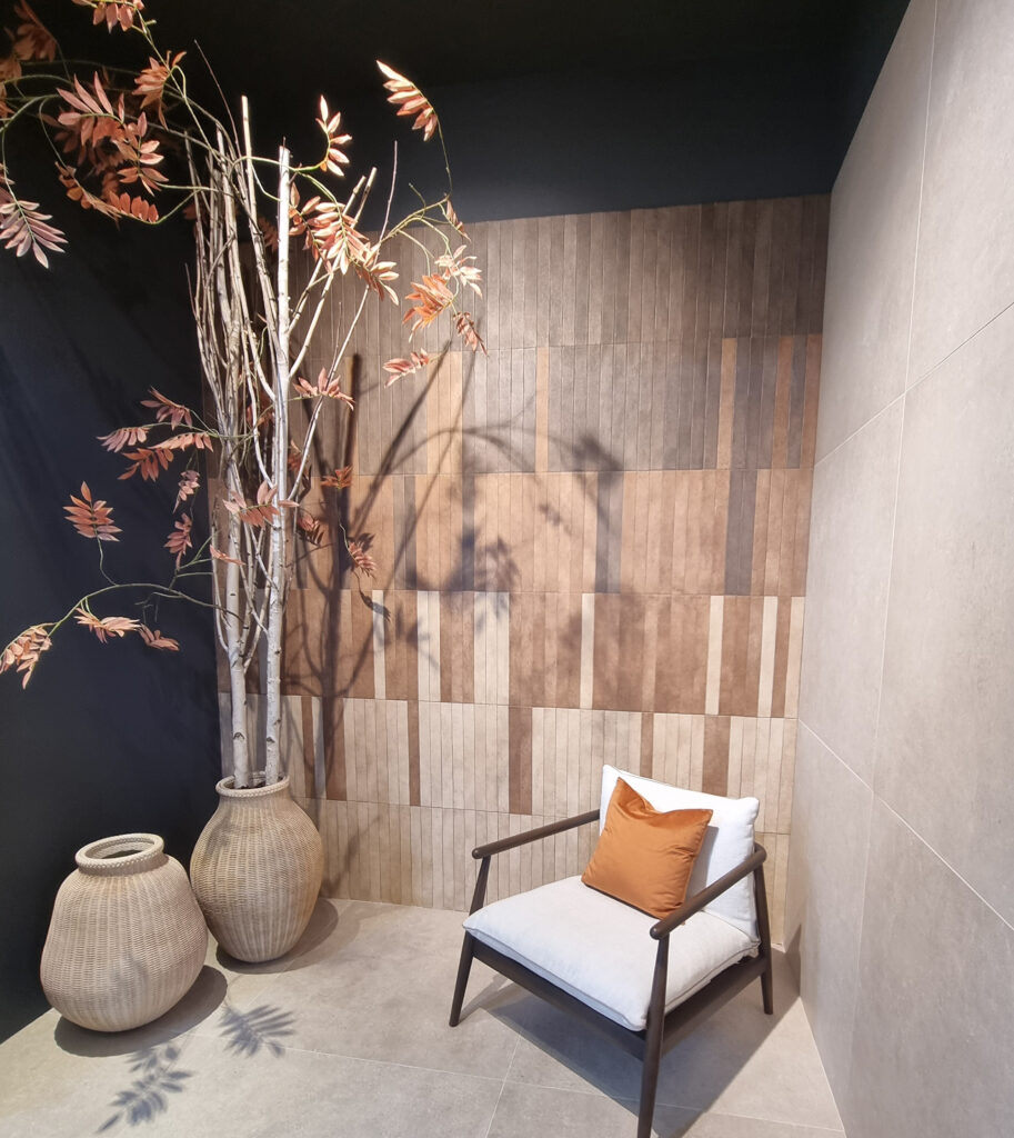
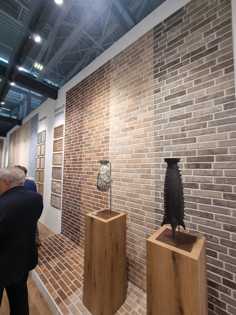
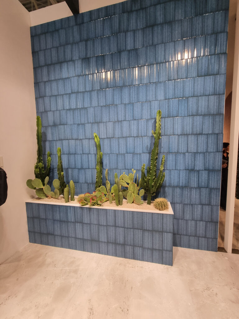
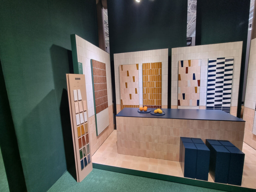
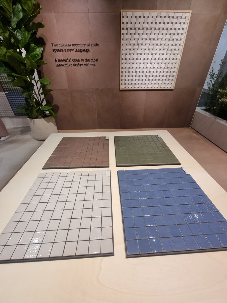
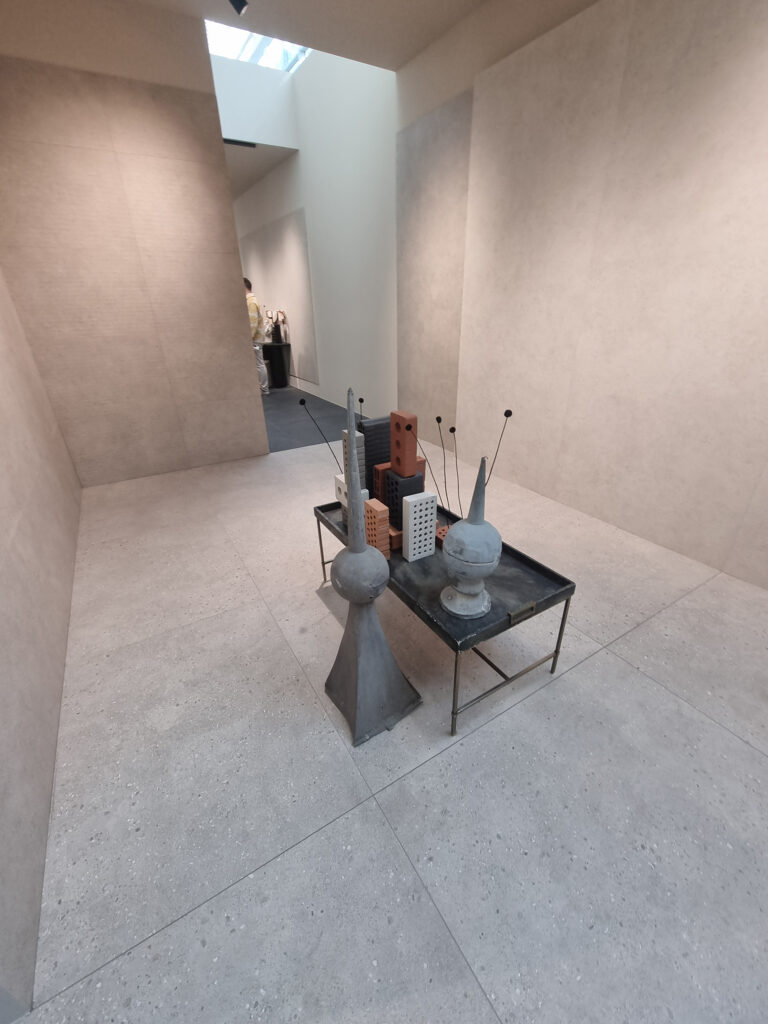
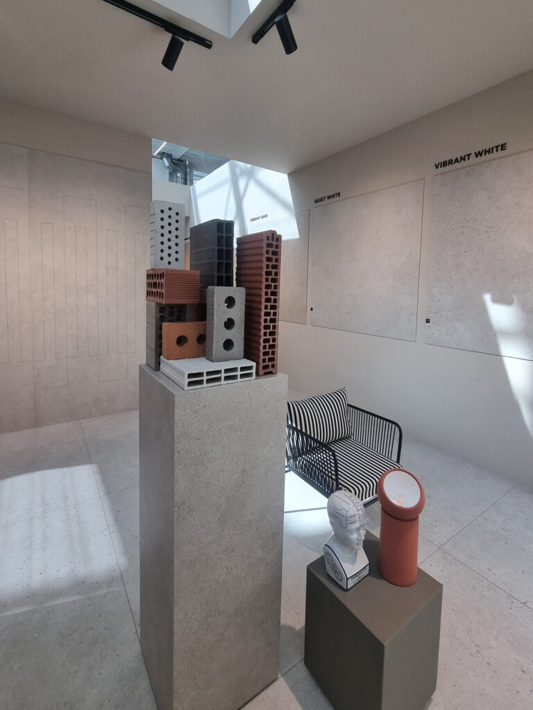
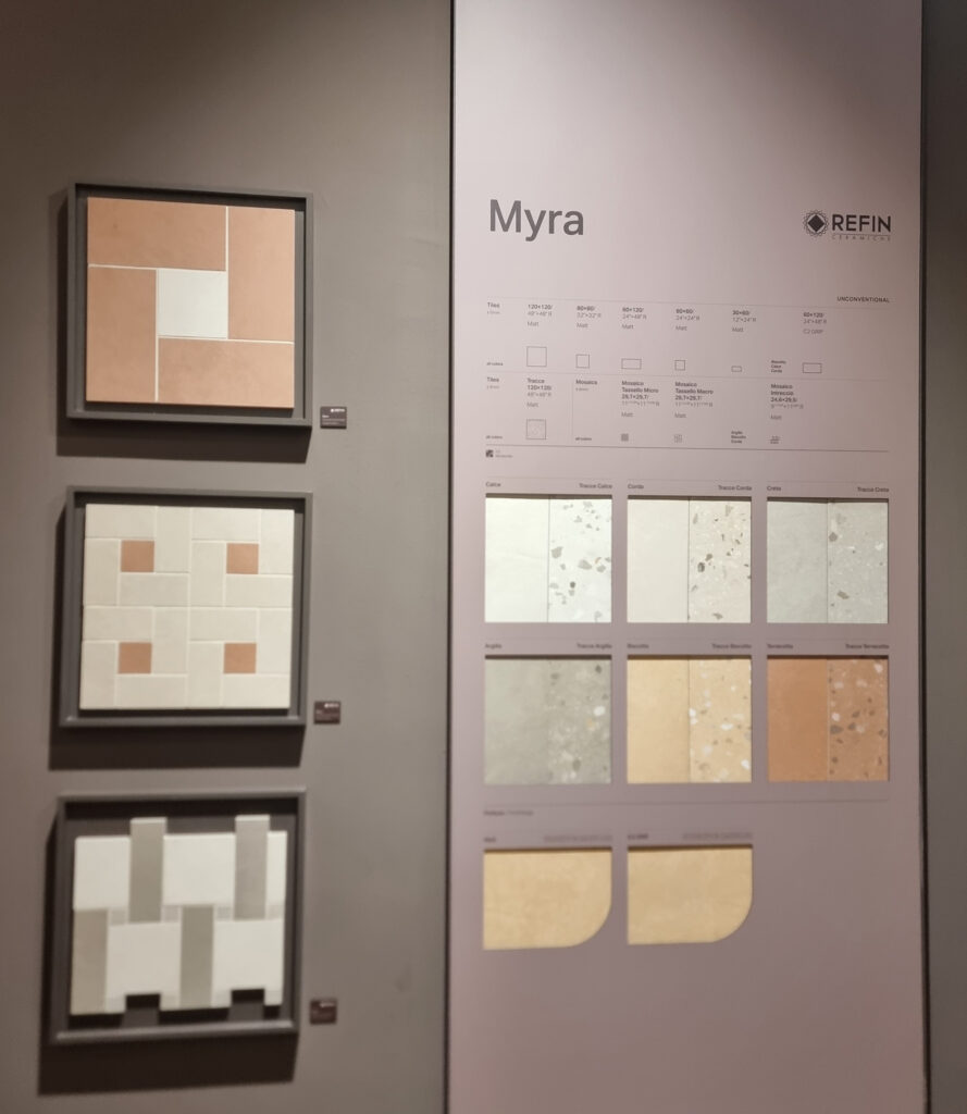
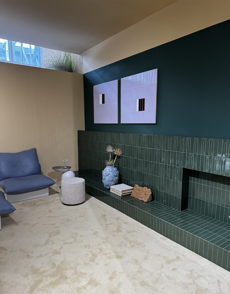
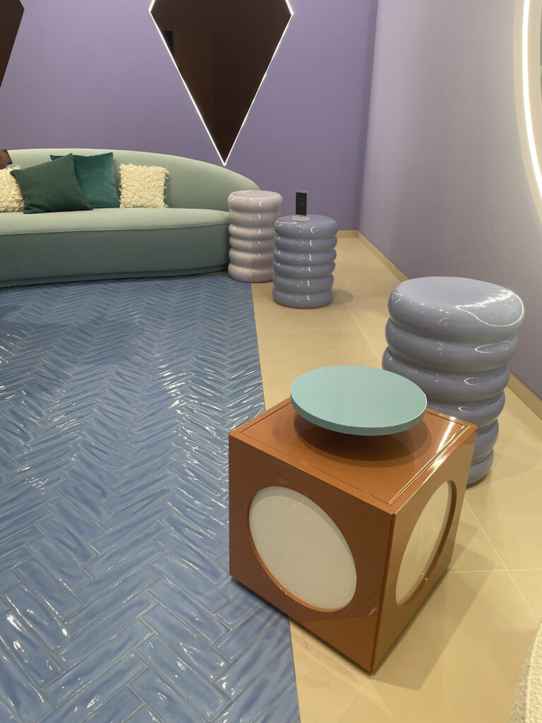
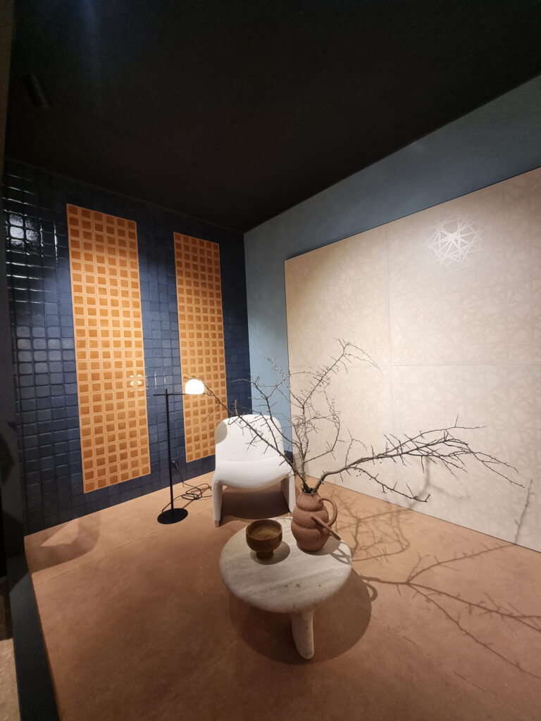
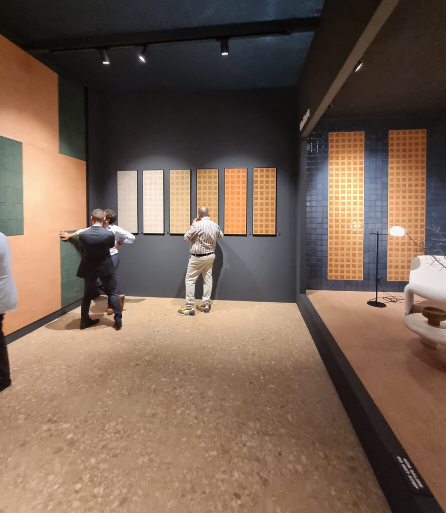
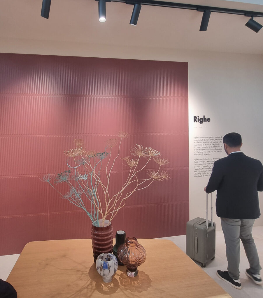
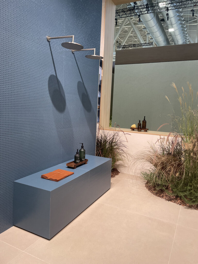
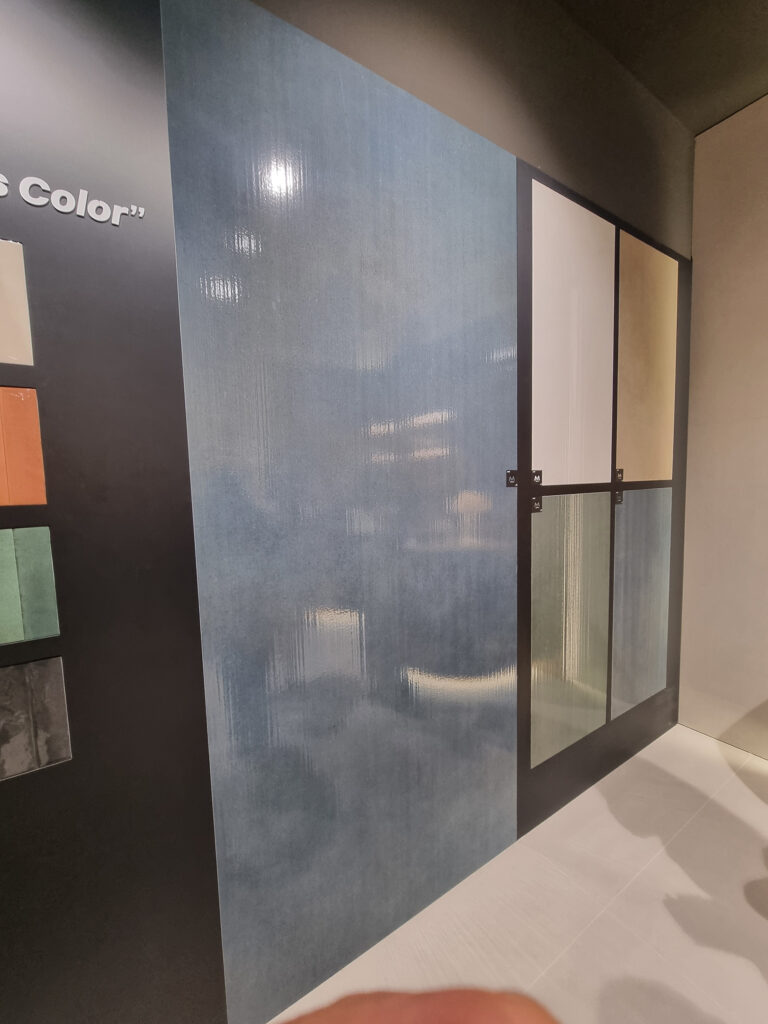
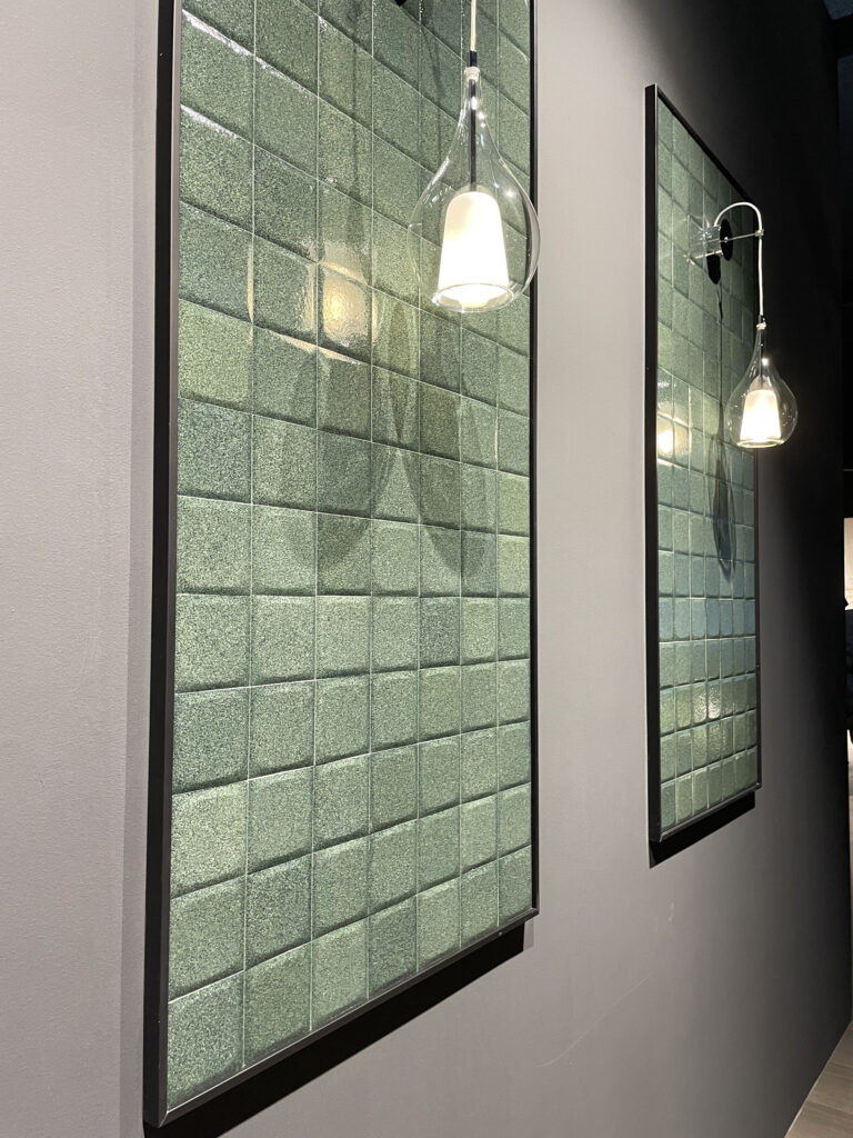
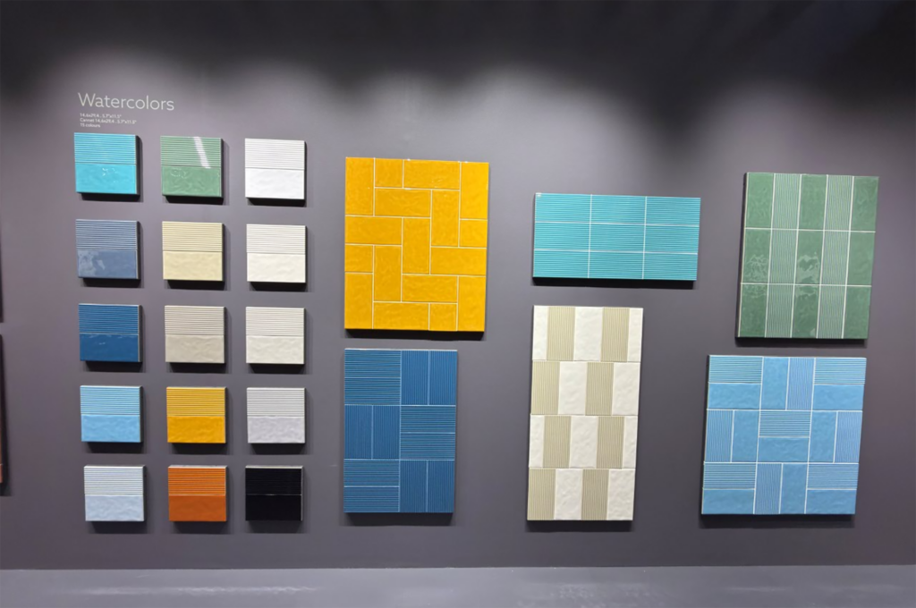
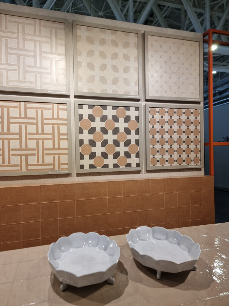
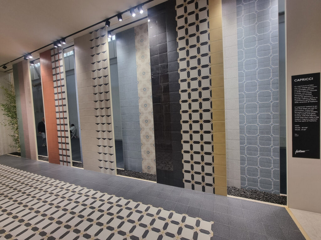
8 WHO WANTS TO BE A MILLIONAIRE As if by magic, all the product managers had their road-to-Damascus moment and went all-in on colorful little bricks and/or little squares. Shhhh… it’s a small revolution. Since 1980, Sassuolo’s mantra has been replicating other materials (this effect here, that effect there). This is ceramic that wants to look like ceramic. And (holy smokes) it looks great too, because with new technologies the little bricks have the flavor and substance of a fine handcrafted piece, not the cheap construction-site stuff the boomers used to sell.
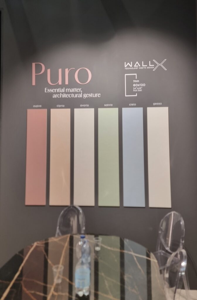
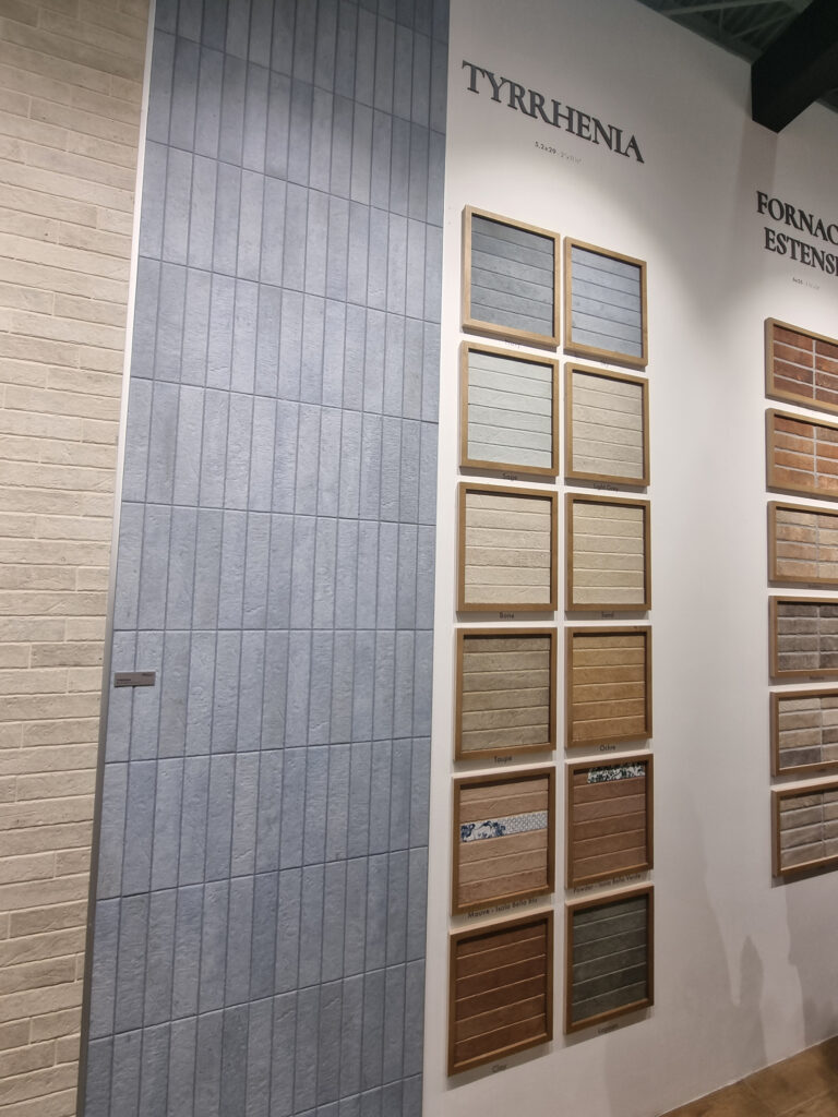
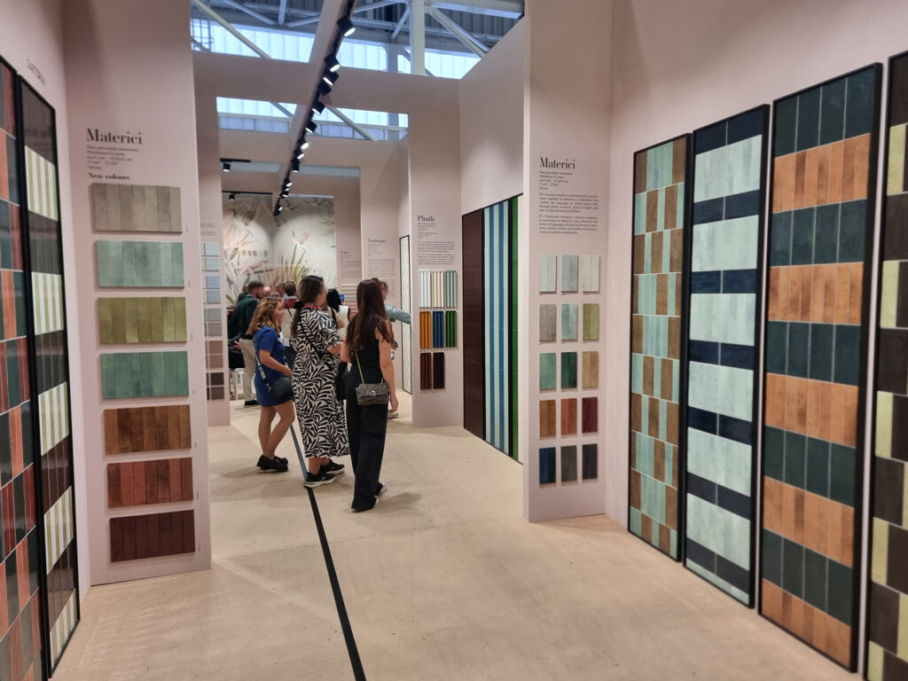
MASTERCHEF There’s more: small, colorful ceramics can be a game-changer. They pair with everything, and in the booths they work as a custom seasoning for the “large-area” categories (concretes, stones, woods). Those are a bit like pasta: always the same, macaroni and spaghetti. With the “small ones,” everyone can dress the pasta their own way. The usual stones, woods, and concretes, plated in the booths alongside tuna beige, pesto green, amatriciana orange, and pumpkin yellow, become a gourmet menu. Bon appétit.
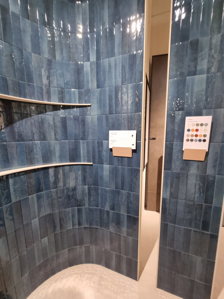
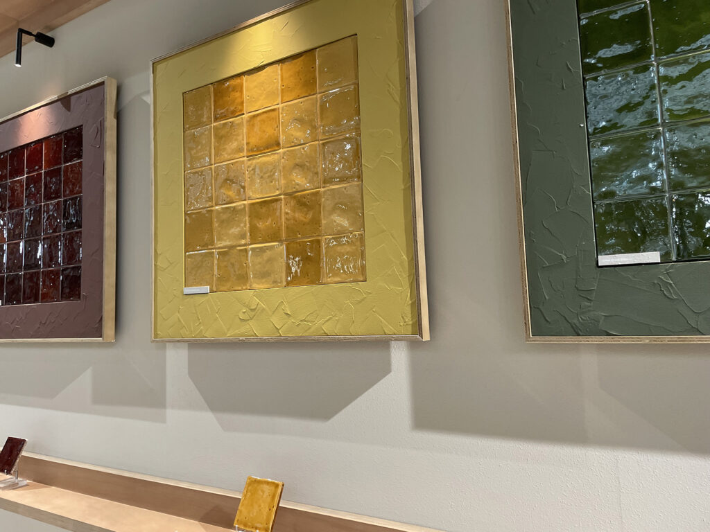
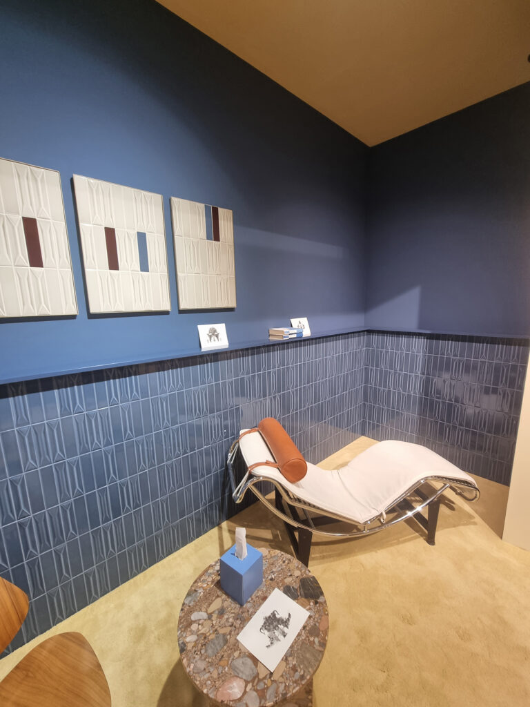
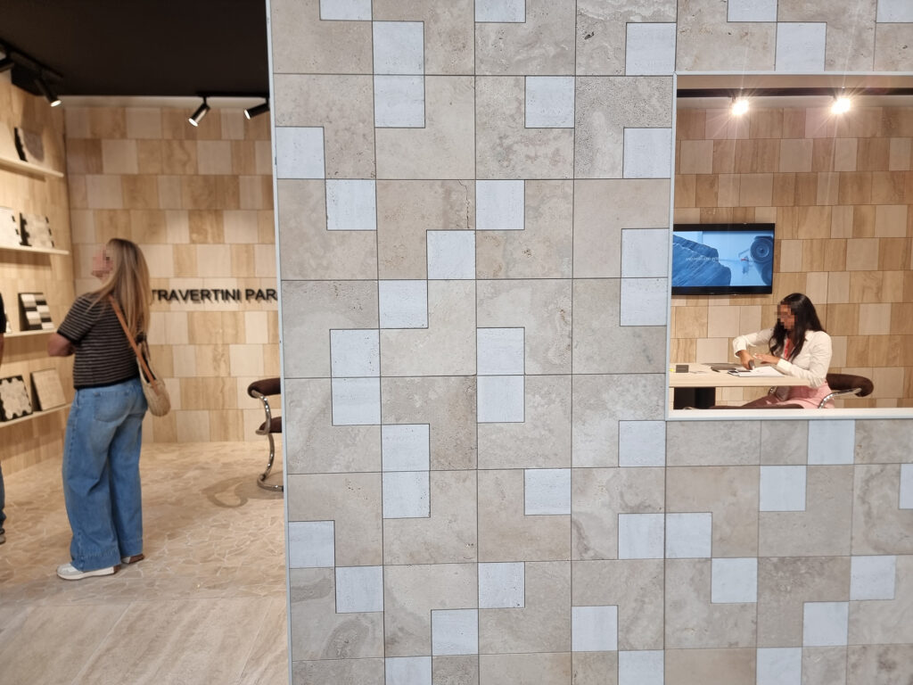
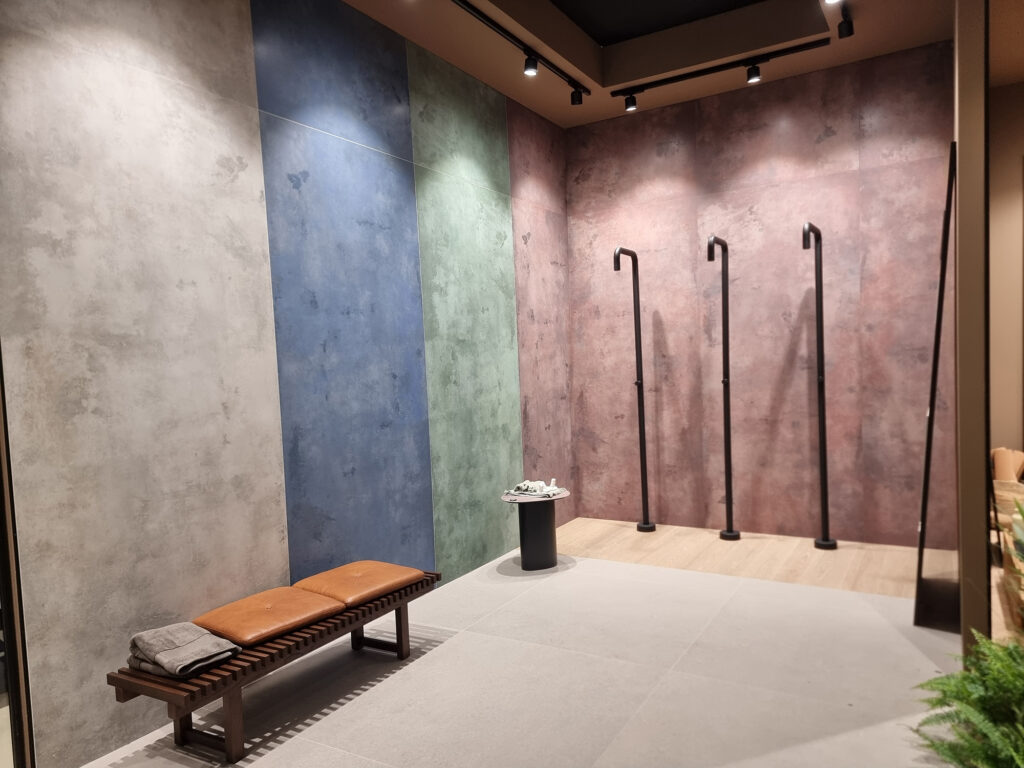
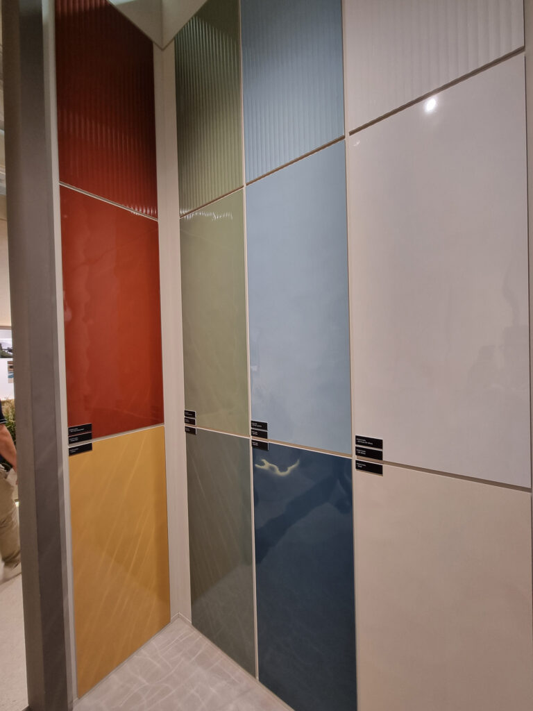
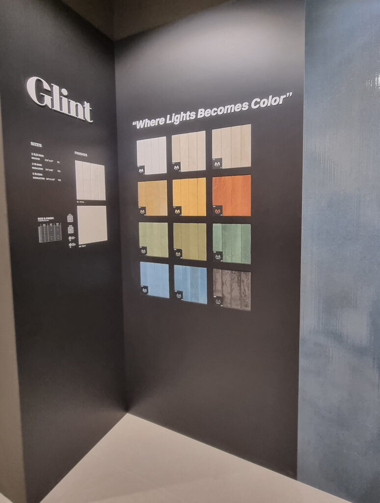
TEMPTATION ISLAND For years, small format was a remote island inhabited by a handful of specialized brands. Now it’s a full-blown overtourism free-for-all. Who knows, maybe the native islanders will claim back by producing …resin-finish calacatta and wood-look planks in concrete. Little bricks and little squares seemed like a must-have, like Birkenstock slides: no brick, no party. Design-wise, most play it safe with Crogiolo-style looks. Glossy, colorful, shade-varied.
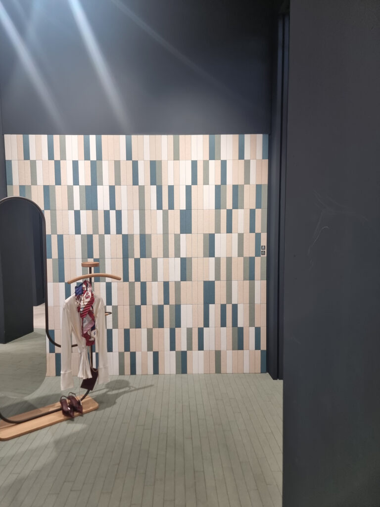
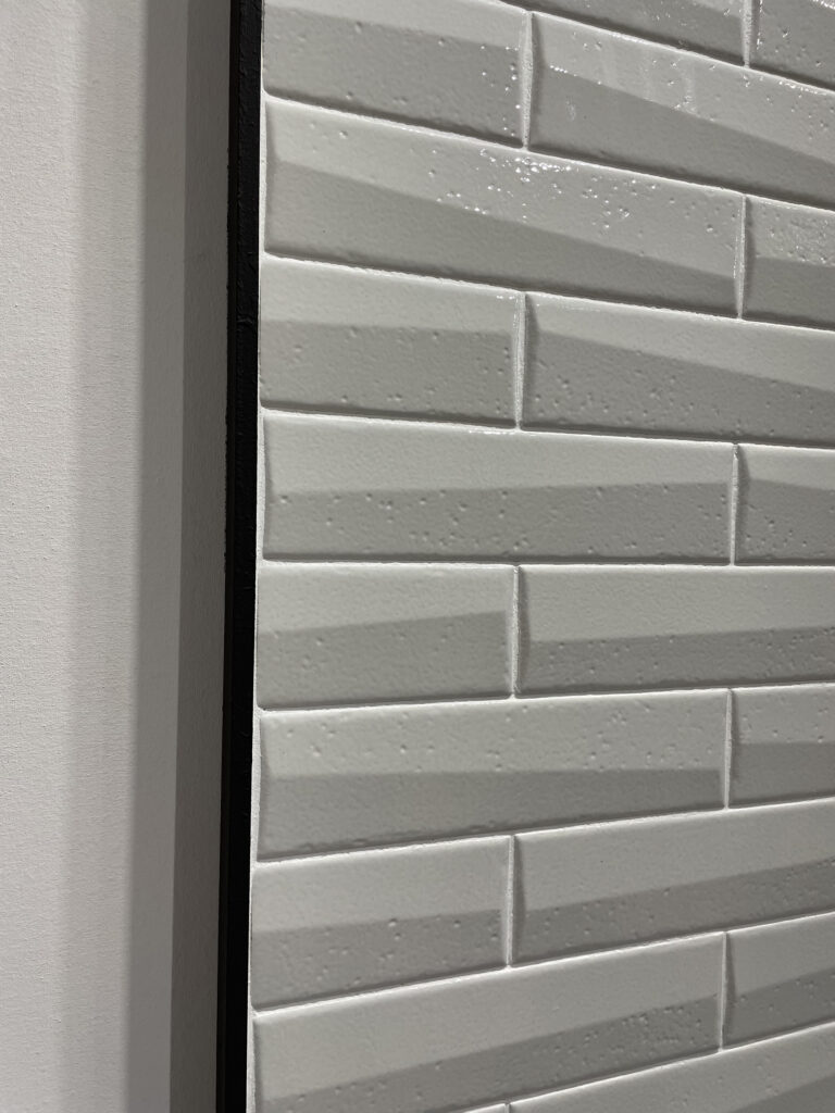
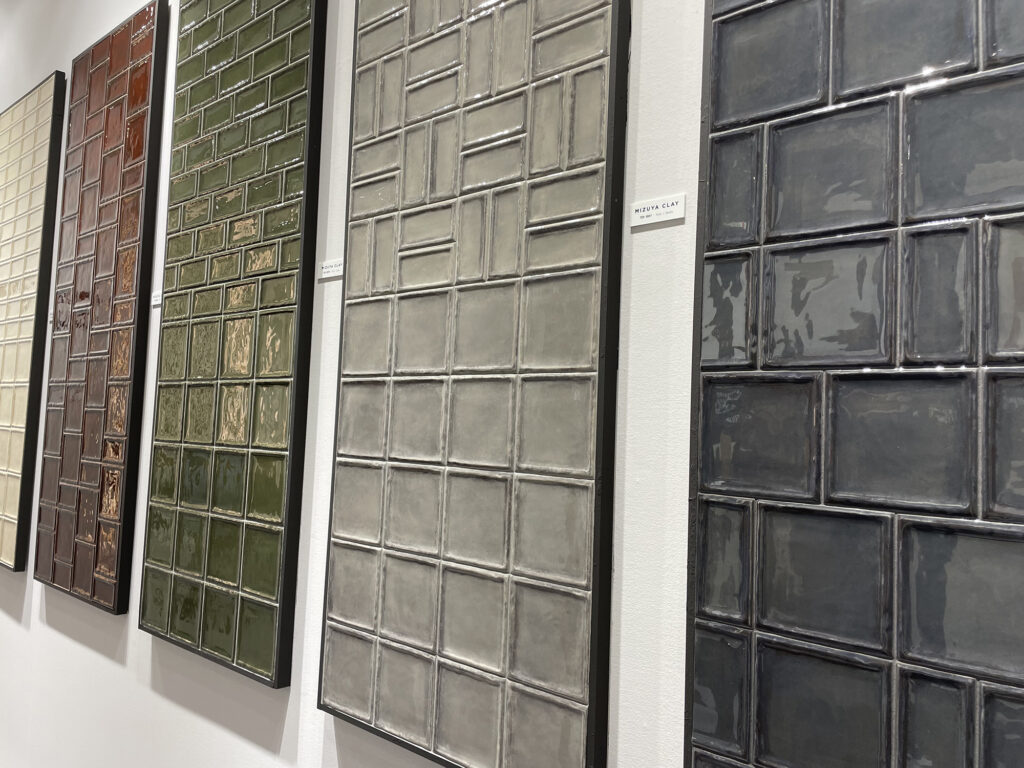
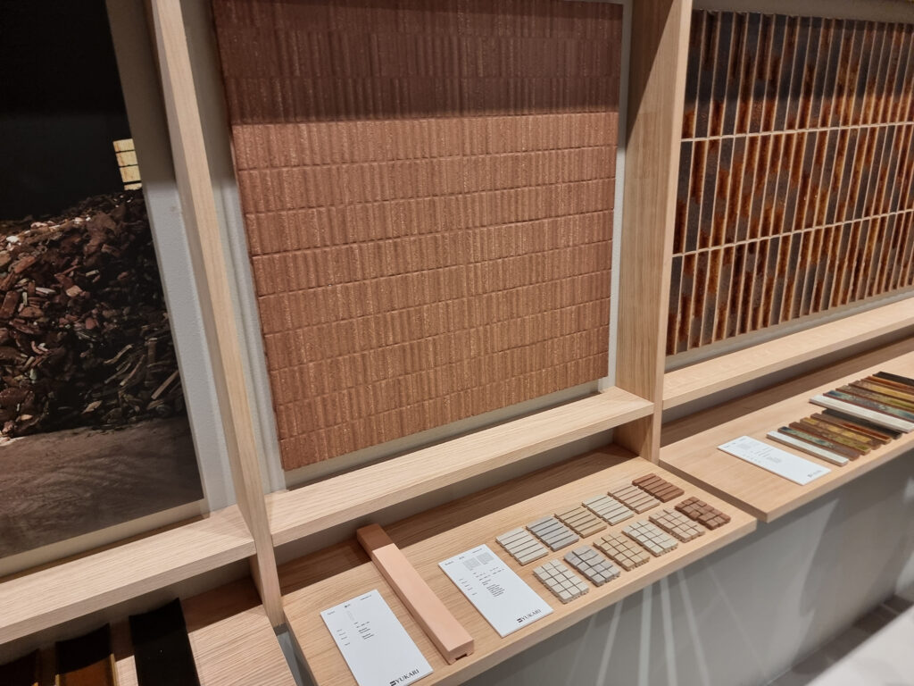
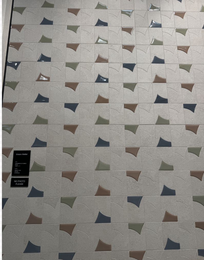
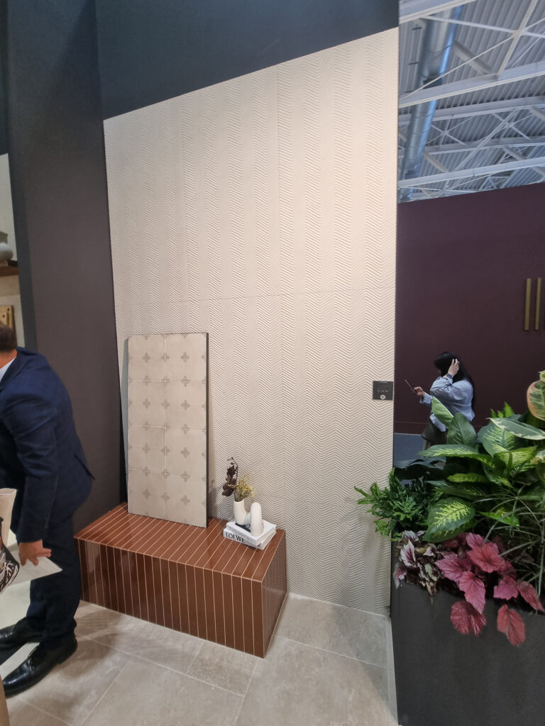
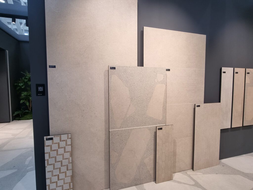
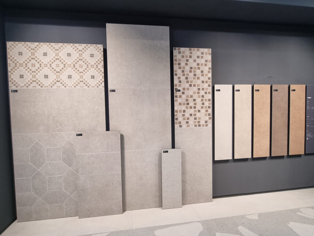
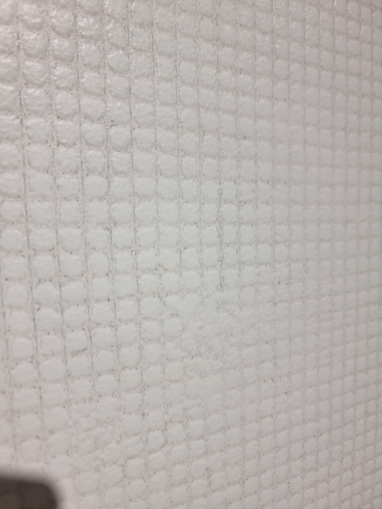
The many brick & small collections also explore other looks: earth tones, speckled, stone (even in glass-wood-earth mixes, Ascot). Or elaborate sets for creative compositions (Keope Grace Atelier, with Margherita Rui). Another strand is more pronounced structures, from geometric textures to irregular surfaces and thicknesses with the imperfection of the natural, handcrafted look (Keradom). The standard brick is about 6×24 cm (roughly 2.5×9.5 in), but there’s also a long-slim 5×45 cm (2×18 in).
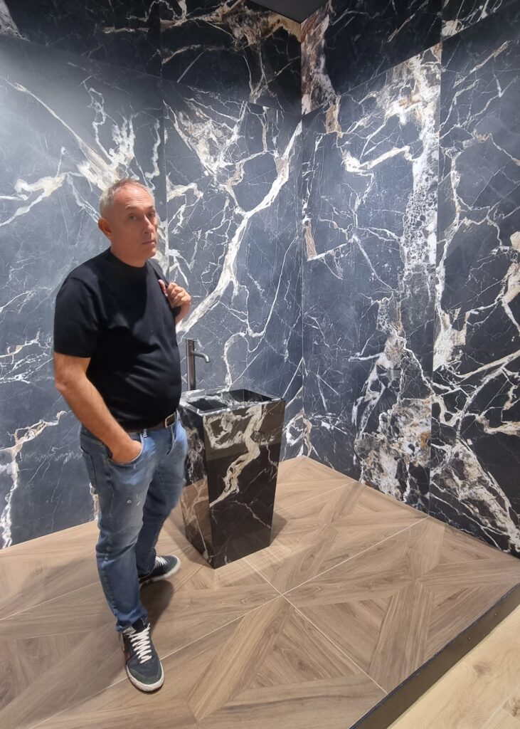
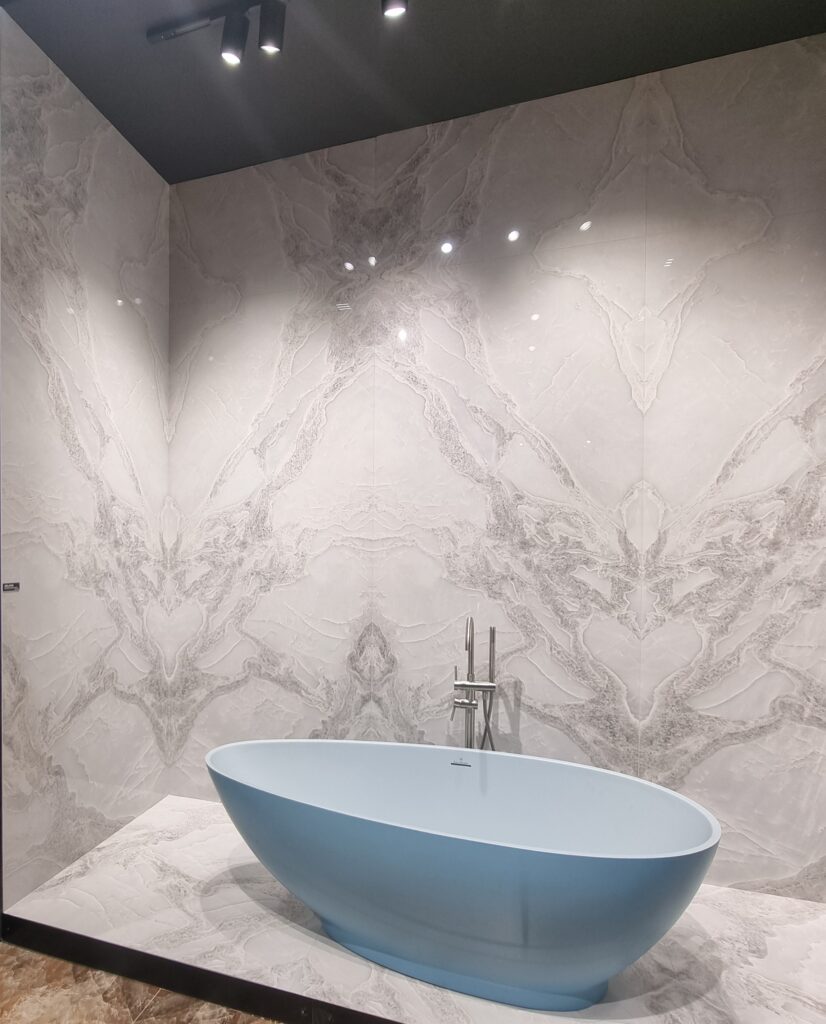
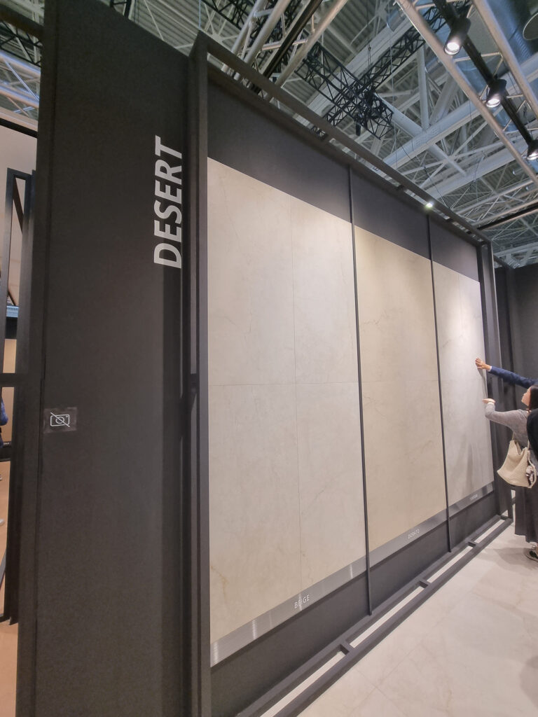
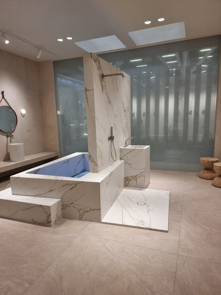
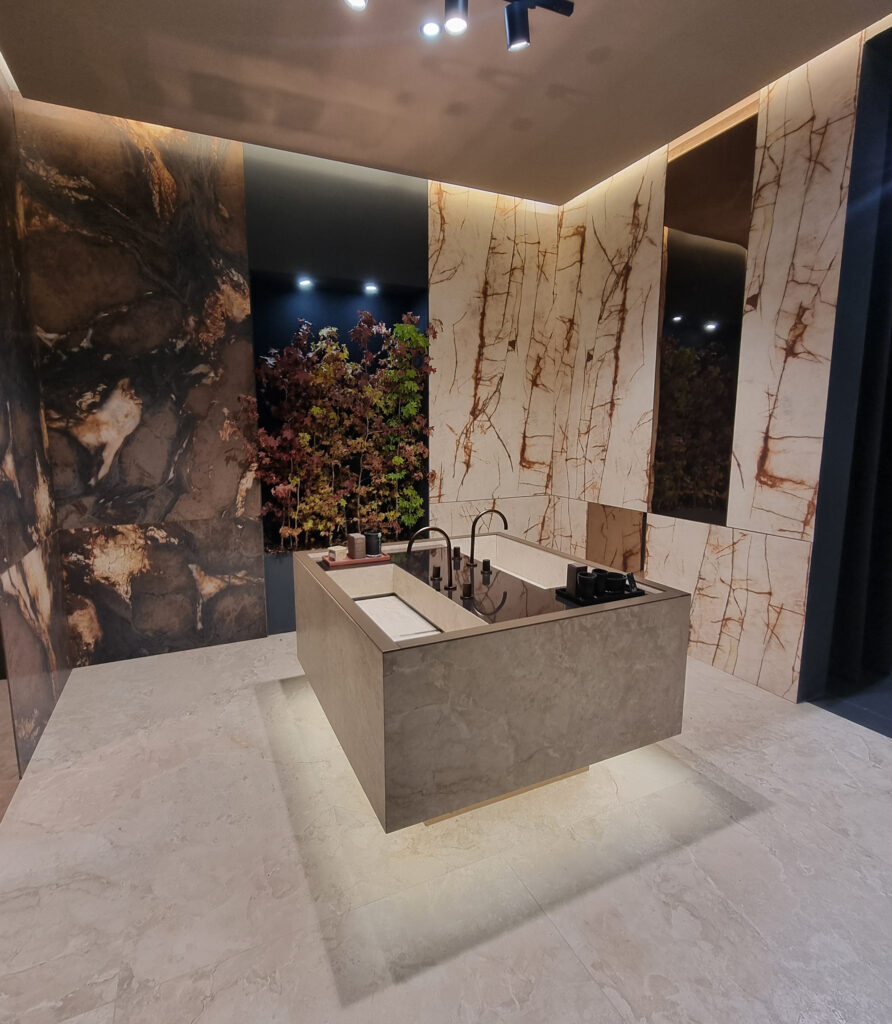
9 MISSING: WHITE MARBLE I’d never have thought it, in fact I tremble as I speak: calacatta and its (white) siblings have vanished from the booths that matter. For years they were the comfort zone: when in doubt, put in a white and you can’t go wrong. Who knows if King Kalacatta has worn out its welcome, or if we’re suffering from the rock-bottom prices of the Asian producers. Off in a corner, a few white-marble bathrooms survive, with their countertops and tubs.
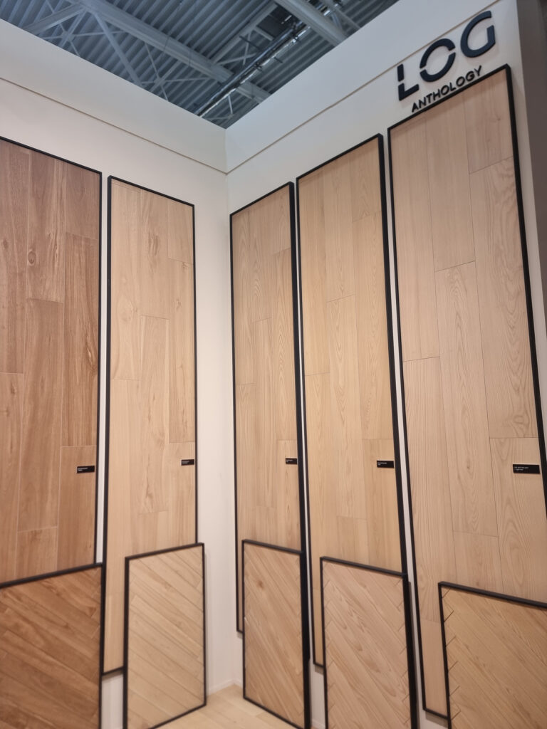
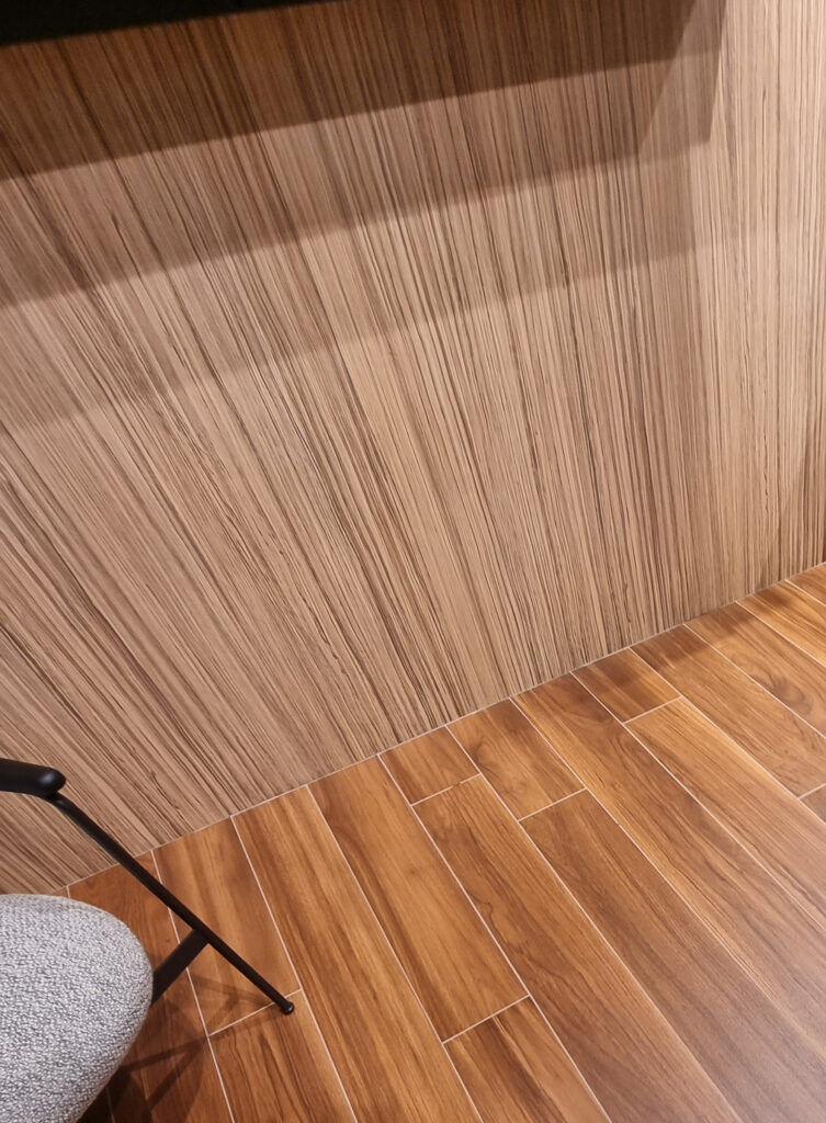
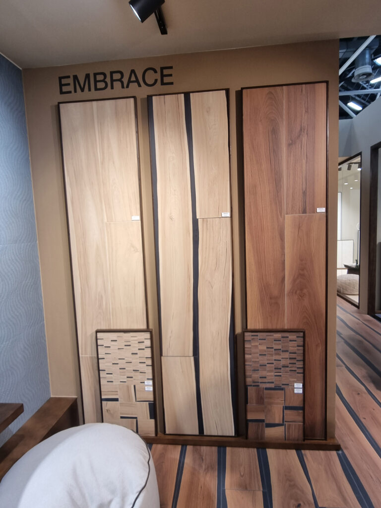
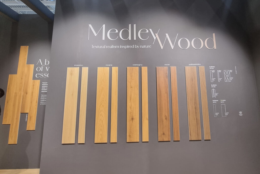
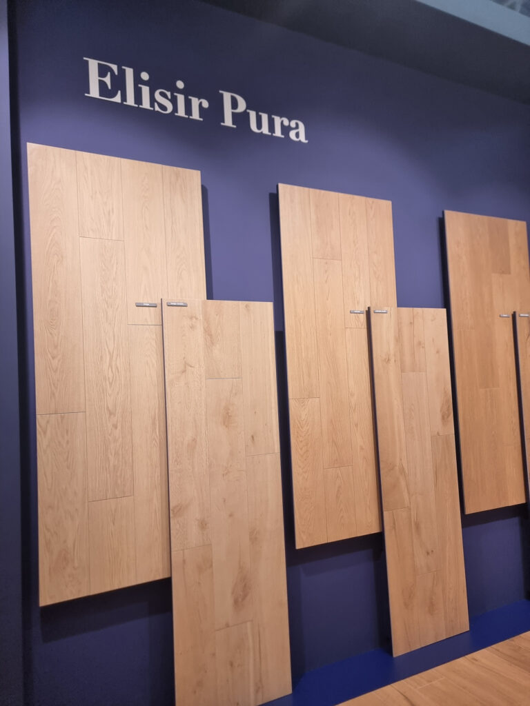
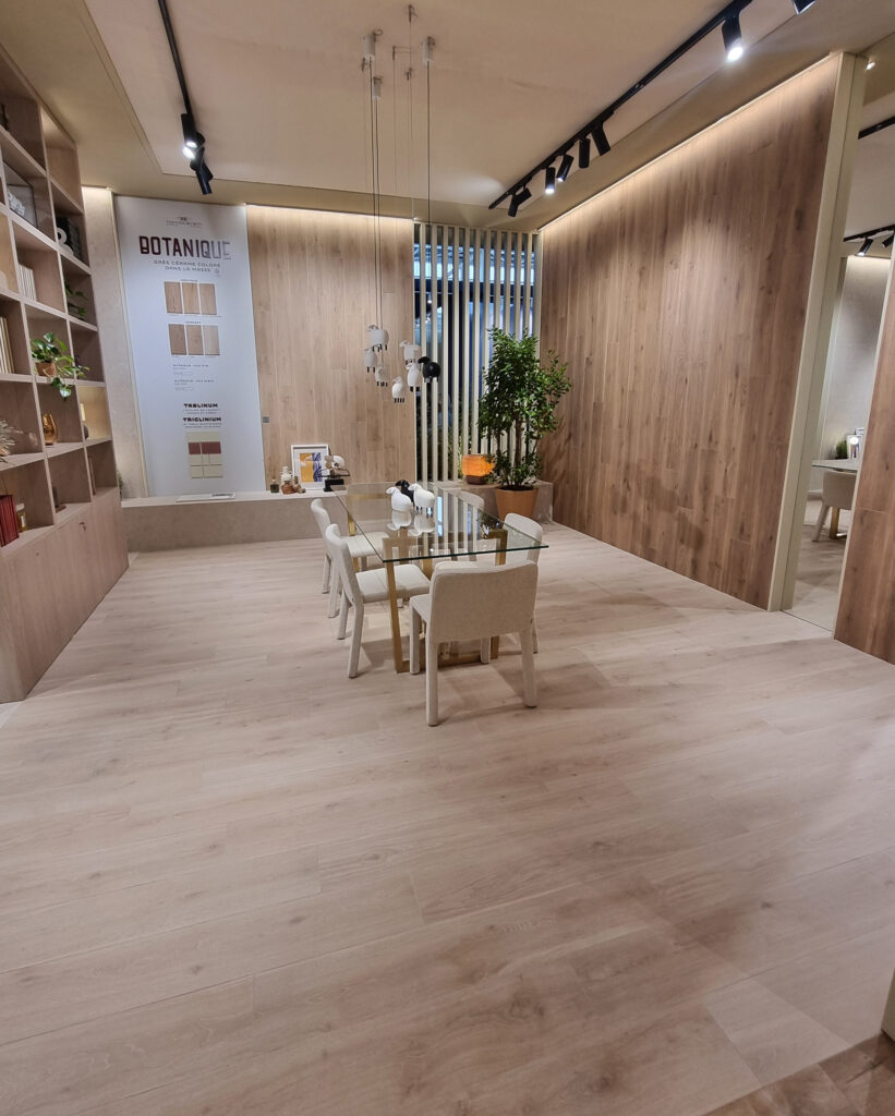
10 MISSING, PART 2: WOOD LOOK A blanket dose of weed killer has decimated the wood-look tiles, along with all those ever-present oaks everywhere. A respected PM whispers that after trying every variation of the Kama Sutra in plank form, nobody knows what else to invent. After the LVT ghost, we’re now suffering from SPC competition.
Back to GEL (Gres Effetto Legno, wood-look stoneware): worth mentioning are a Zebrano (zebrawood) at Atlas Concorde, Edimax’s original slightly crooked planks, and some nice small-format installations.
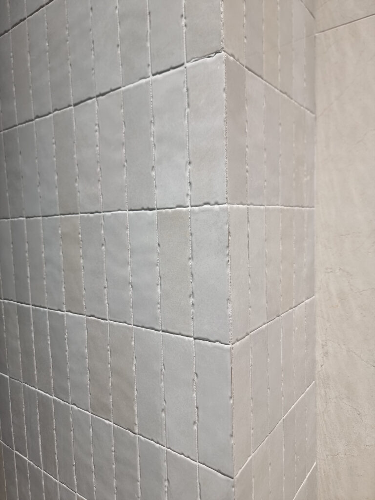
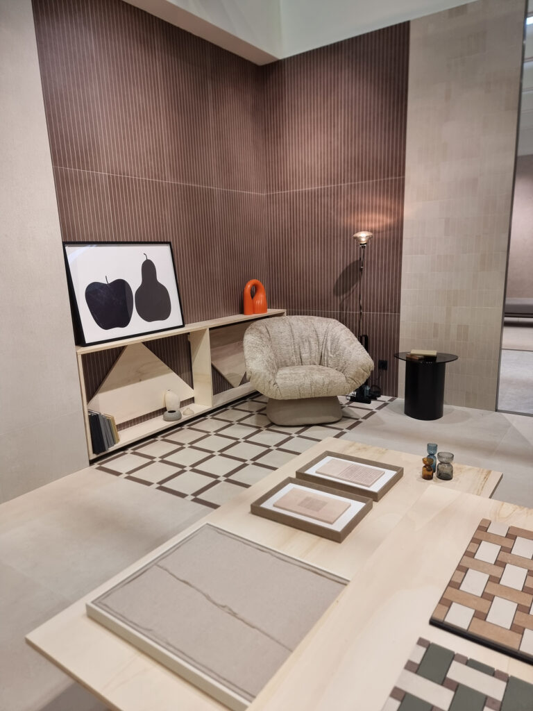
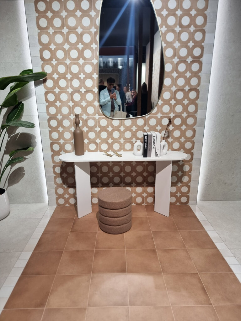
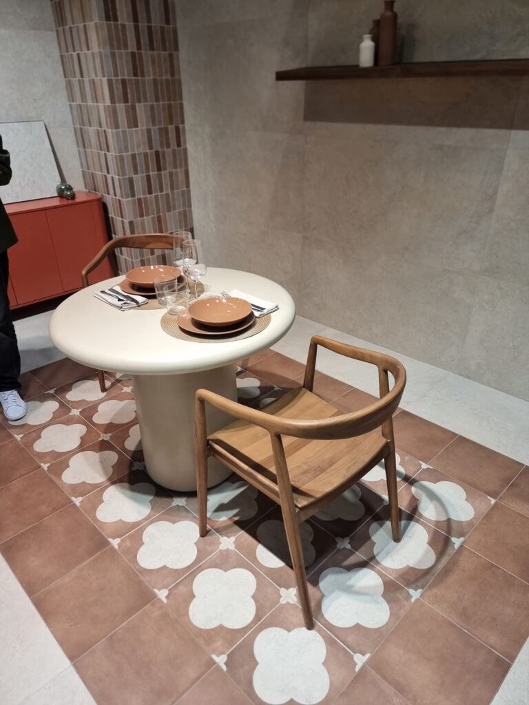
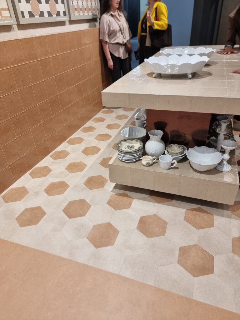
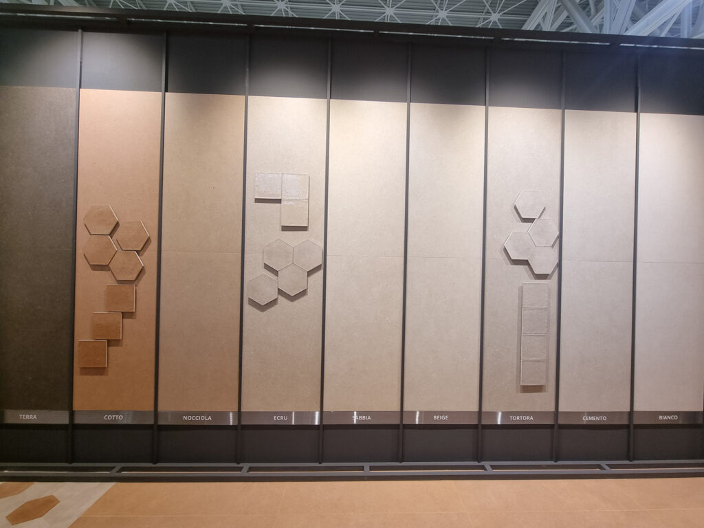
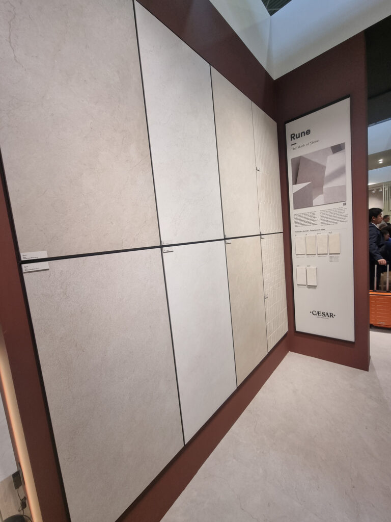
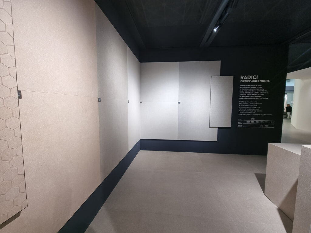
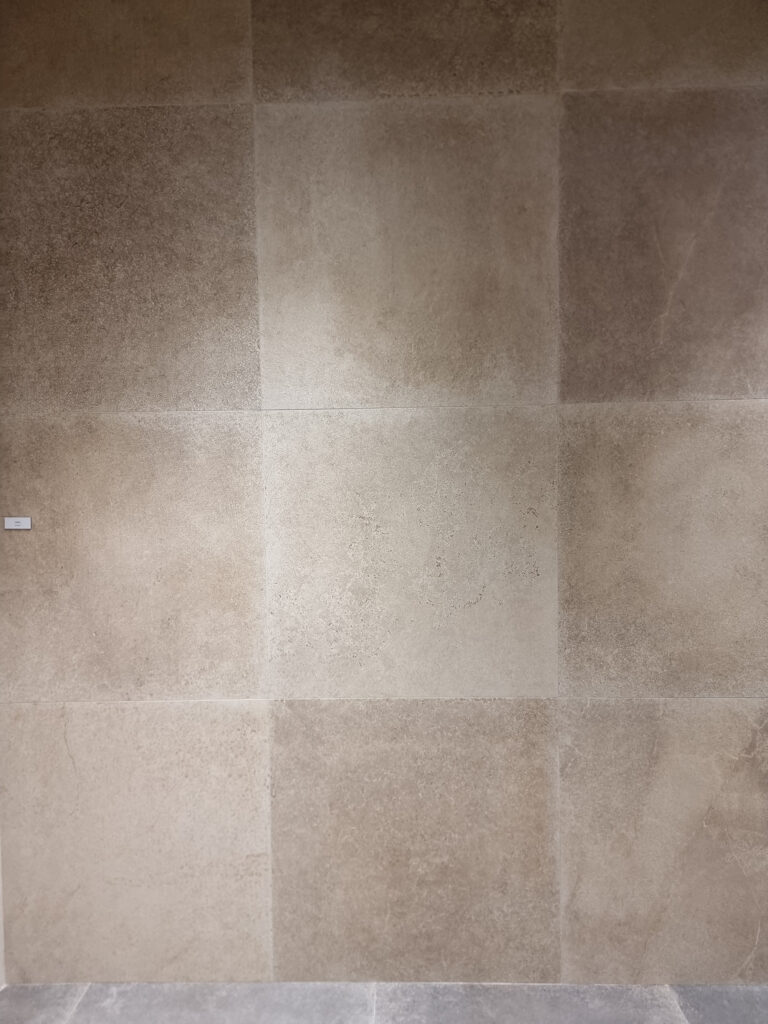
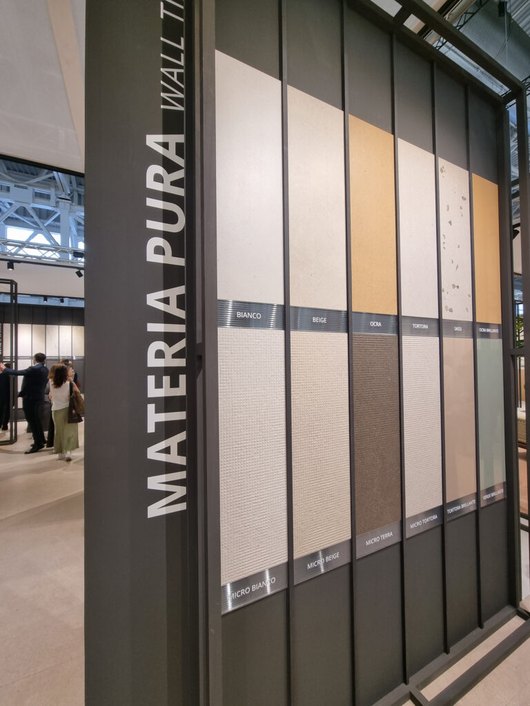
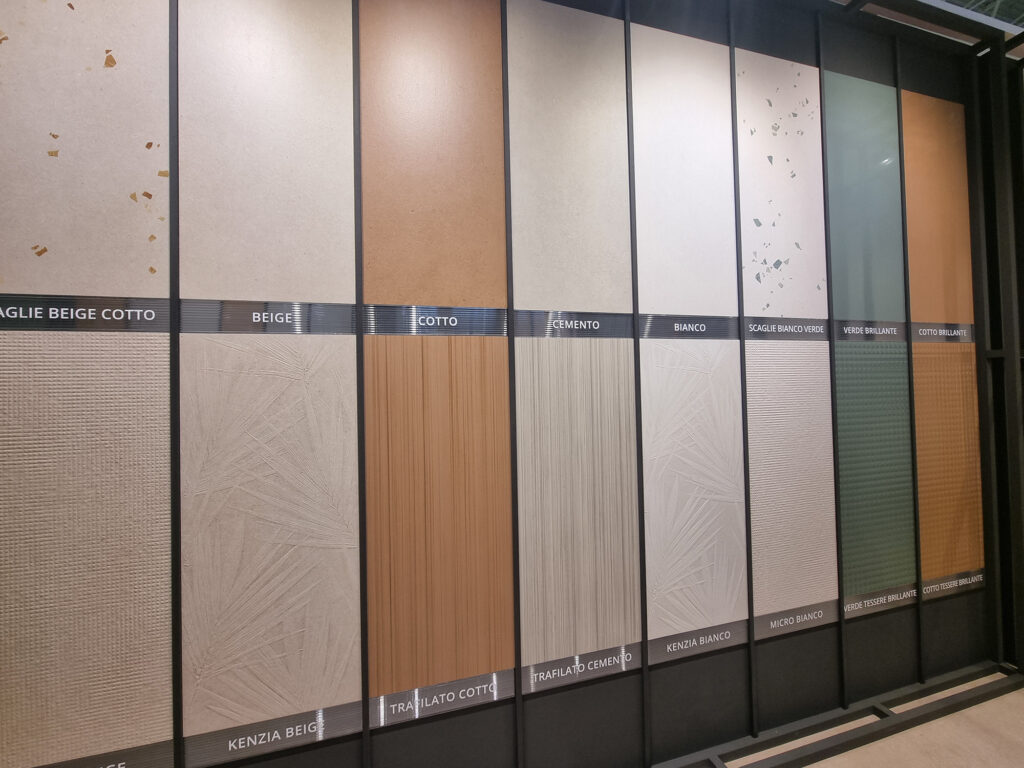
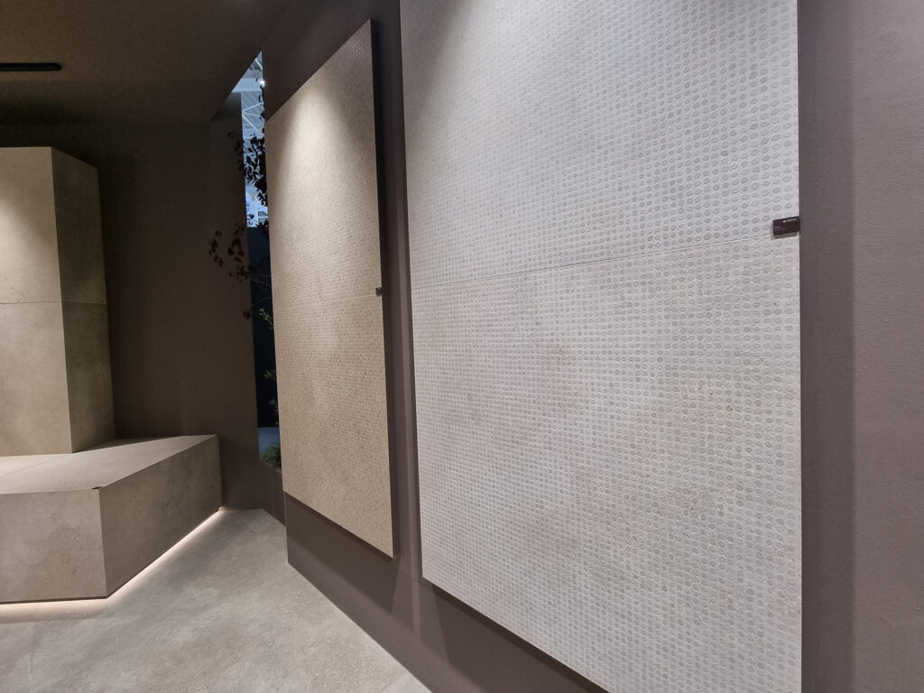
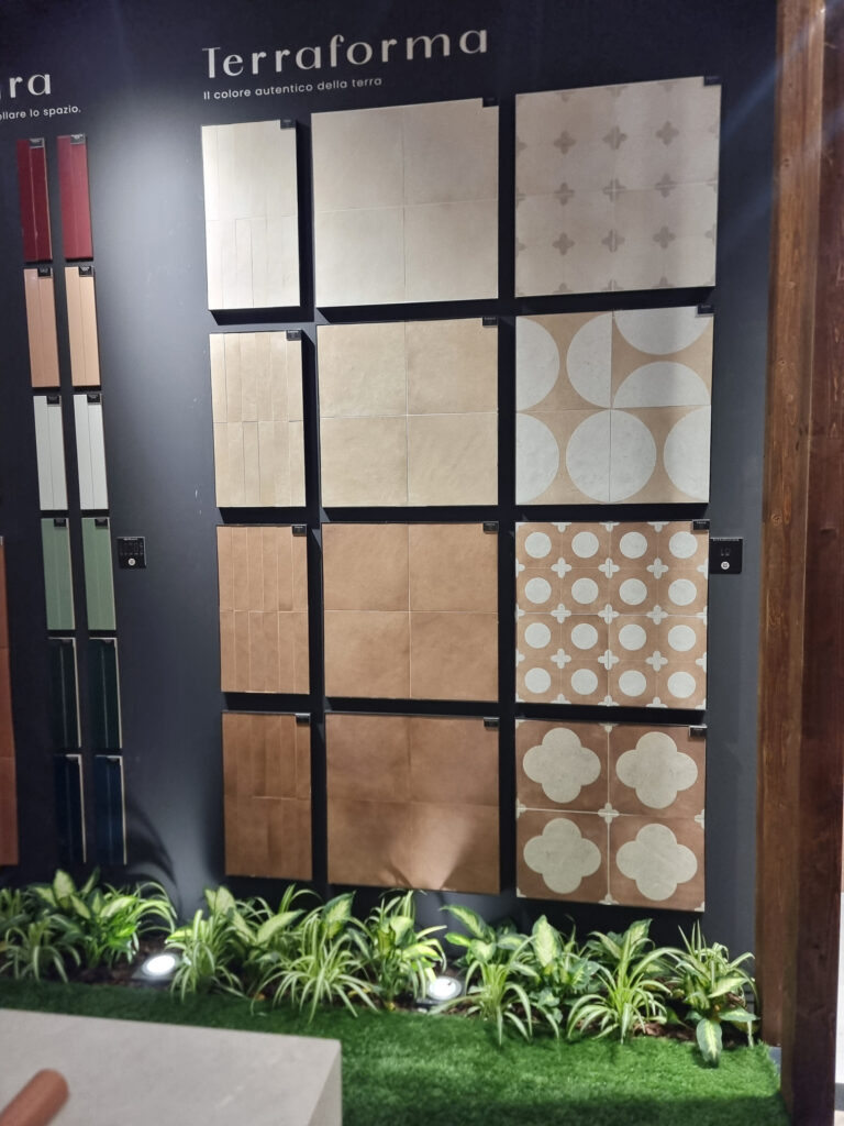
11 COTTO: COOKED AND SERVED If a faithful replica of handmade cotto has always been hard to digest for sales, then let’s evolve it into a stylized hybrid in a modern key, more crowd-pleasing and easier to swallow. With these “delicately textured” surfaces, it’s hard to tell whether the base is cotto, resin, plaster, or soft stone. Either way, they do the versatile job of concrete, but with more feeling and a wider, more current color range (Caesar Lore). They come loaded with accessories: decors, 3D textures, brushed finishes, real or simulated mosaics.
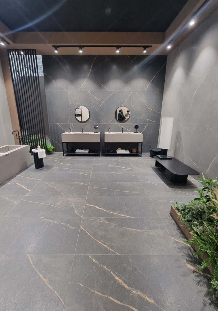
12 THE INHERITANCE: STONE LOOK Among the big-five effects, the stone look is confirmed in a big way, in several strands.
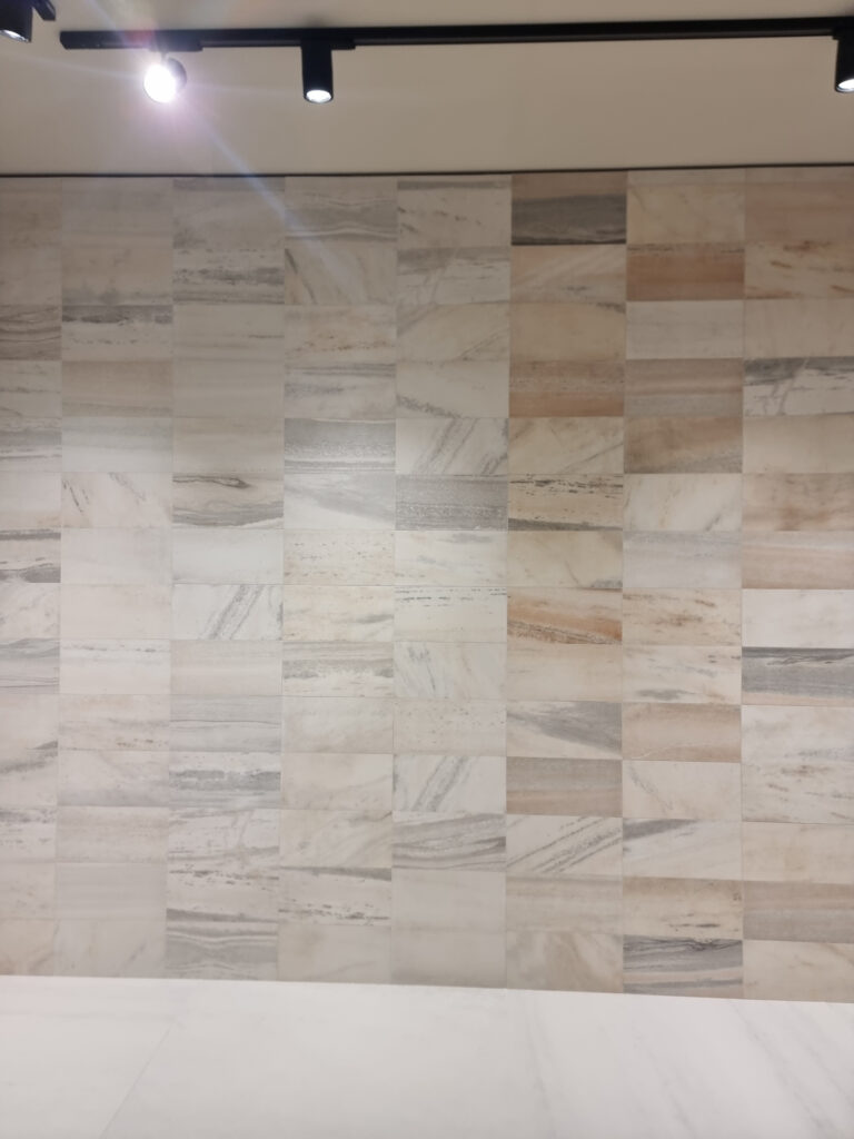
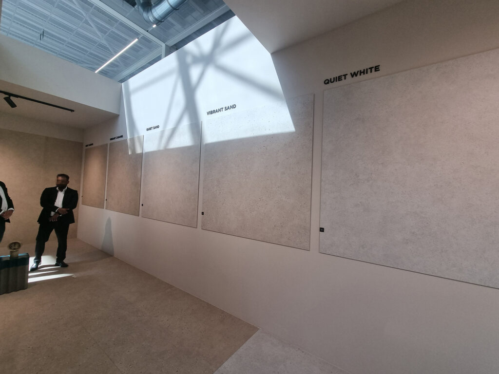
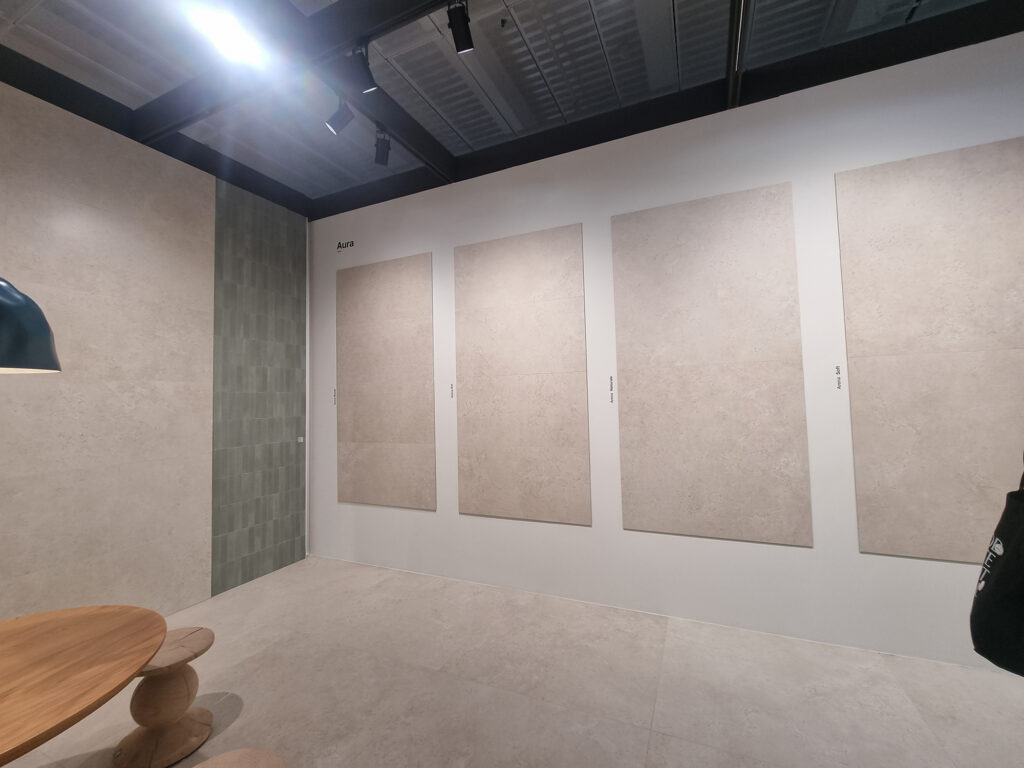
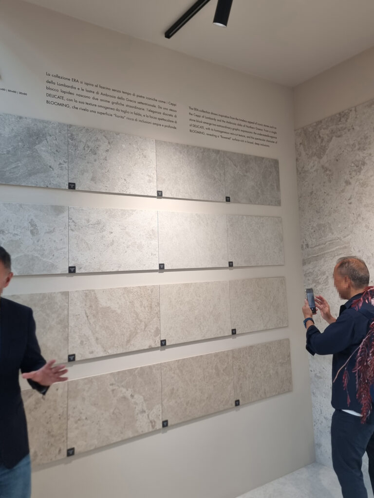
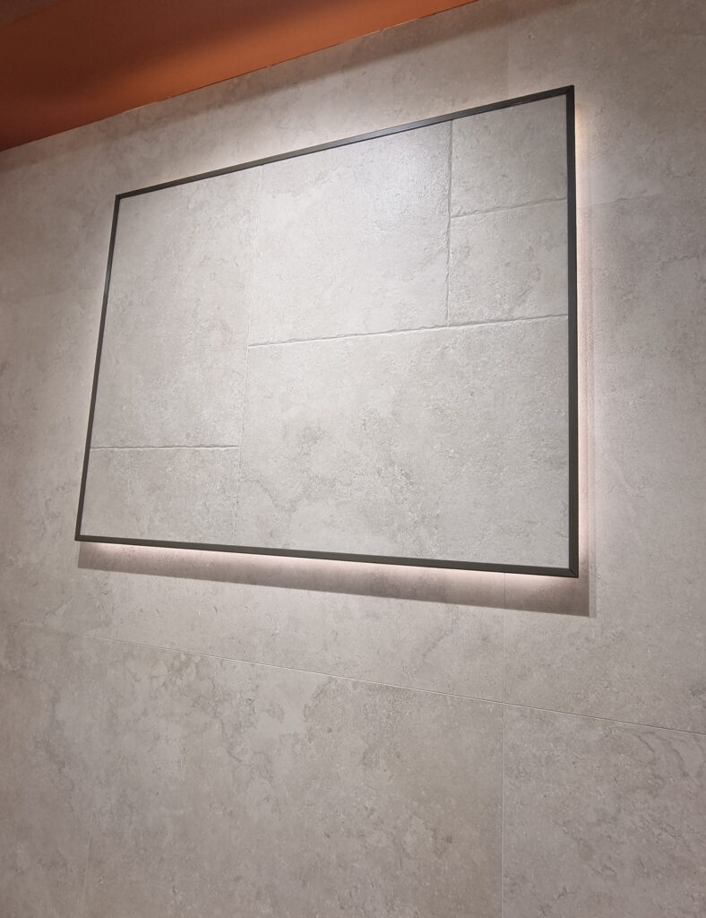
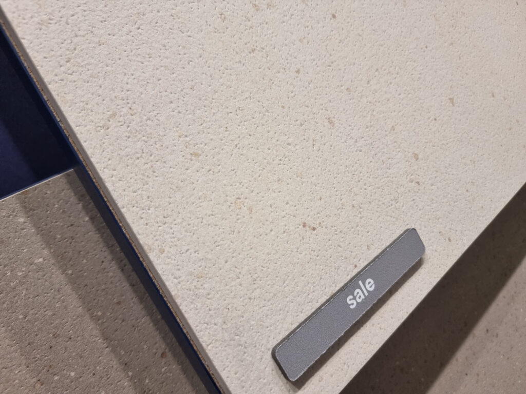
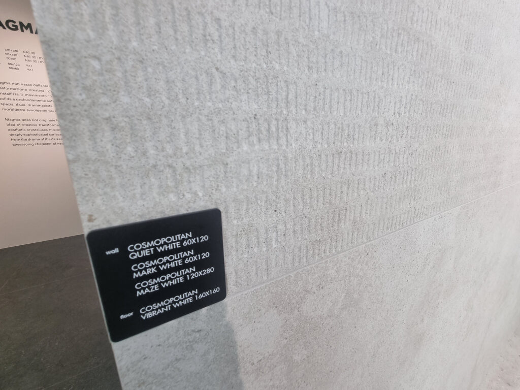
White & friends collections. In pursuit of the “ultra-sellable”: a few ultra-light shades, with very subtle textures or veining like limestone, fine gravel, and pebbles (a base only experts can identify). Few colors but many formats, and lots and lots of surfaces with tongue-twisting 3- and 4-letter names: nat matt soft silk pearl grip ext rock strut… and arigatō, the rigatino (fluted finish).
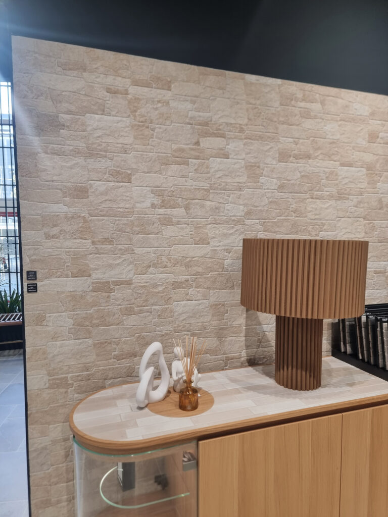
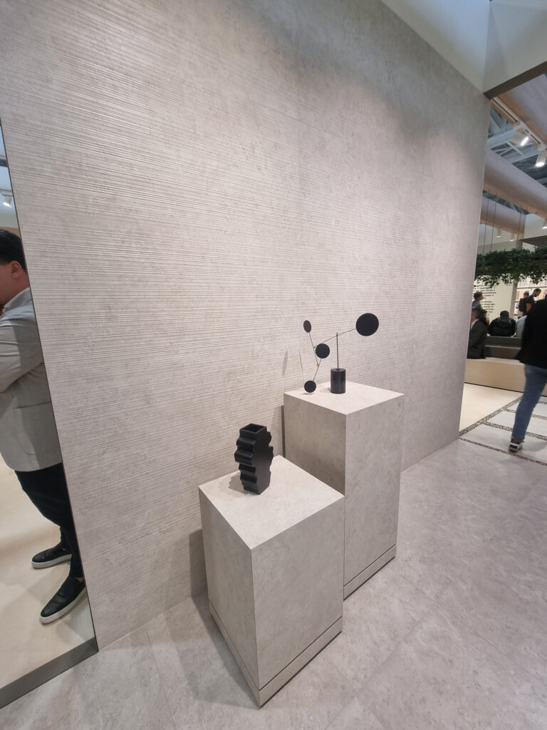
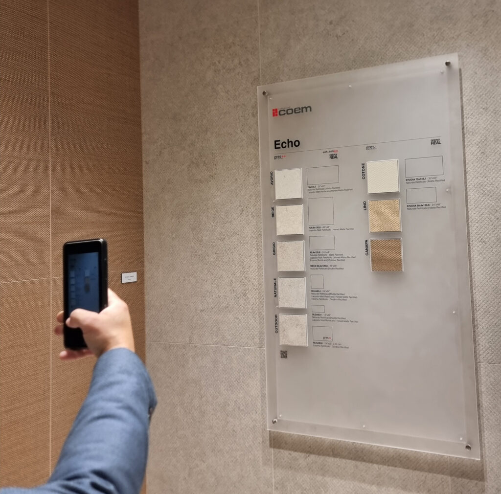
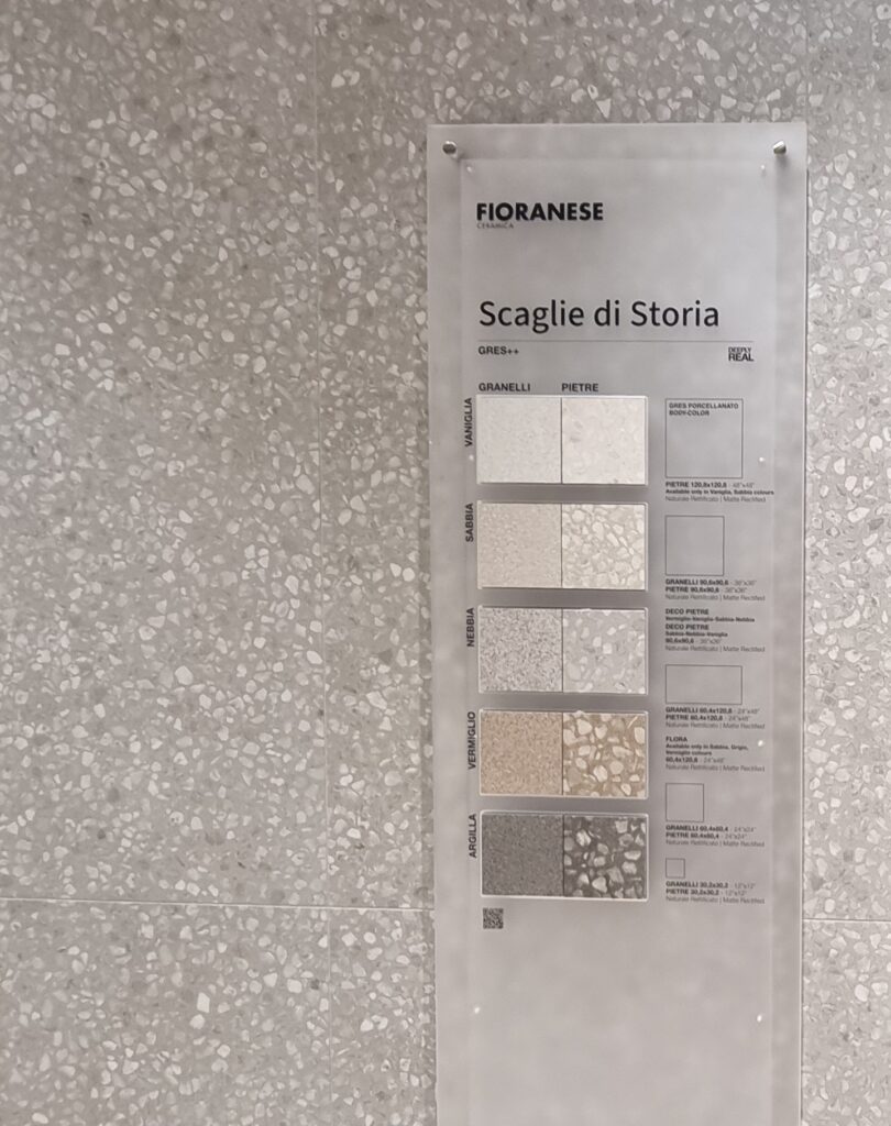
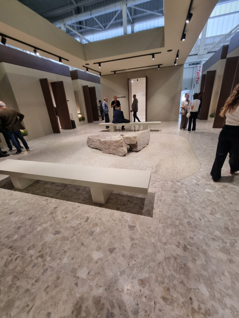
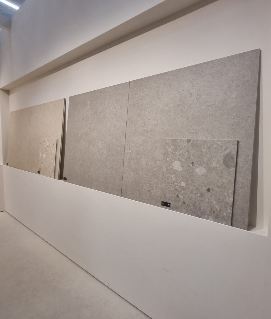
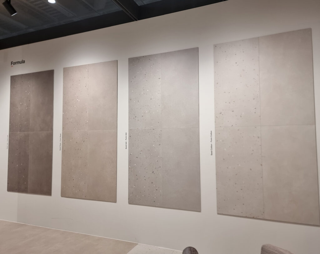
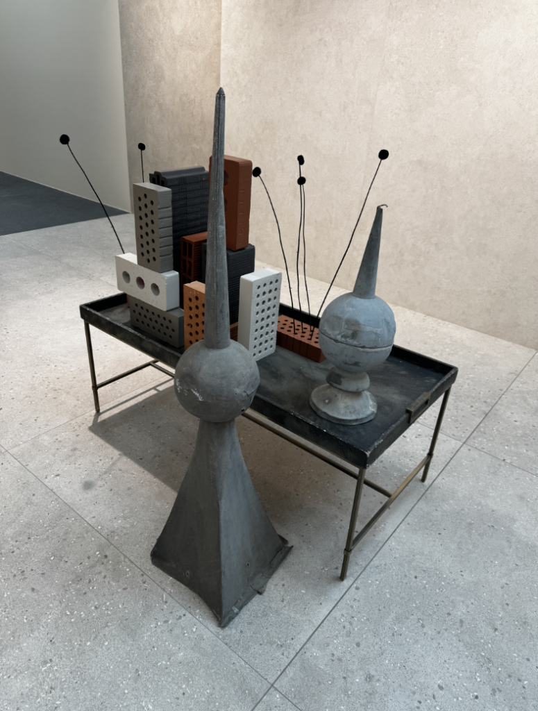
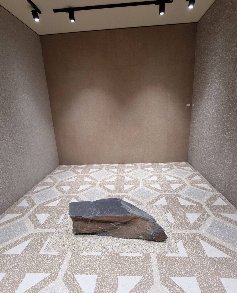
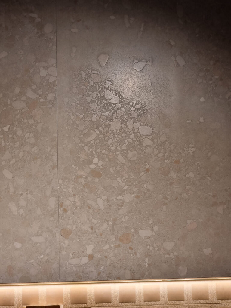
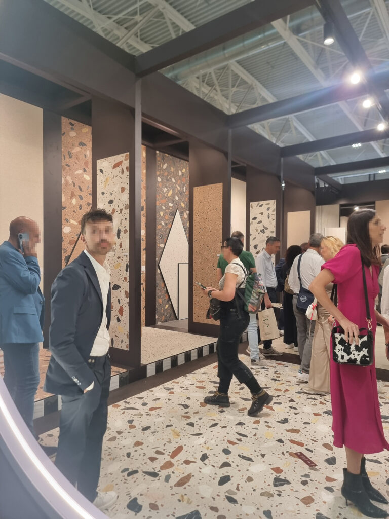
Still and sparkling stone. Another classic with more character, offered or re-offered in a uniform natural version plus a “sparkling” variant with visible grit, dense or combined, micro or medium (various bases: terrazzo, ceppo, palladiana, gravel). Special mention to Coem for top ceramic pieces with a sense of material authenticity that makes full use of the latest technology.
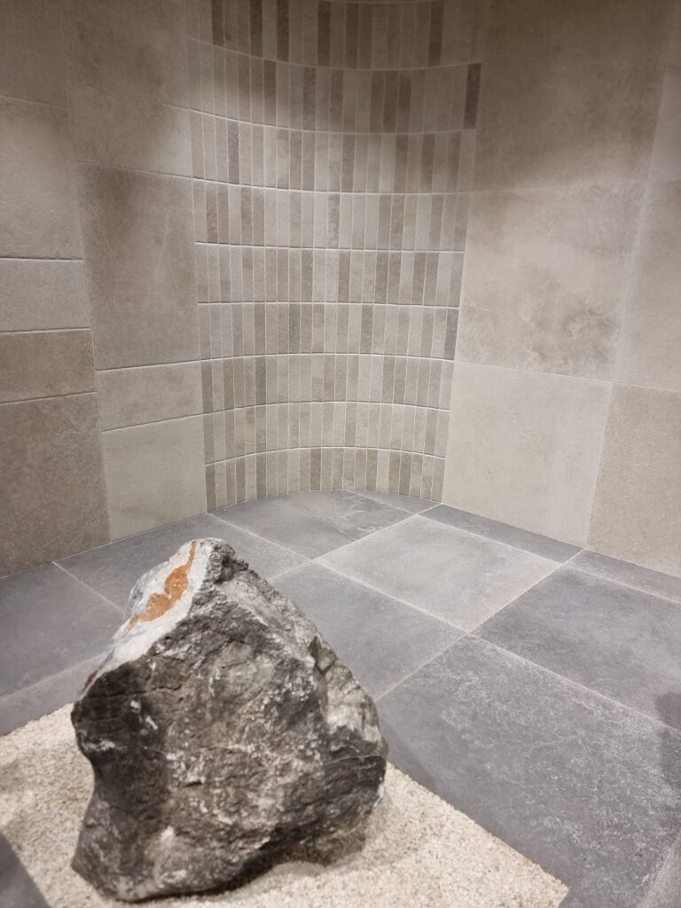
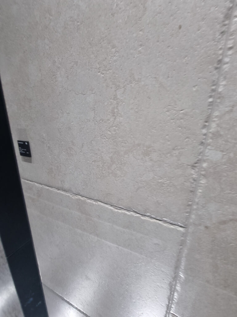
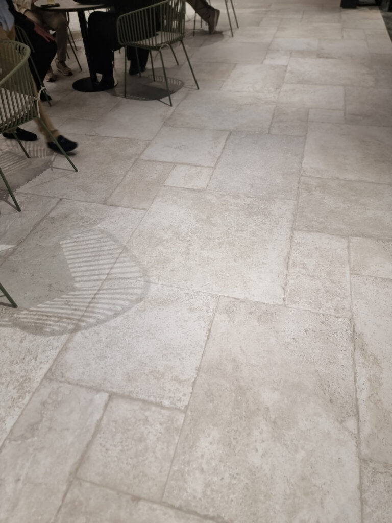
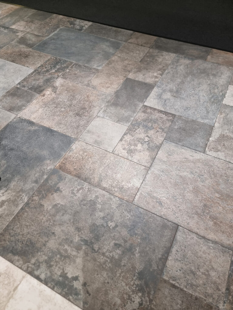
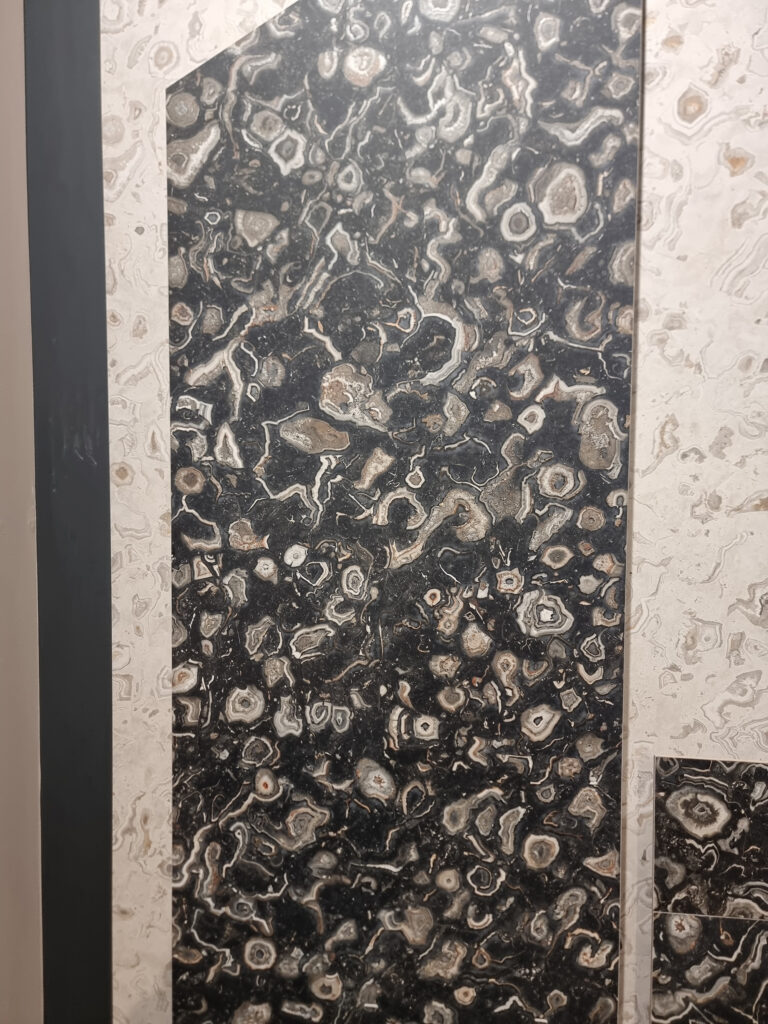
Bold & old stone. A 90s throwback that’s back in trend. Rounded, battered edges, multiple formats, worn-look surface. Beloved by the in-crowd. From Edimax, Tagina, Coem, Cerdomus, and others.
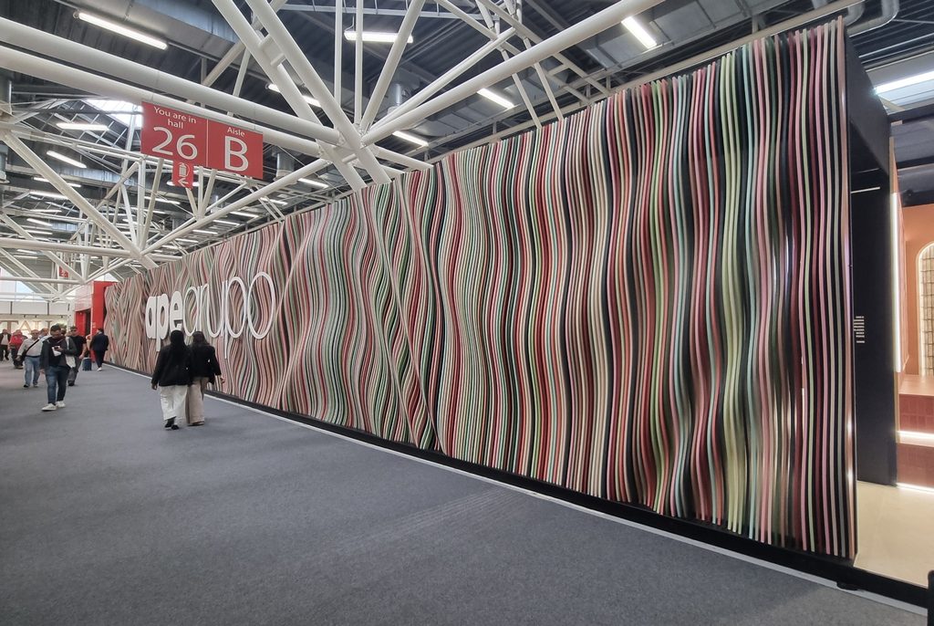
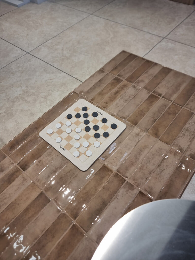
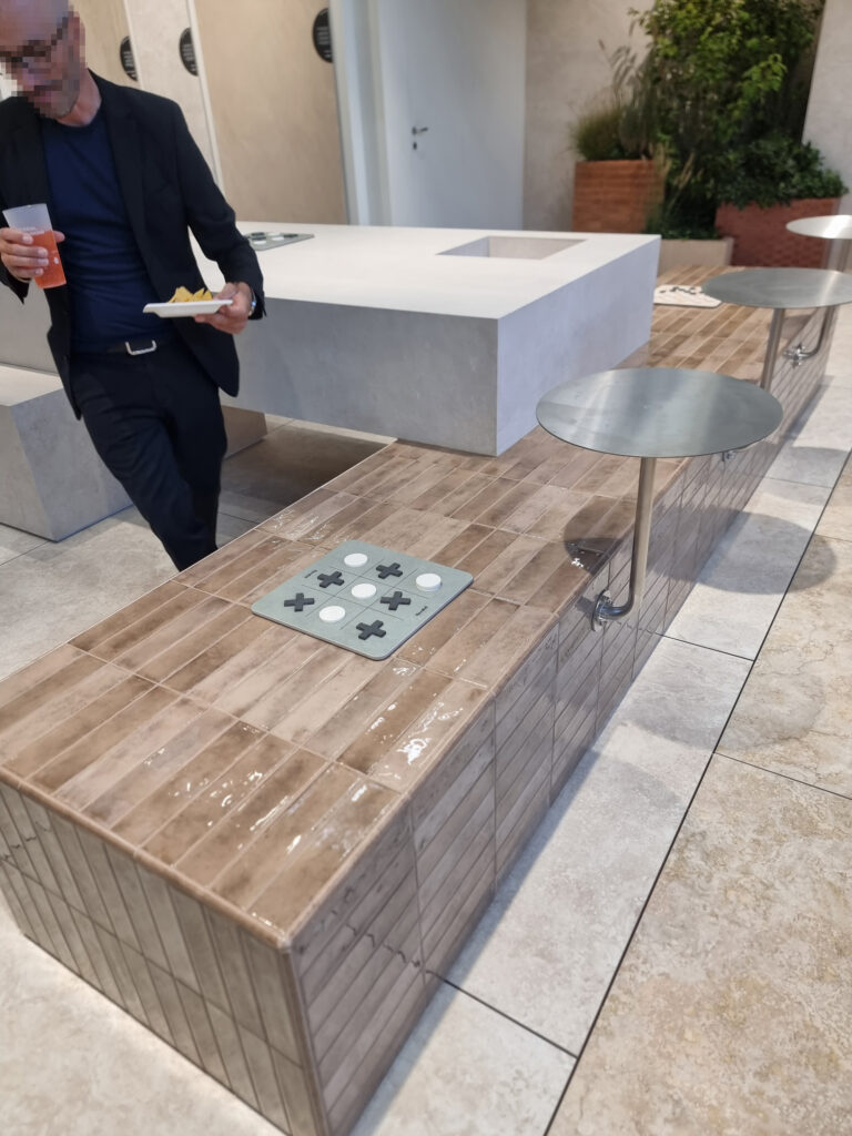
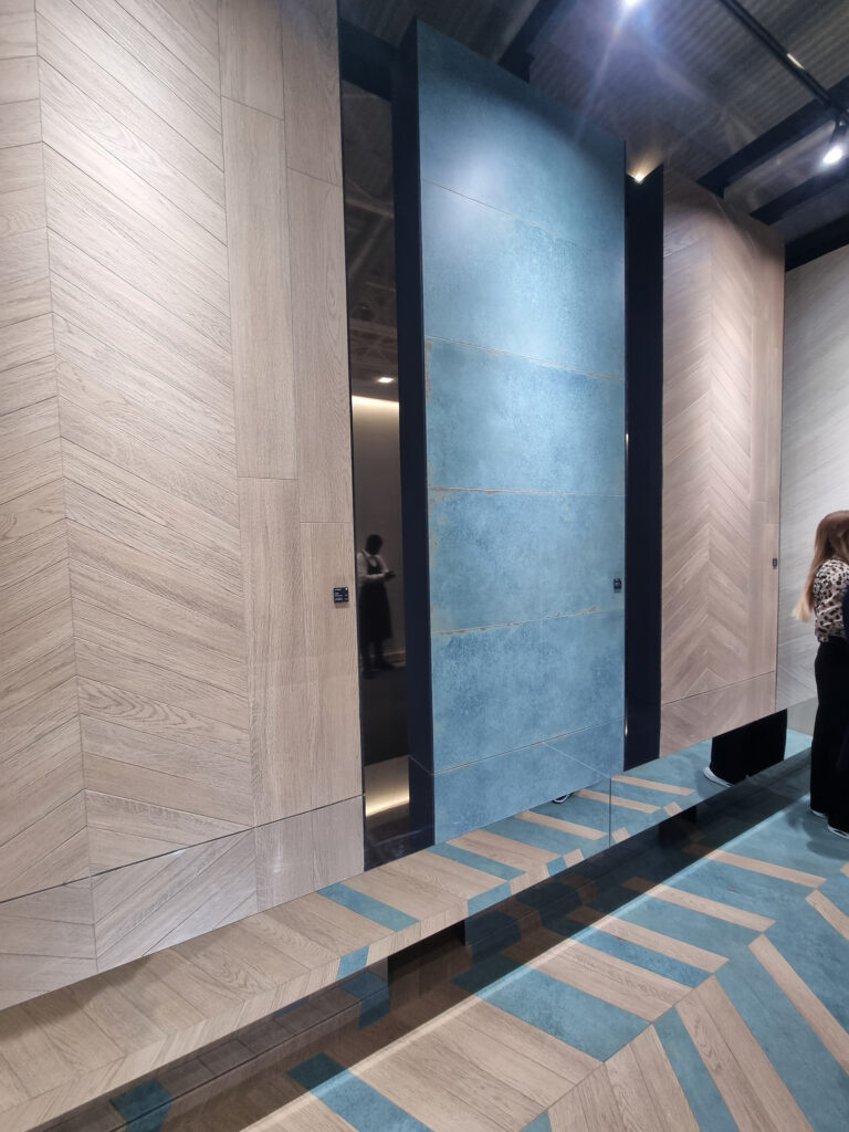
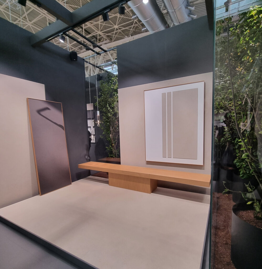
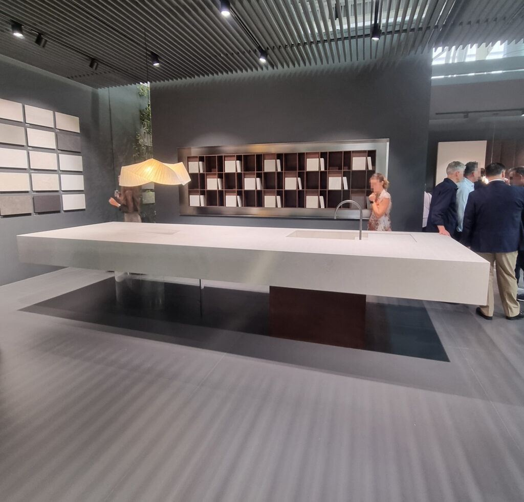
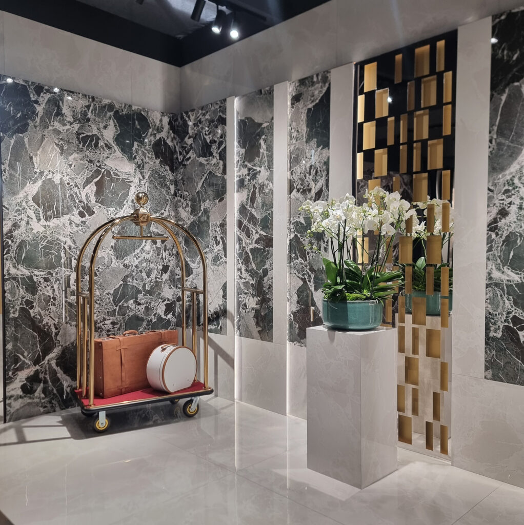
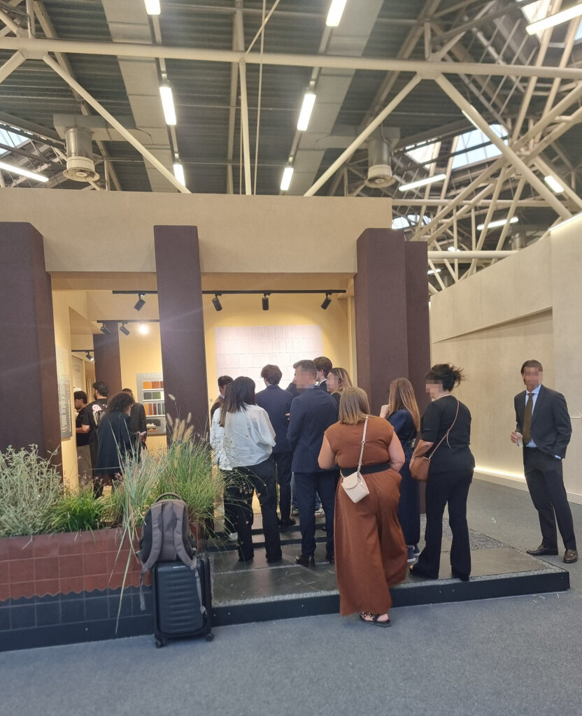
13 BOOTHS GOT TALENT (CROWD-PLEASERS AND CROWD FAVORITES) A rundown, in RANDOM order, of the booths we liked most (overall, and by our staff). But first, a cross-cutting impression: less reliance on high-design furniture rented at its weight in gold, replaced by creative, original ideas or by conceptual minimalism. Spaces dressed with kitchen counters, tubs, sinks, benches, and tables tiled with slabs or bricks. A great many well-made booths, but a bit homogenized. They lack that certain something of personality that makes you remember one in the evening, when your smartwatch reads 20,000 steps and your feet have the squishy consistency of pulled pork.
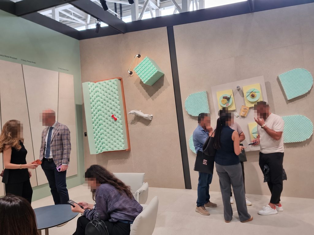
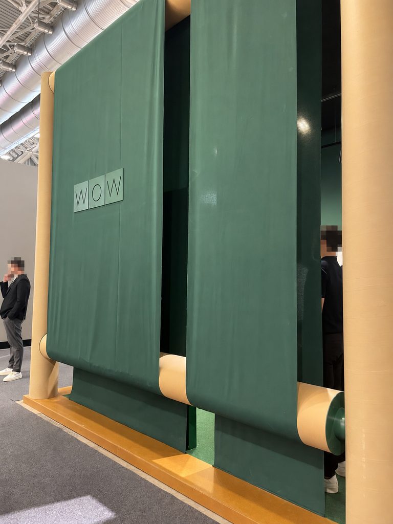
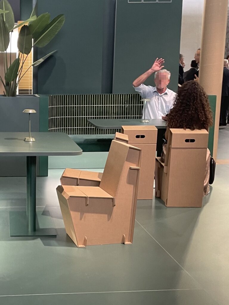
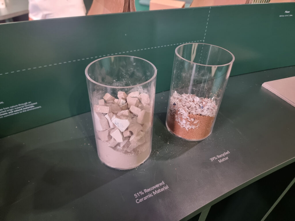
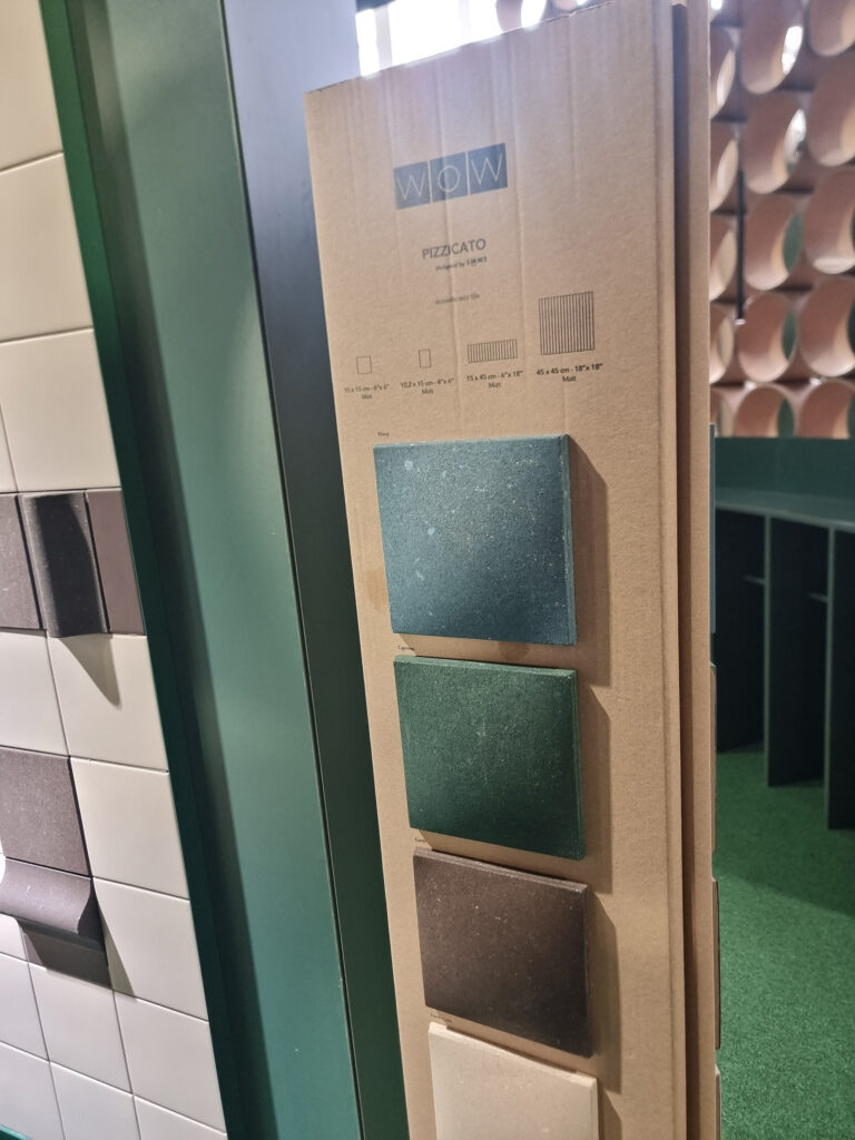
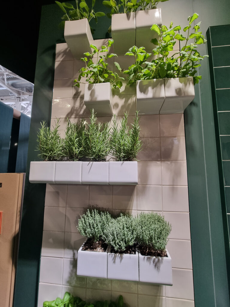
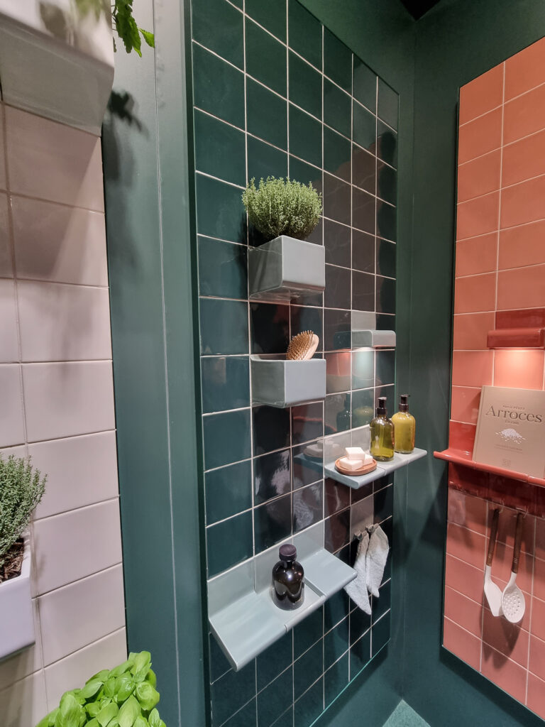
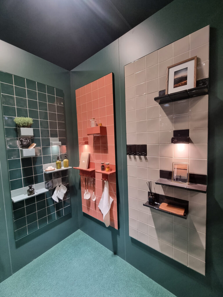
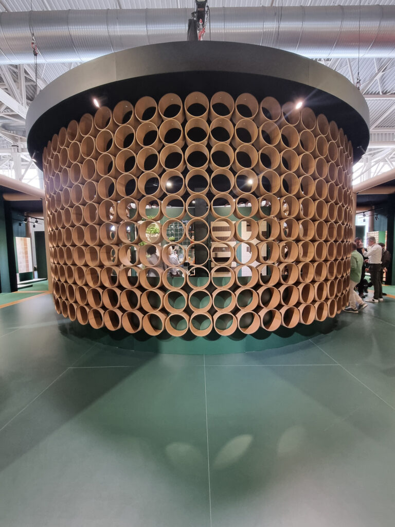
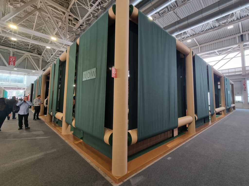
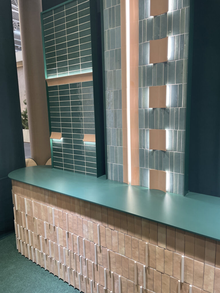
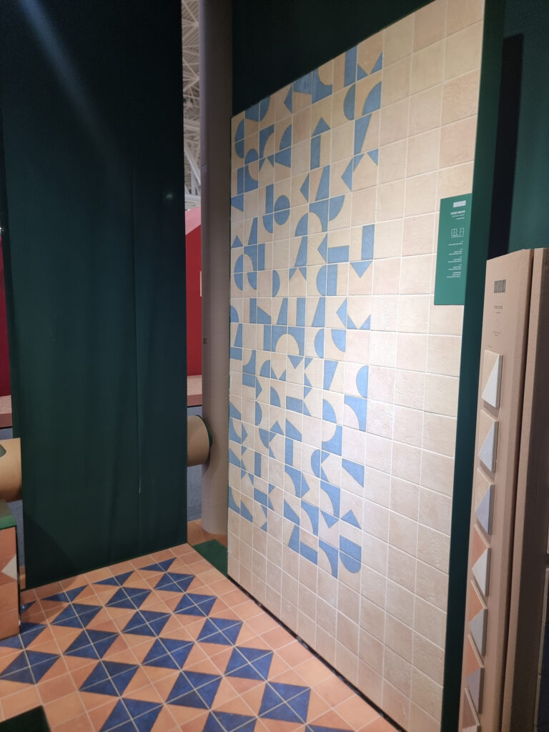
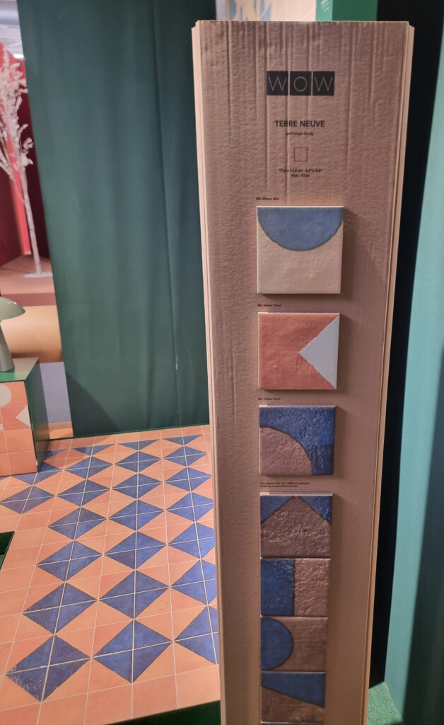
Wow. Interesting and (very) fresh, full of ideas. A modular structure made of green materials that are usually underused: cardboard and fabric in a gorgeous bold green. It works well with small formats and would lose out with 24x48s. The products are also (very) original, with novel solutions and accessories (modules that house LED lighting, shelf modules, and planters). Plus sound-absorbing tiles (good-looking, too) made from recycled materials, and much more: Wow in name and in fact.
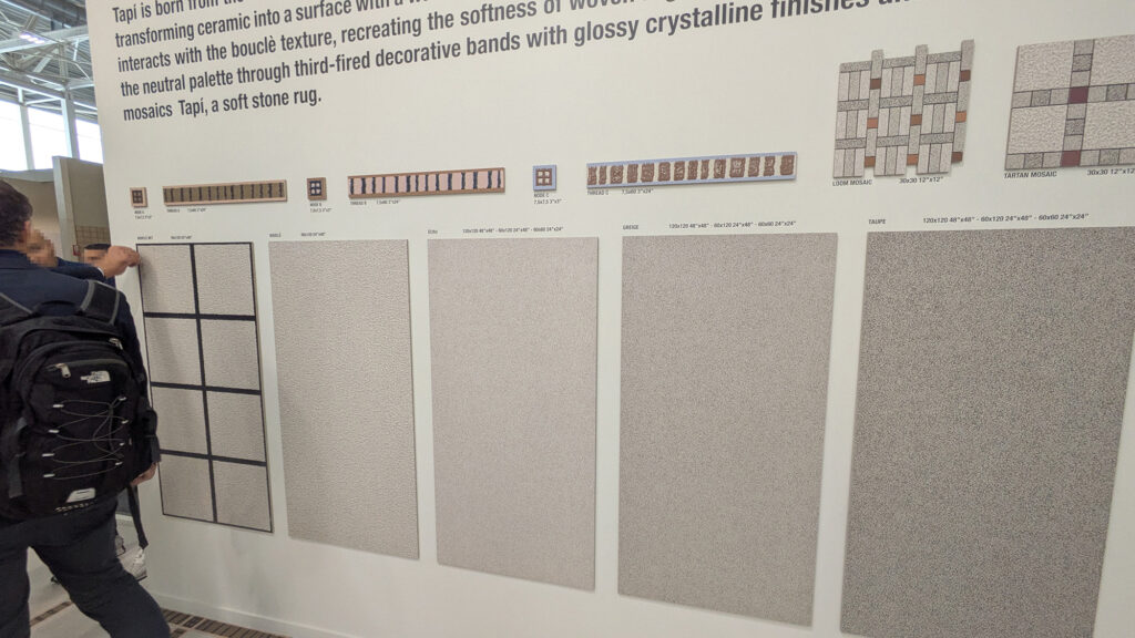
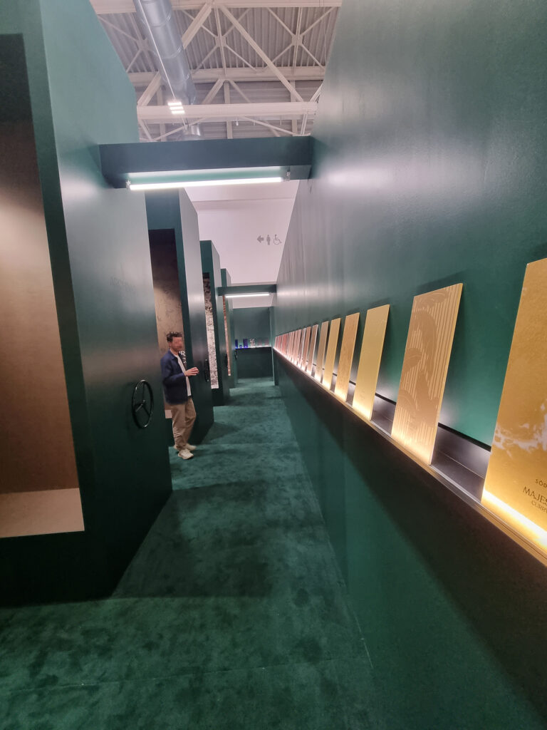
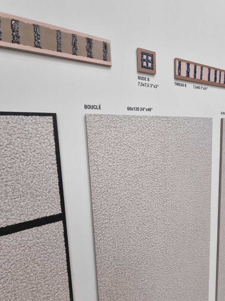
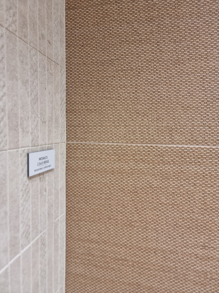
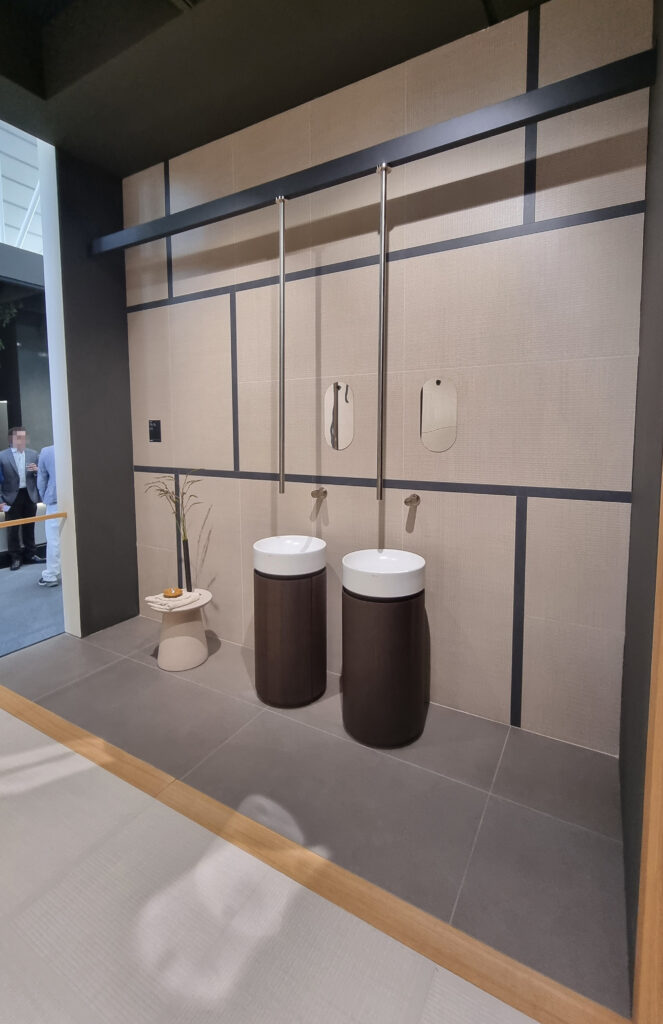
41Zero42. Among the most mentioned and visited. “The washing-machine one” proves you don’t need a stratospheric budget to stand out and be remembered. The big communal table is lovely and welcoming; the bouclé-effect floor-and-wall covering is a daring first that doesn’t thrill. The booth is split into two zones, and the “Sodai archive” half is a kaleidoscope of colors and graphics (lots, maybe too many) with a super-compilation of design icons.
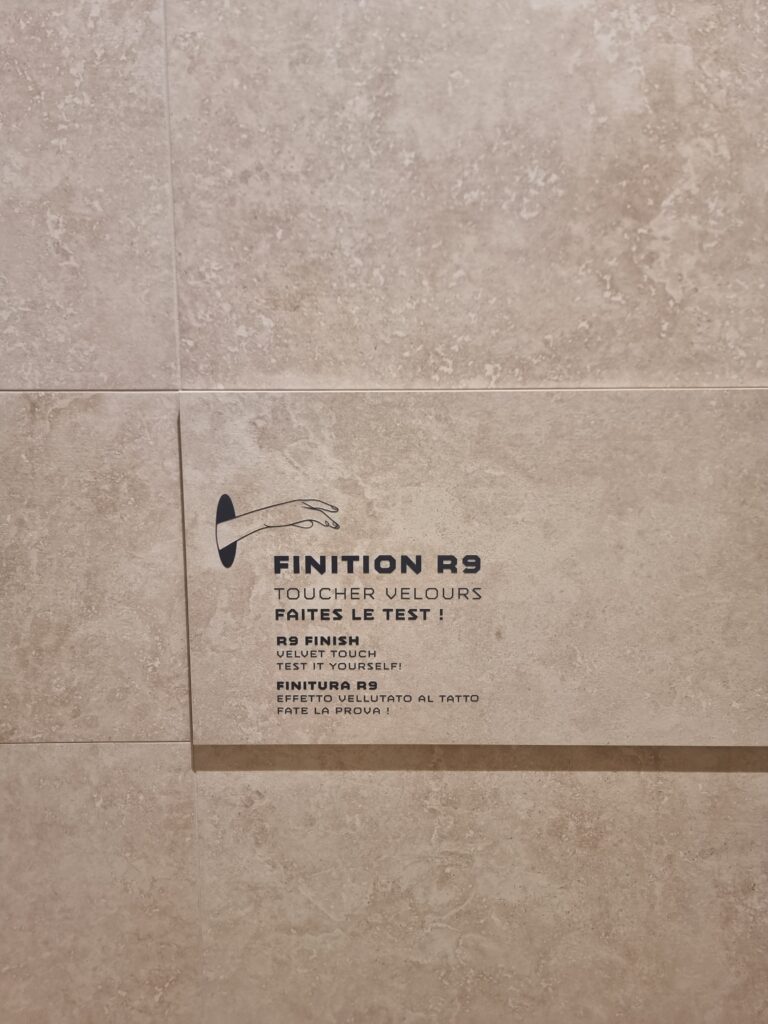
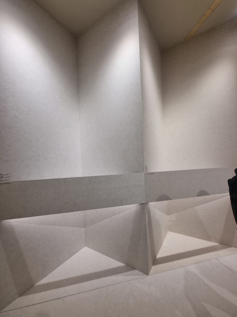
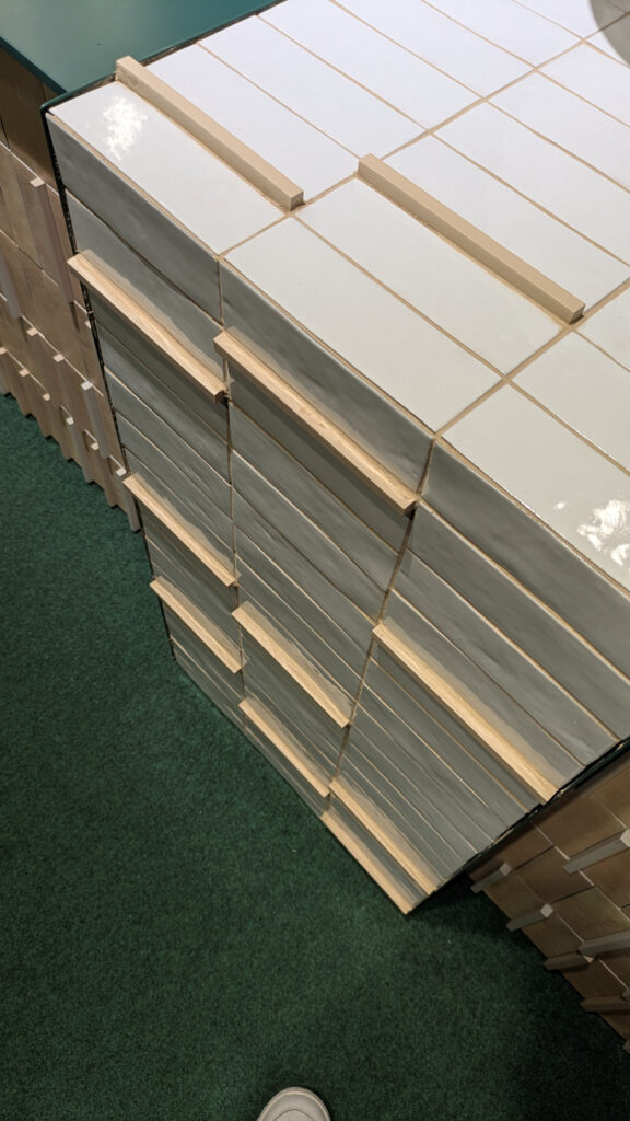
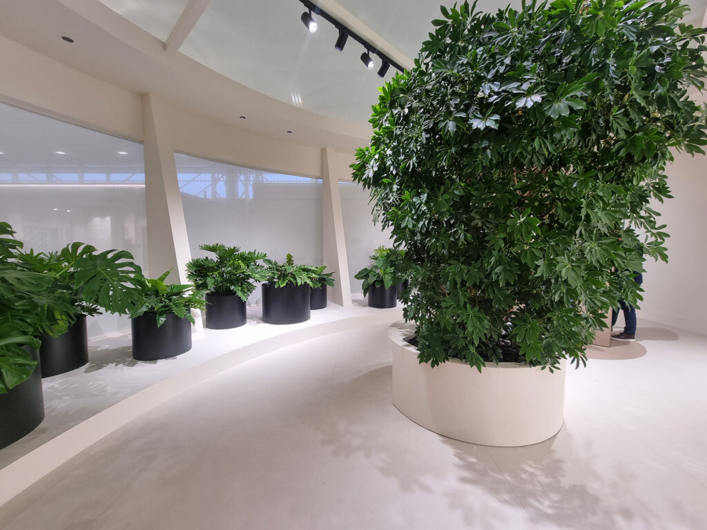
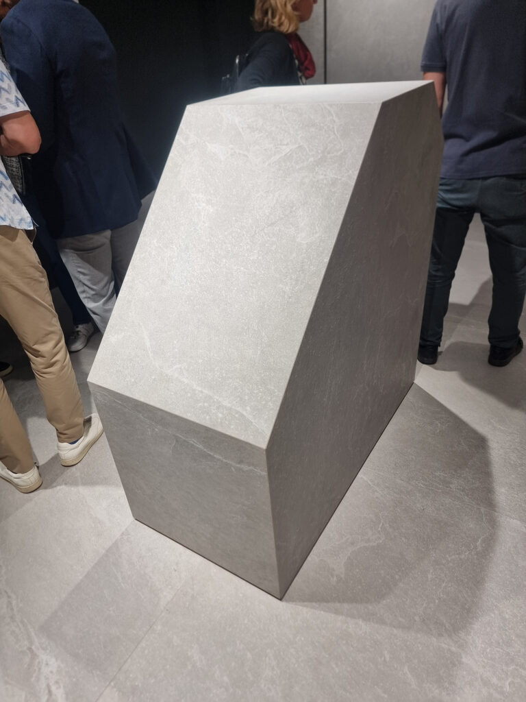
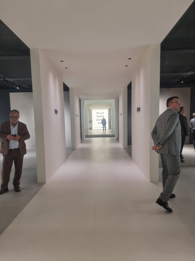
Imola Ceramica. Less is more. Imola is curvy and white. Architecture, space, cleanliness. The (omnipresent but always effective) handwritten phrases by Pietro Terzini serve as the focal point of the perspective vista. A winning choice not to fill the whole perimeter of the plot with a box, creating instead a sinuous form that breathes in the space. In the interior areas, instead of furniture and styling, there’s a ceramic monolith with a sloped top that invites you to touch the product. A slam dunk: surfaces are chosen with the hands, not just the eyes, an aspect that’s generally underestimated.
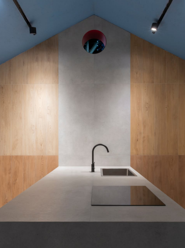
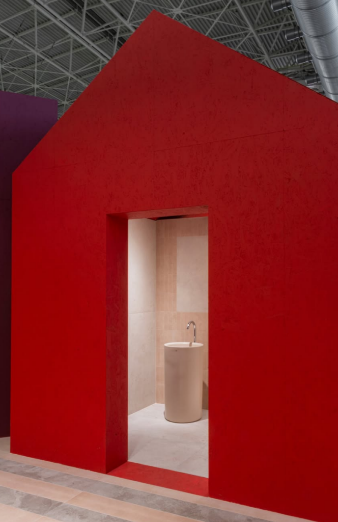
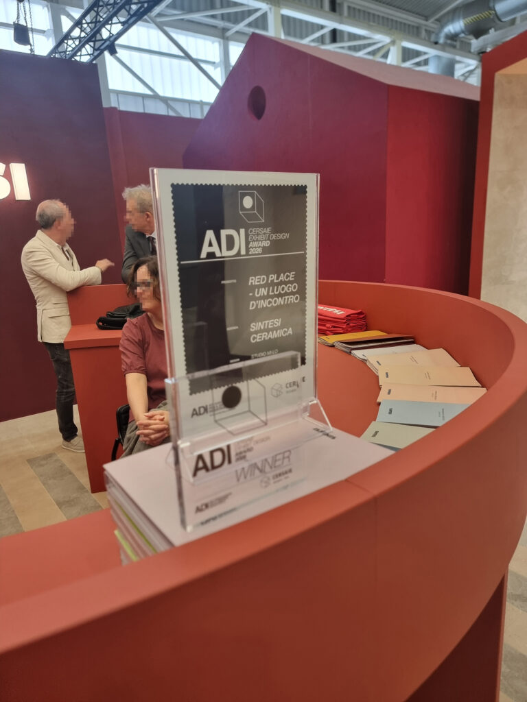
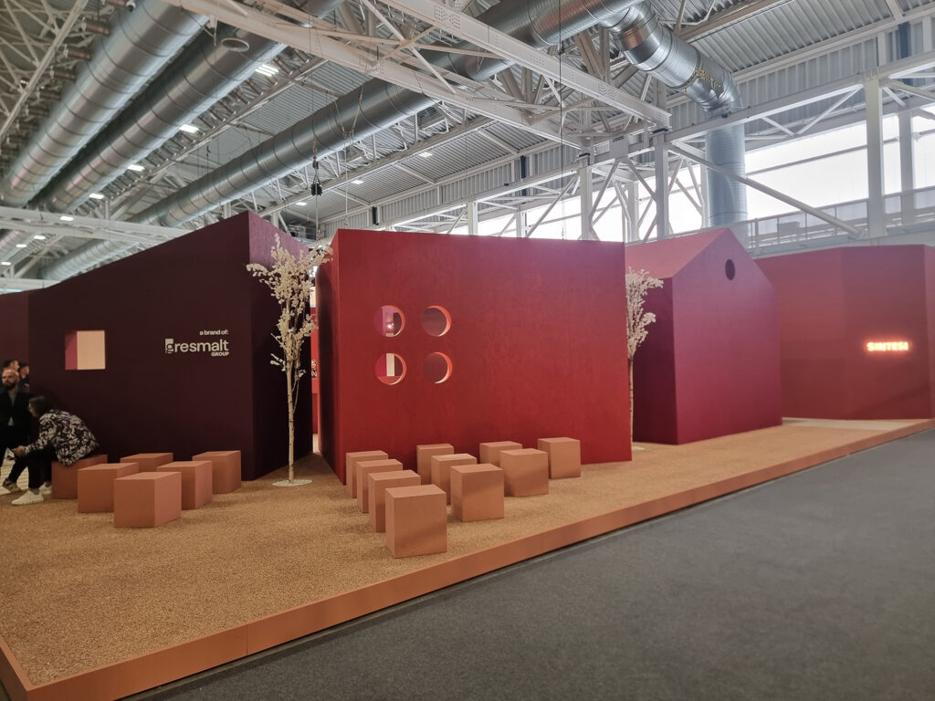
The same logic of unfilled space, opening up room to let the volumes stand out, drives the (award-winning) Sintesi booth. Little houses in a gorgeous deep red (on the outside) surround a small piazza, off of which open intimate, functional display areas.
Living Ceramics. Stylish and rigorous, in both the high-design styling and the products. The product lives almost entirely in total white. A precise positioning, zero flea-market effect. And there’s no need to overhaul the booth structure every year.
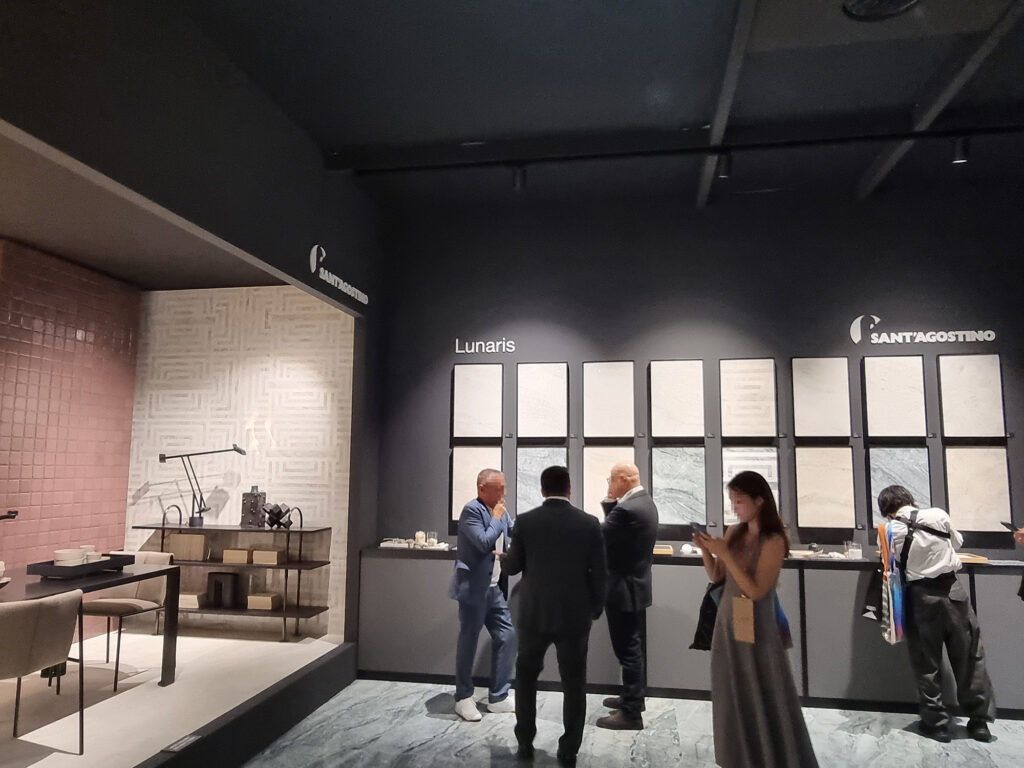
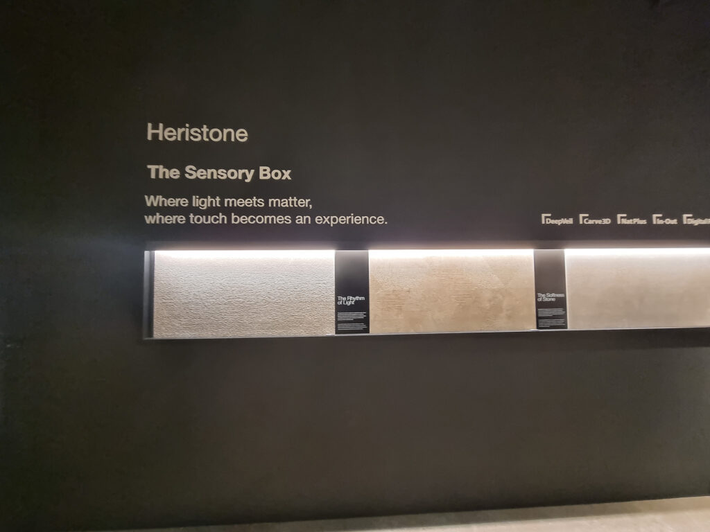
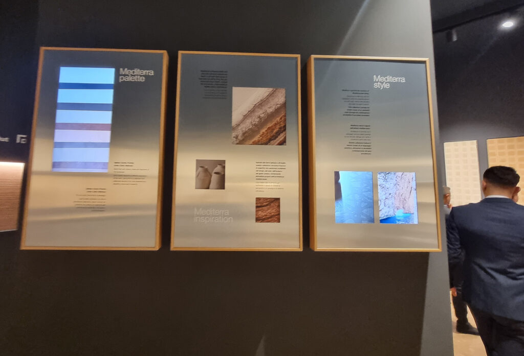
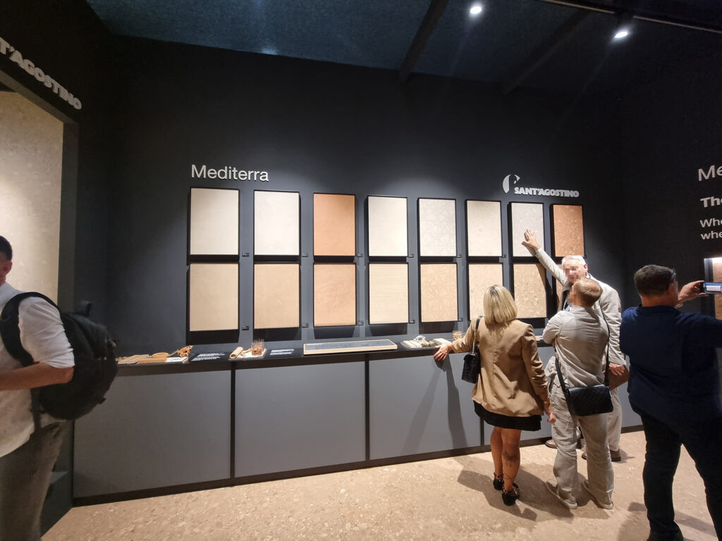
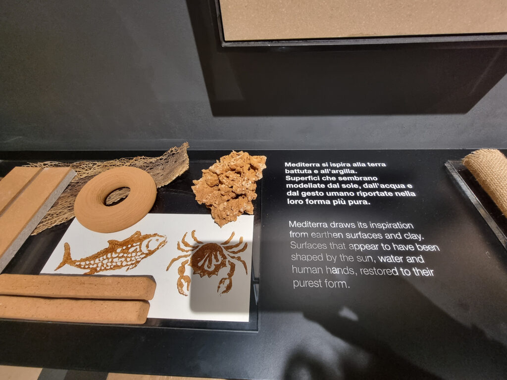
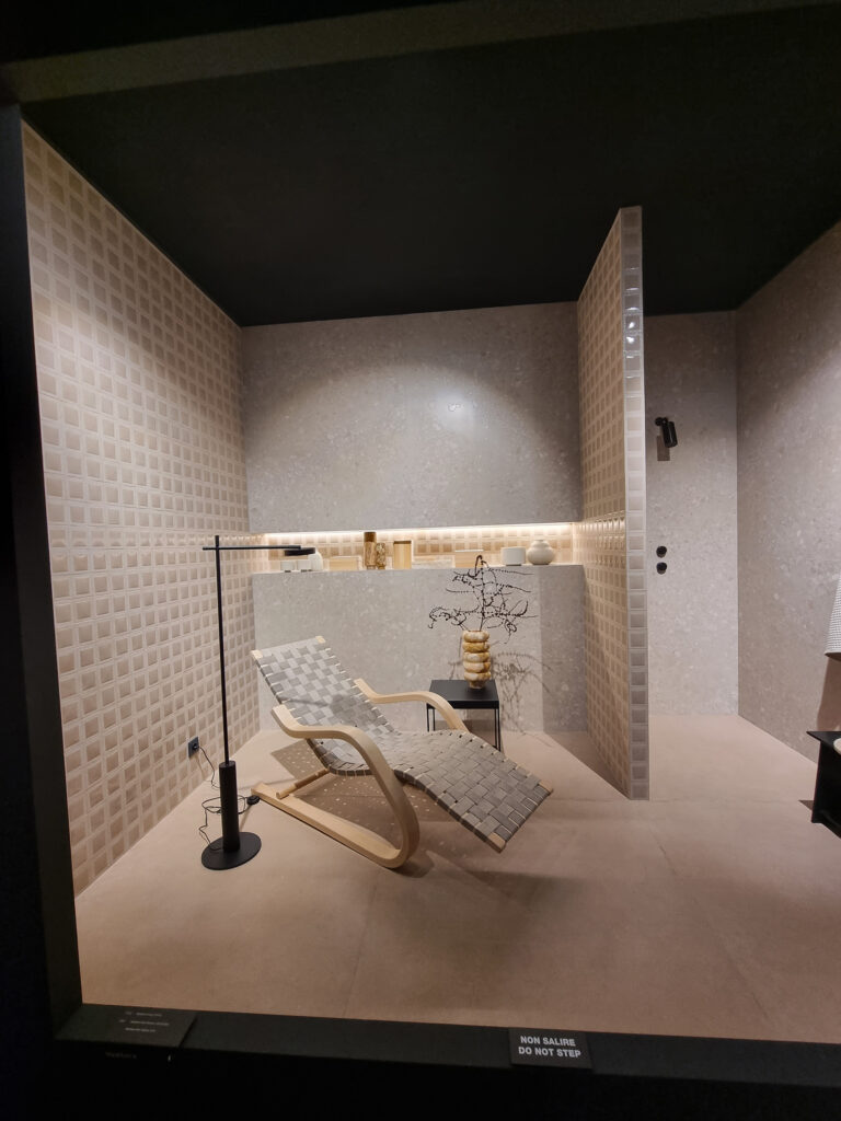
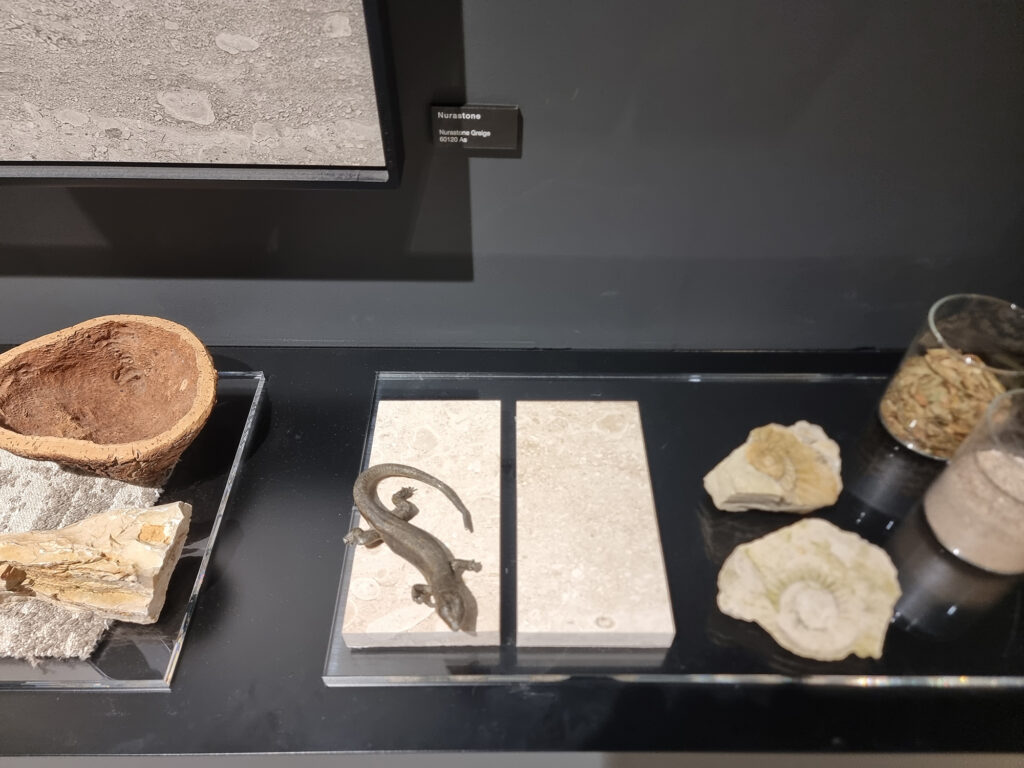
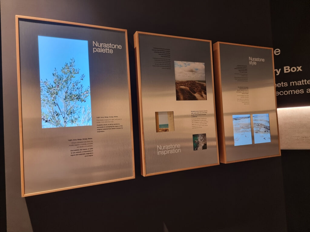
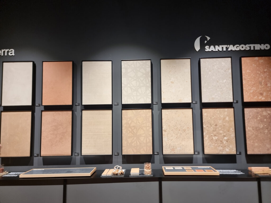
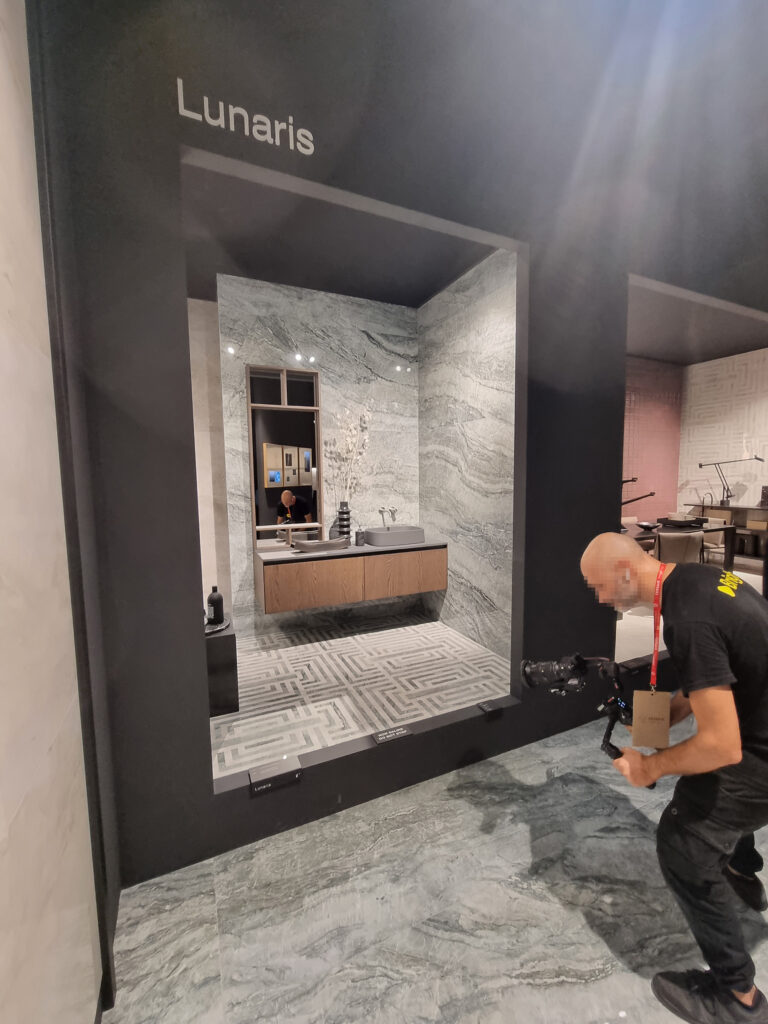
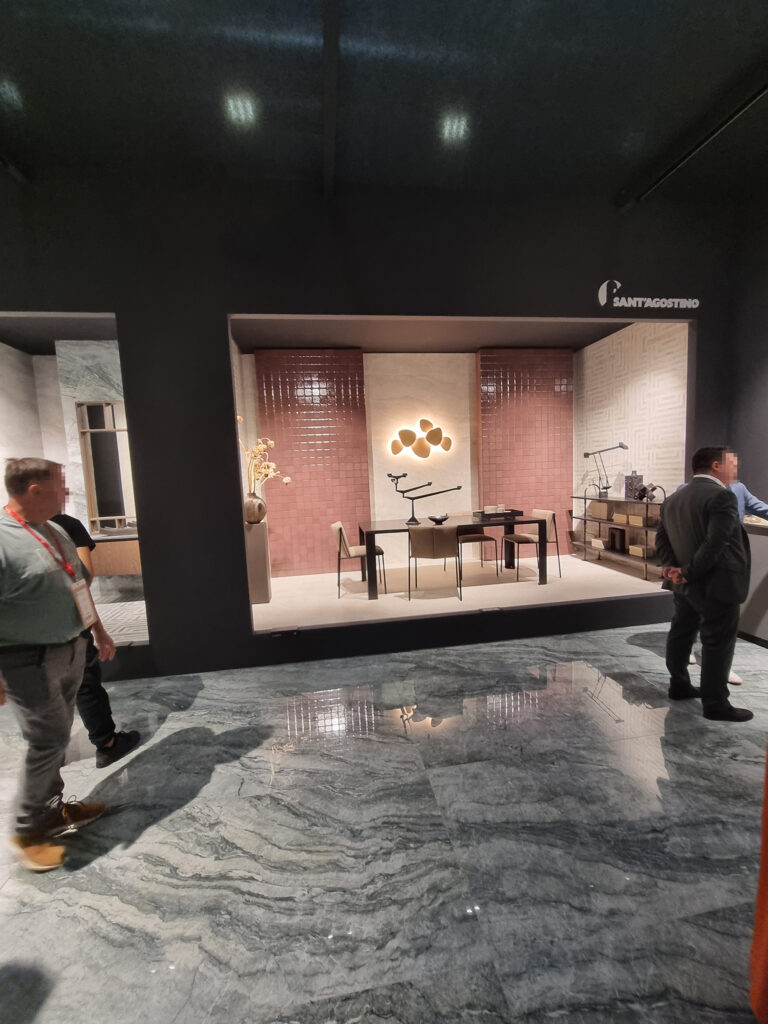
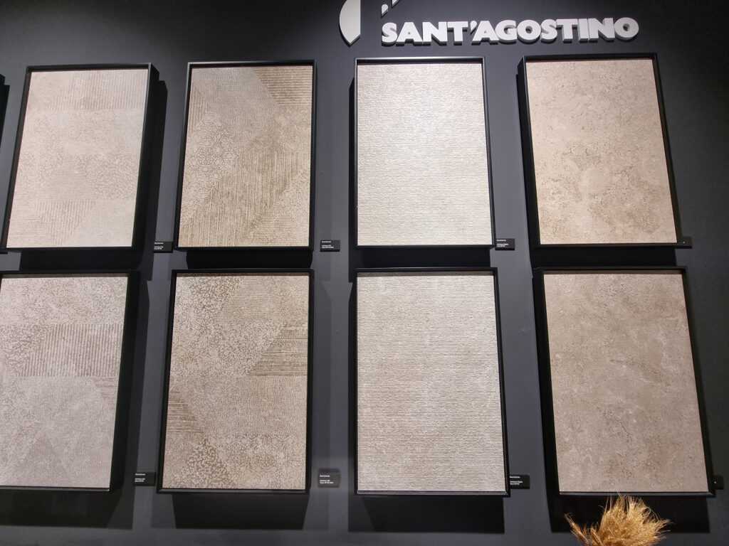
Sant’Agostino. Conceptually classic, masterfully executed. A thesis on how to showcase the product. The liturgy comes in 4 acts. A big “inspirational” shelf with textured objects, with a recap of the range above it. A smart communication panel with 2 or 3 small monitors and advanced storytelling. A “Sensory box” wall with raking light for reading the surface. A meticulously designed niche-box among furnishings and creative but plausible installations. A lot on the grill; maybe a few products could have been spared.
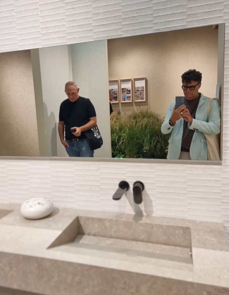
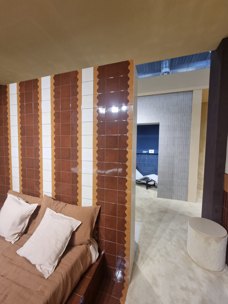
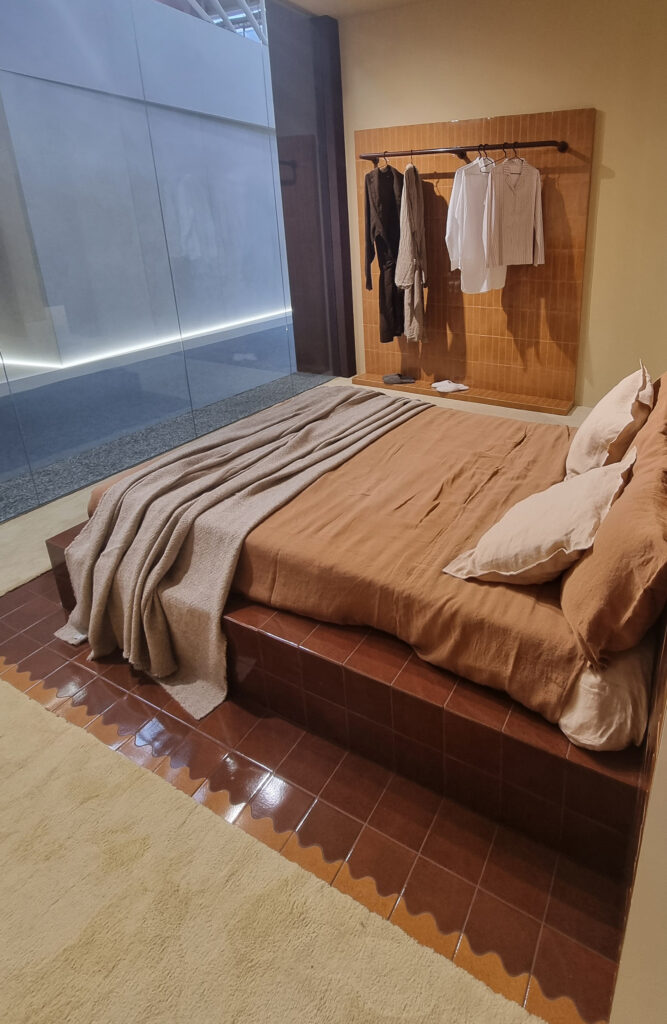
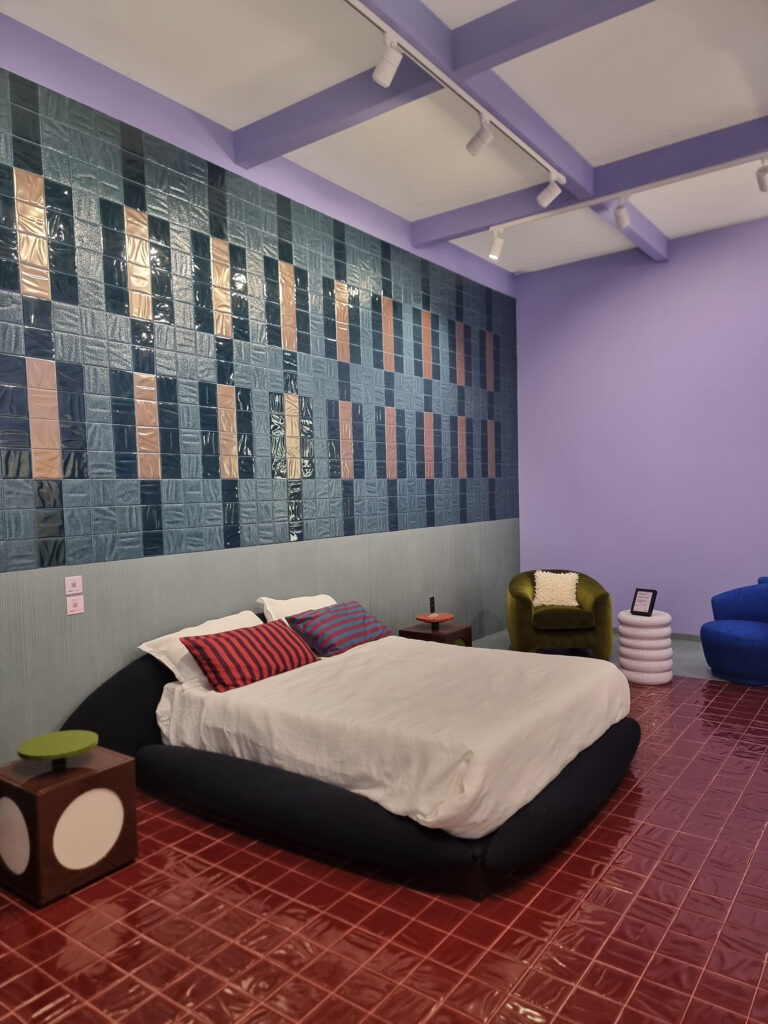
Quintessenza. A carefully designed space with lots of ideas, where small format is in its element, inspiring sales beyond the usual bathroom. A concrete trend that uses ceramic on shelves, bed headboard walls, niches, living areas. Displayed like this, it appeals and it works.
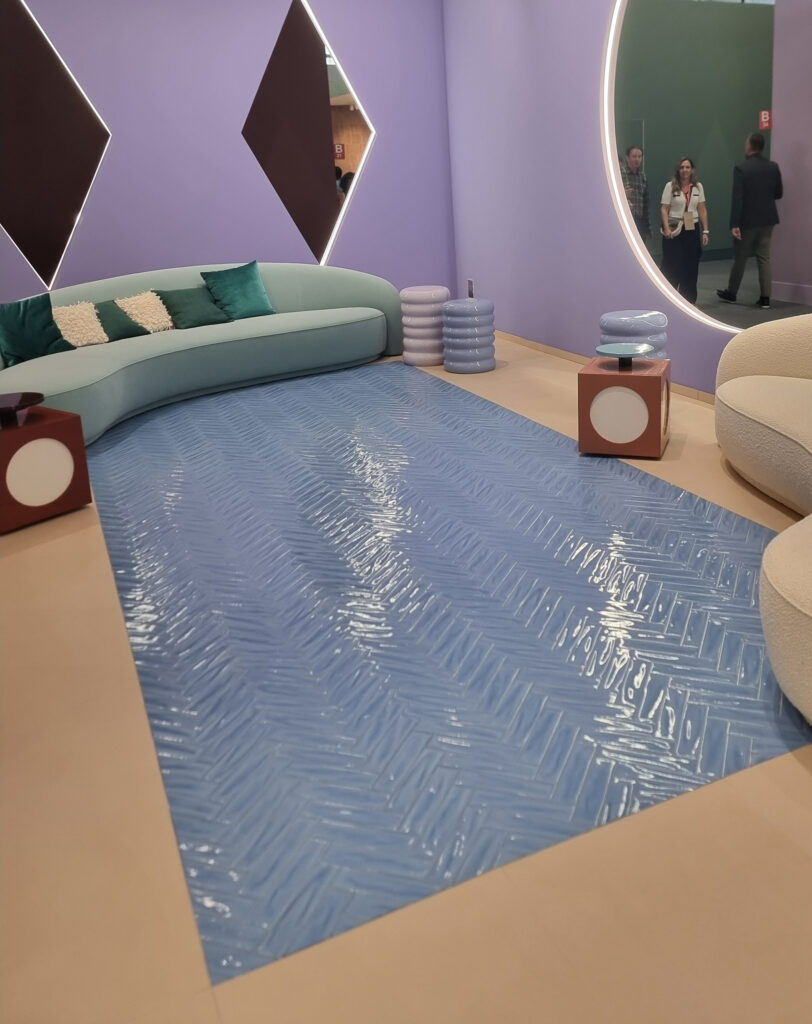
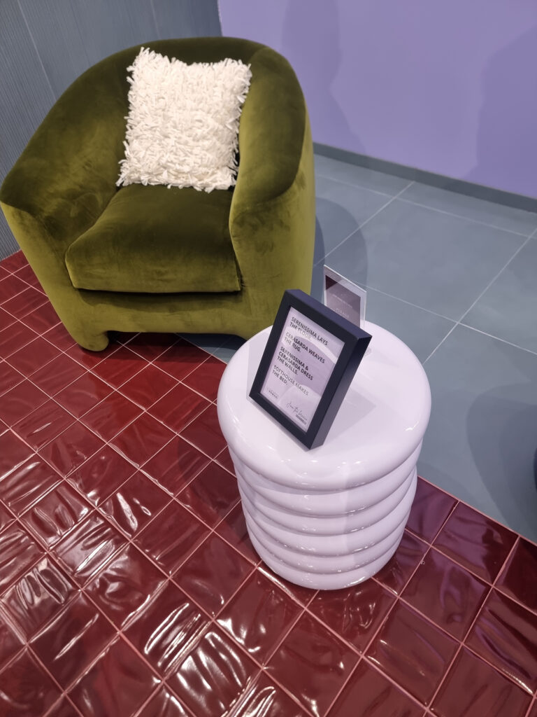
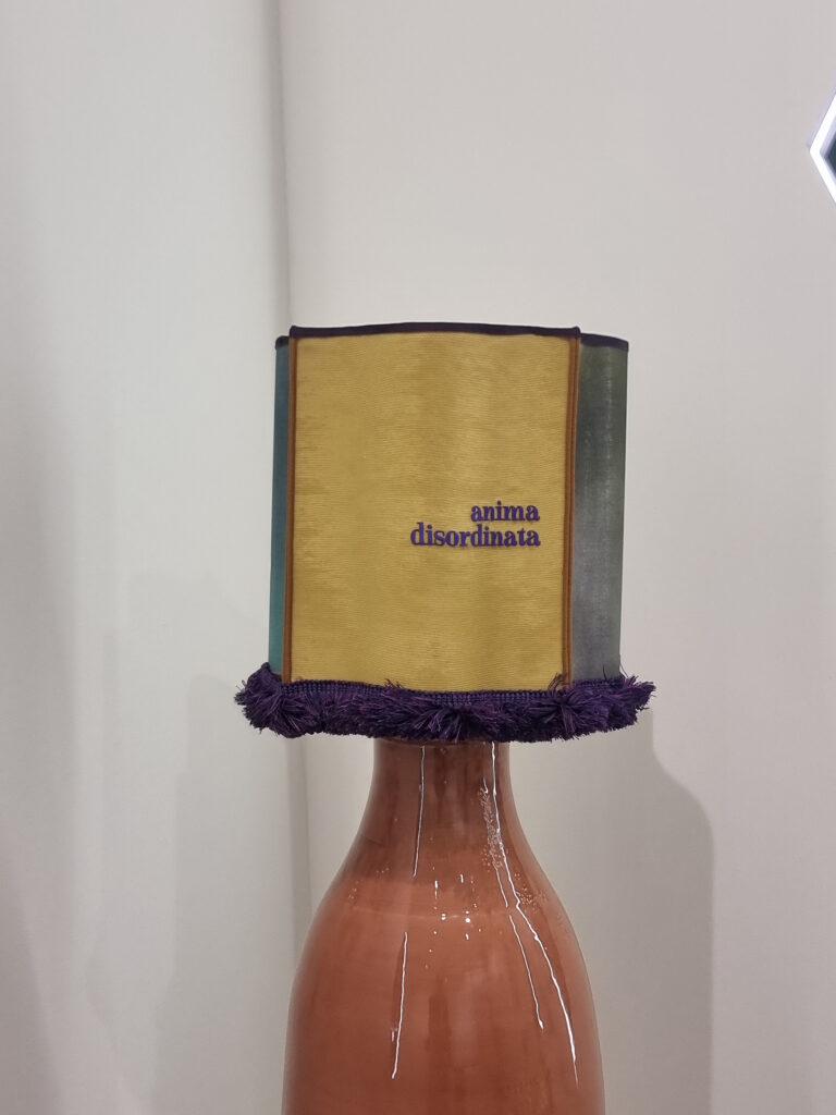
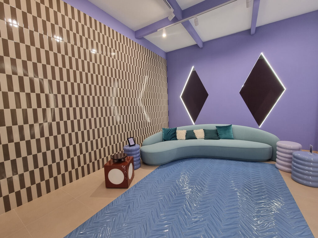
Gruppo Romani. A booth built to make an impression, with plenty of Instagrammable plus points, and in fact it’s among the top on social. The partnership with Casaornella (a Fuorisalone icon) extends to Cersaie and will continue with the “join the pack” theme, announced on social media through playful images of animal masks. The mood is colorful, ironic, but chic. On the product side, the overall look suggests a Cerasarda-ized soul. Maybe the “large-area” brands and products are a bit overshadowed and fade into the background, but that’s fine. Separating and distinguishing the individual brands (Cercom, Serenissima, Cir) would drain the booth’s strength, which instead hits hard by conveying a strong creative identity.
EUROVISION GRES CONTEST
Grand finale on product, with a top ten of mixed themes in strictly random order.
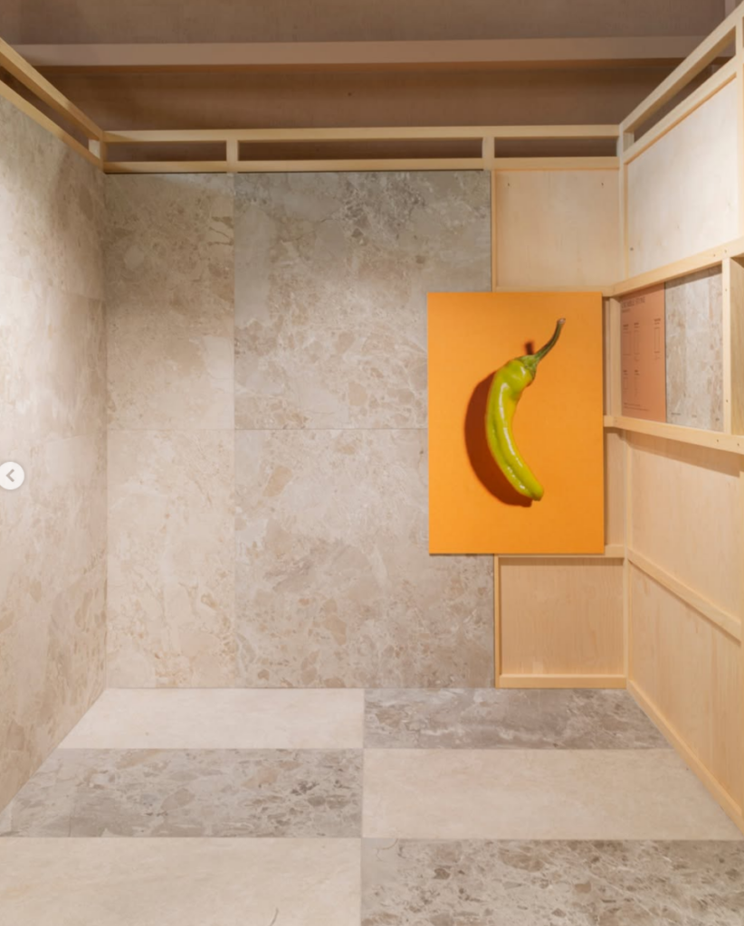
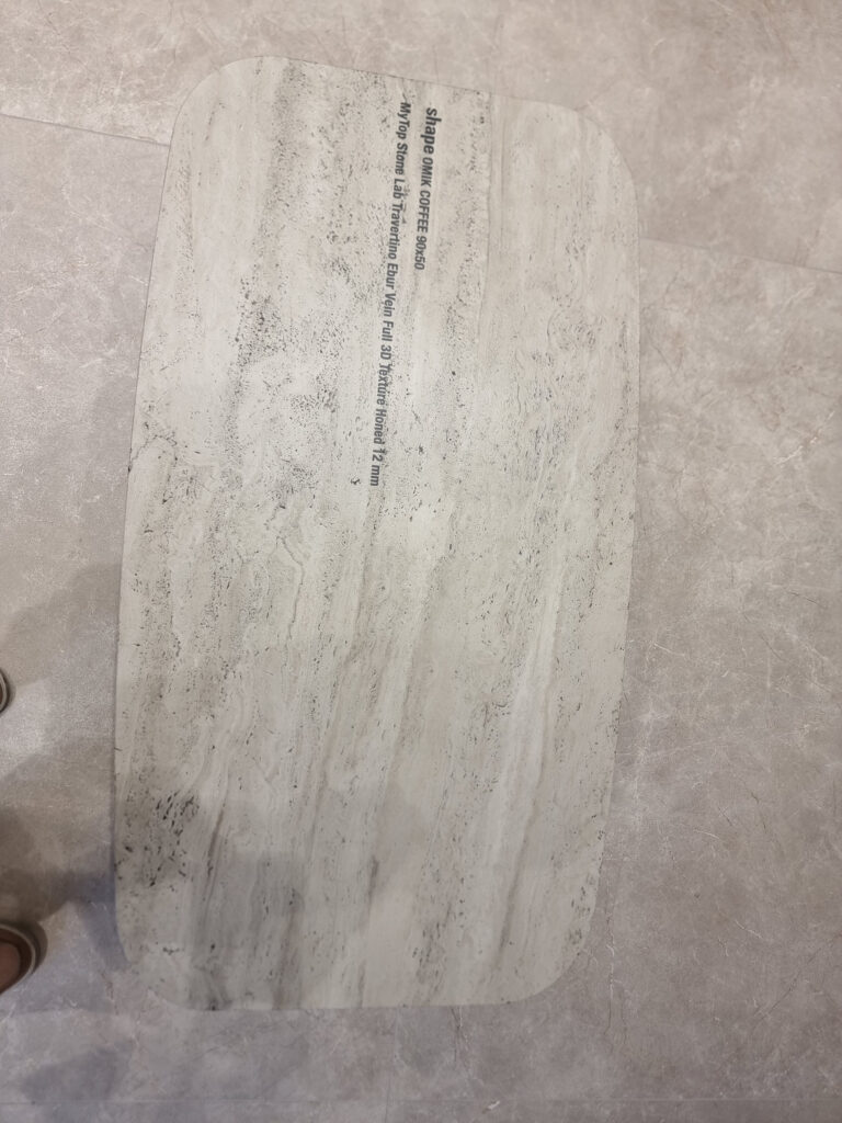
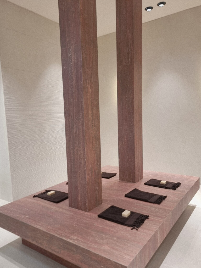
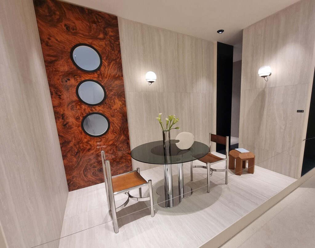
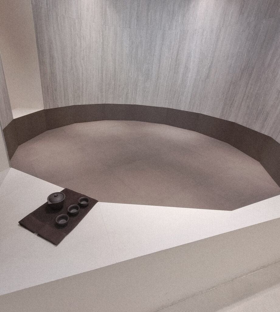
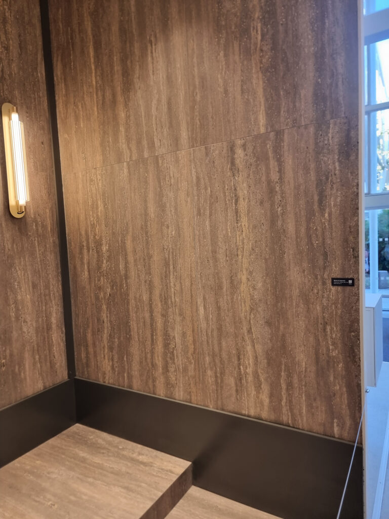
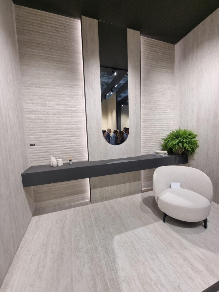
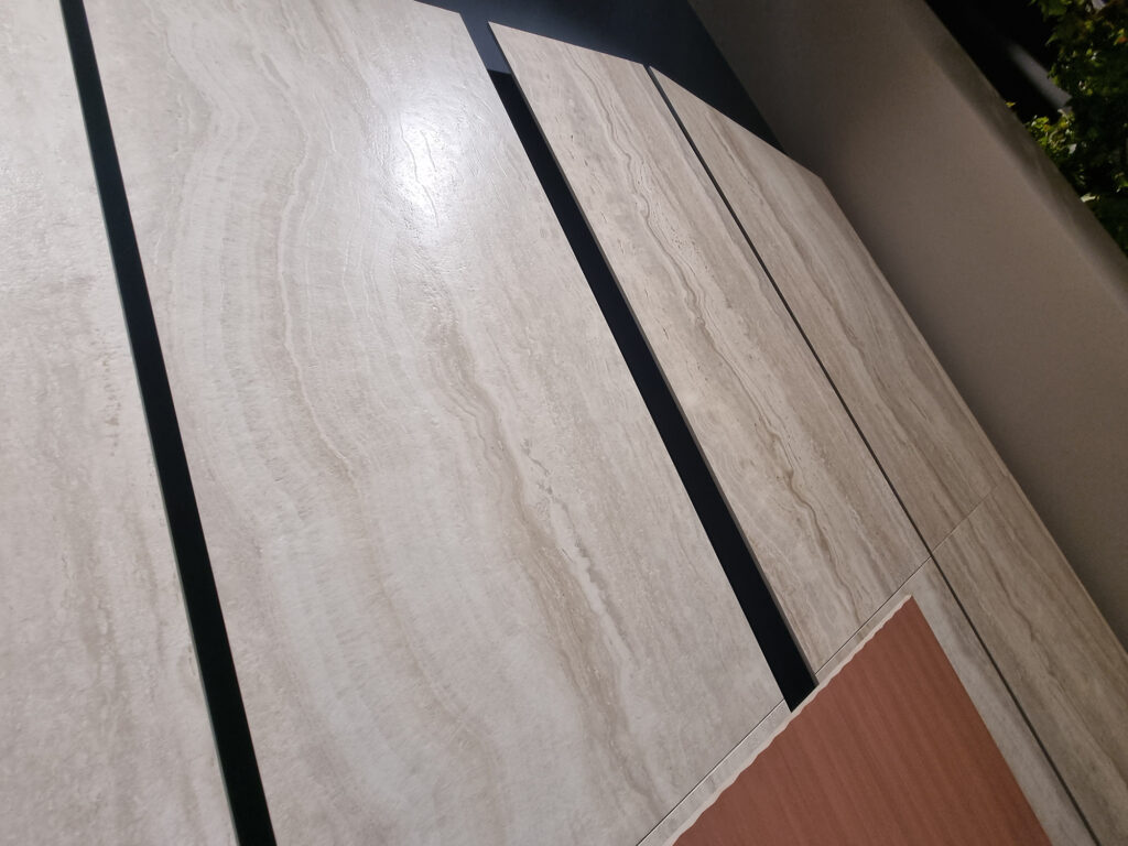
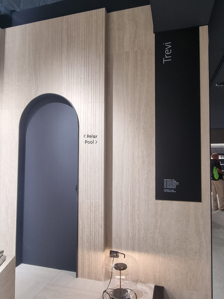
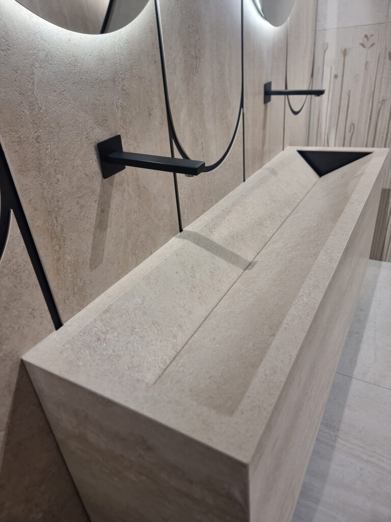
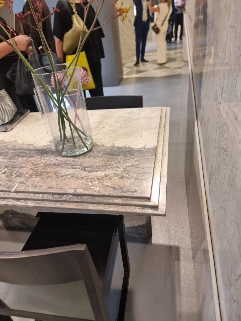
Travertine. The irreducible. Not always in pole position this time, but always cross-cut + vein-cut. Textured variants and some less-seen shades (Italgraniti). Much loved in SPA settings.
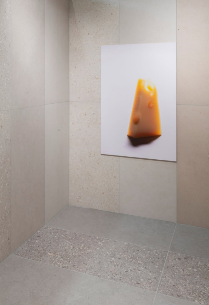
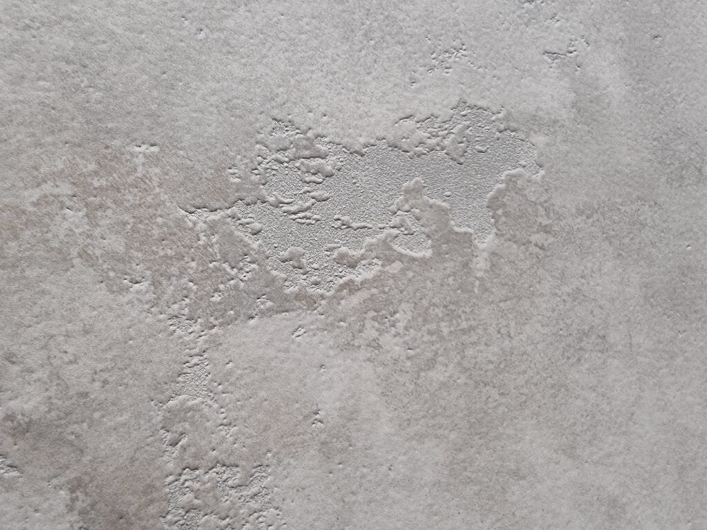
Cement look (or resin, its homozygous alter ego). Also lower-profile now. Nearly everyone had already fired off the mega color range in their showcase. A few with wall or small-format variants.
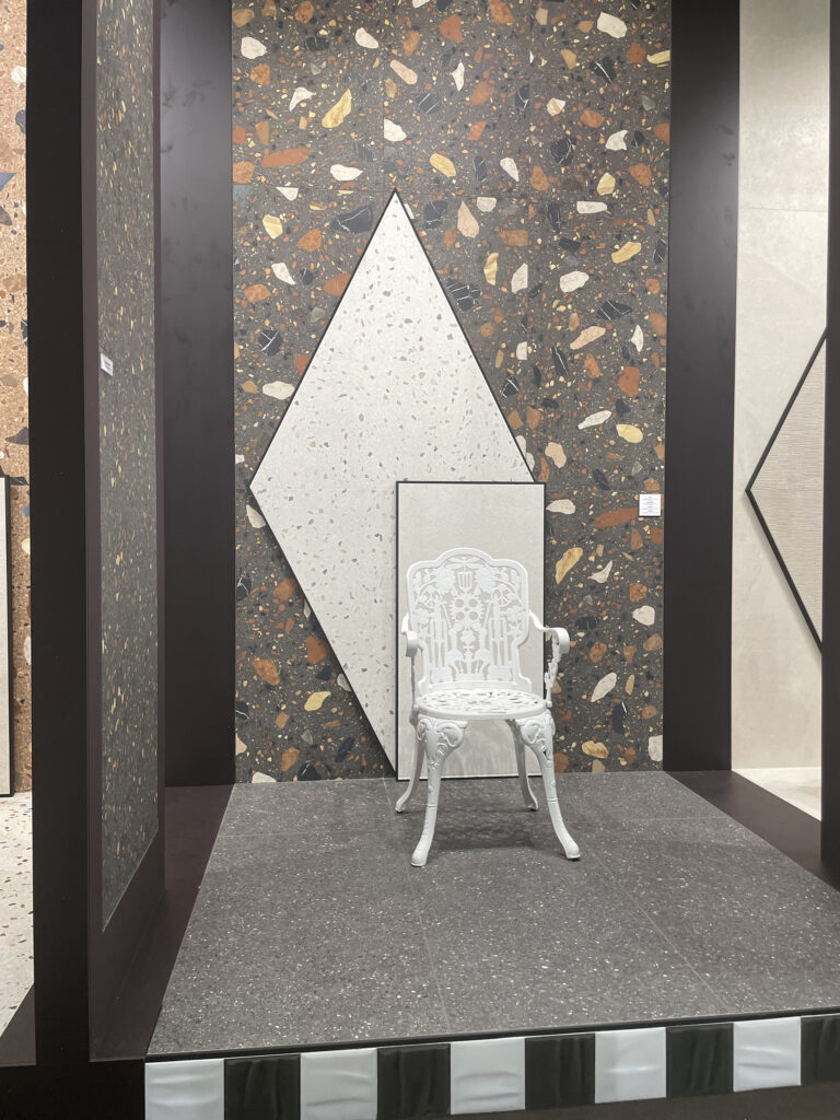
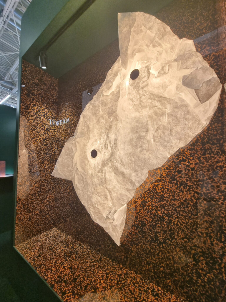
Tousled coordinates. A tendency evolving out of mix & match (of different series), which had gotten a bit tiresome (moodboards included). On the horizon: pairings and gender-fluid series where heterogeneous elements live together, in leopard-spot colors and textures: mini-maxi formats, lux & matt surfaces. A win-win: lots of original, high-impact variants without cluttering the catalog with useless items.
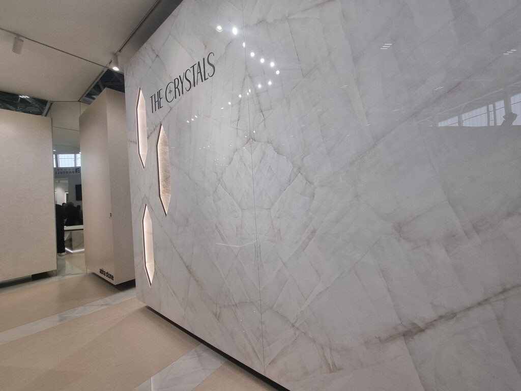
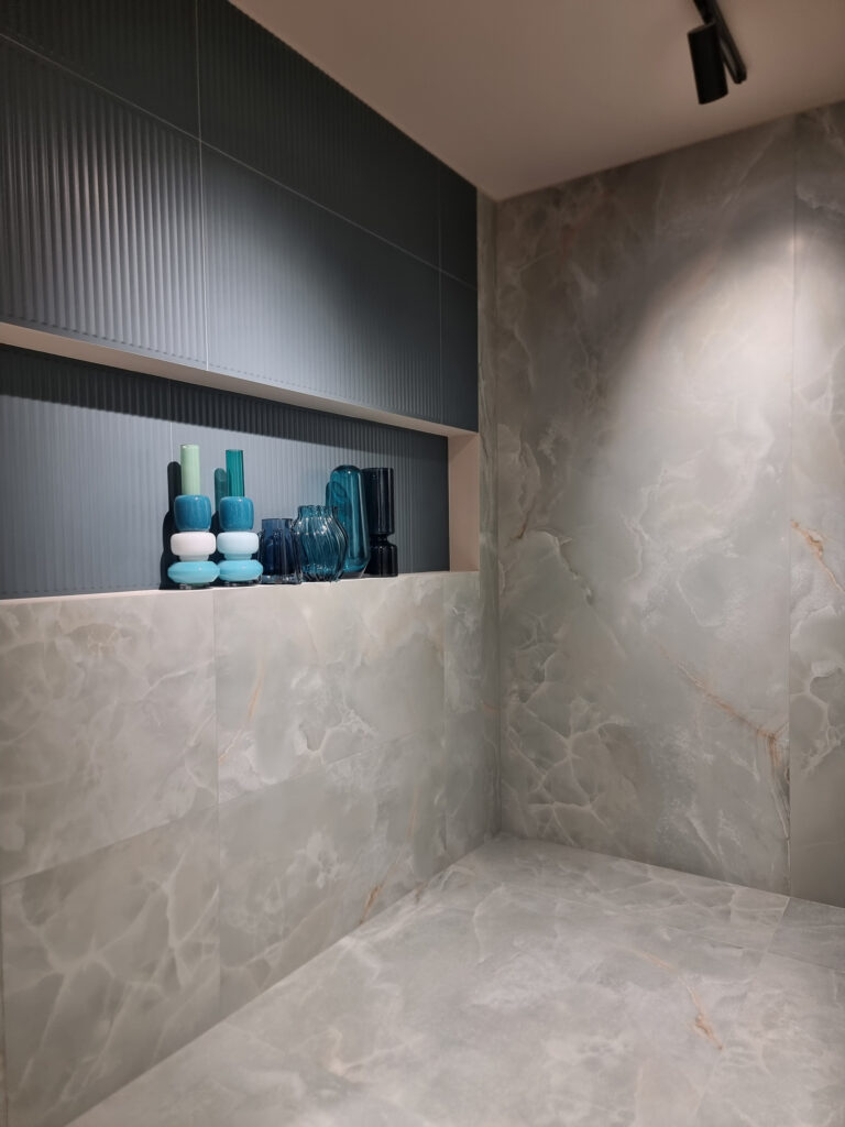
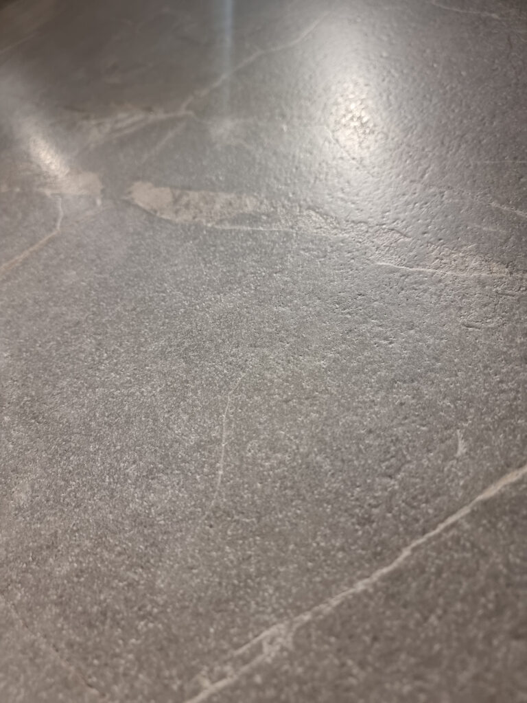
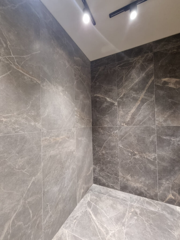
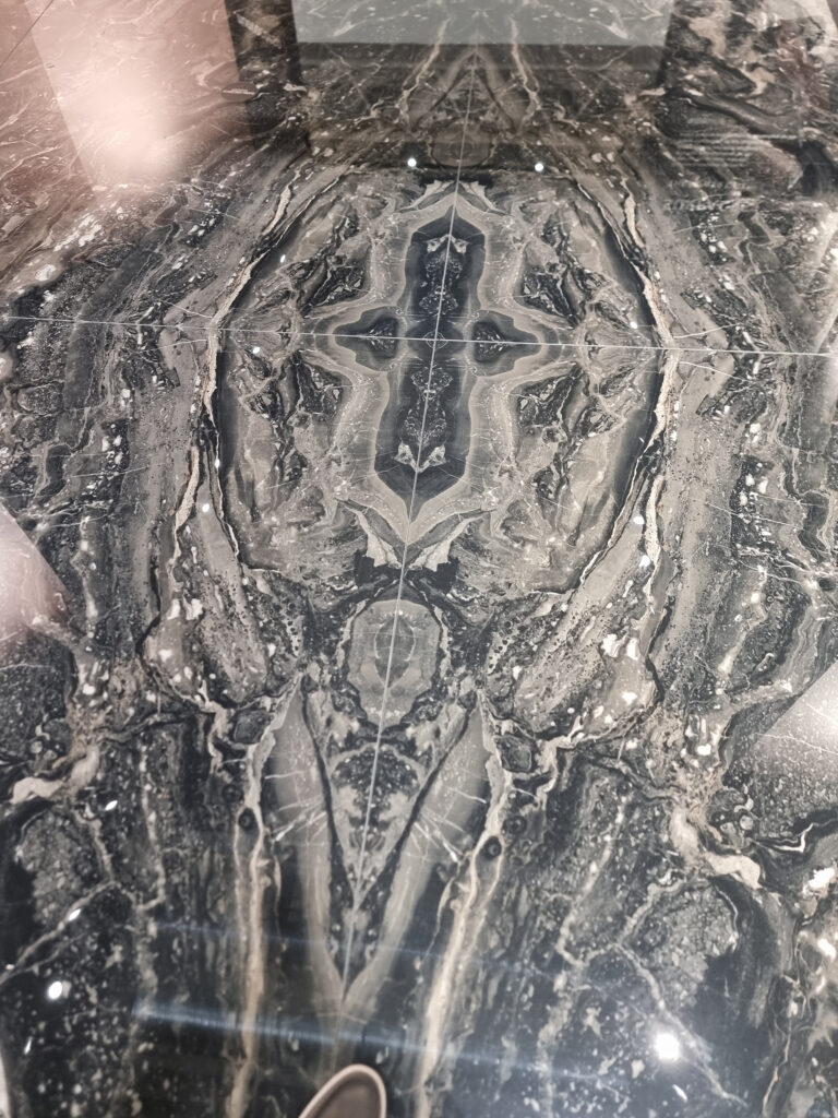
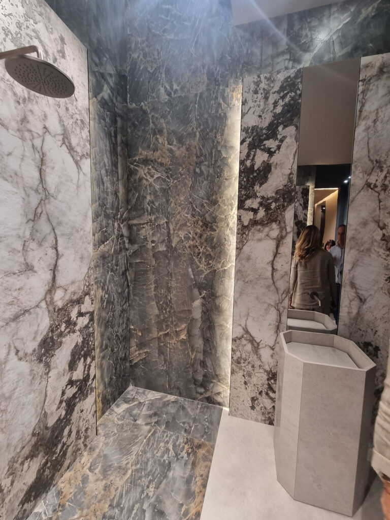
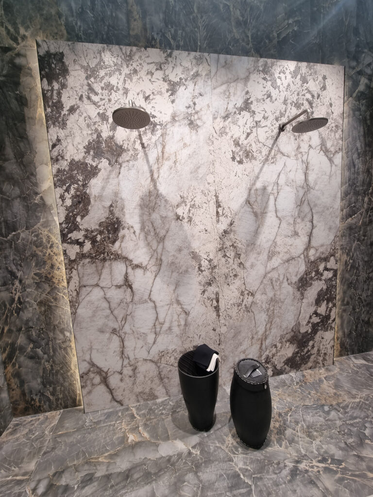
Marbles. Glossy is banned and survives almost only in slabs. 2026 is onyx-free, and flashy looks are declining too. The new marble offerings avoid the “usual suspects” and are matt, textured, or in assorted soft finishes.
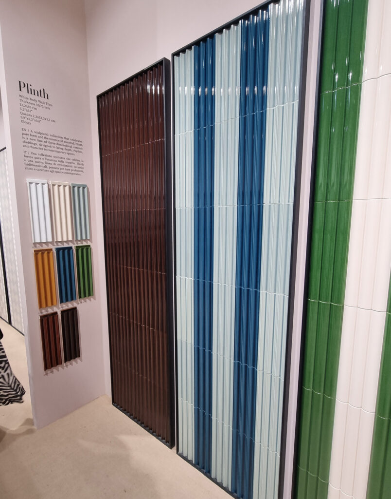
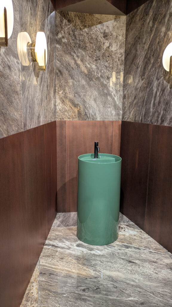
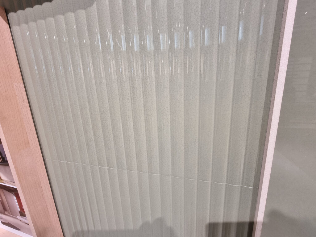
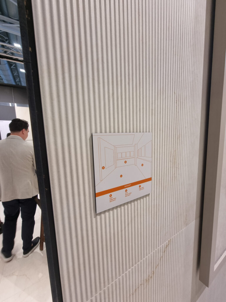
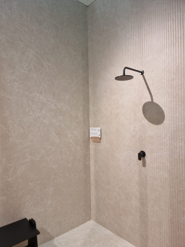
Reeds and fluting. Rigatoni and spaghetti in overload are heading into a detox phase. Variants with micro or mega lines, even super-maxi on the short side (ABK). Or they soften into wider, lower little waves. Alternatives are being explored: light brushed textures, ping-pong-style rounds (Refin), micro-mosaics, and assorted light reliefs.
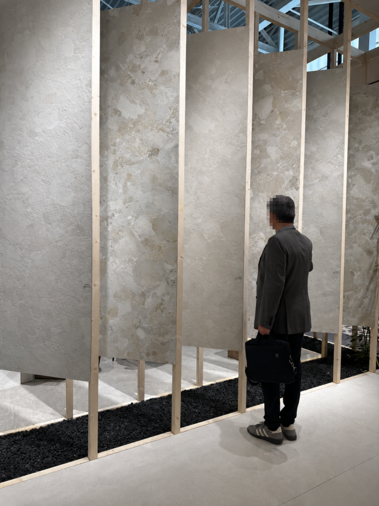
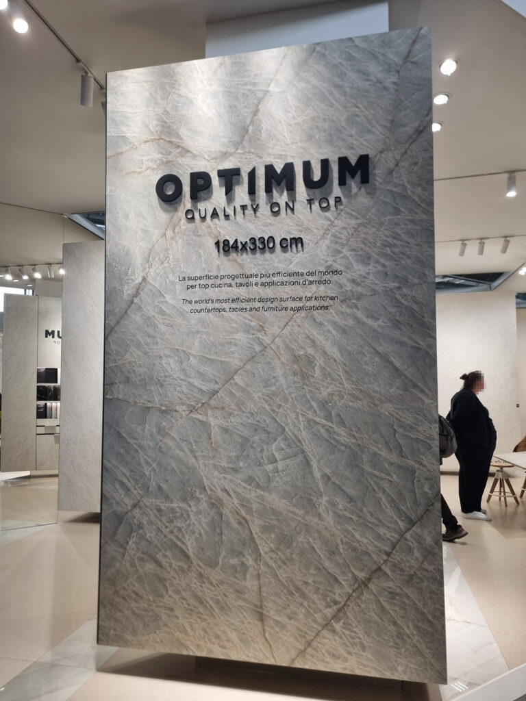
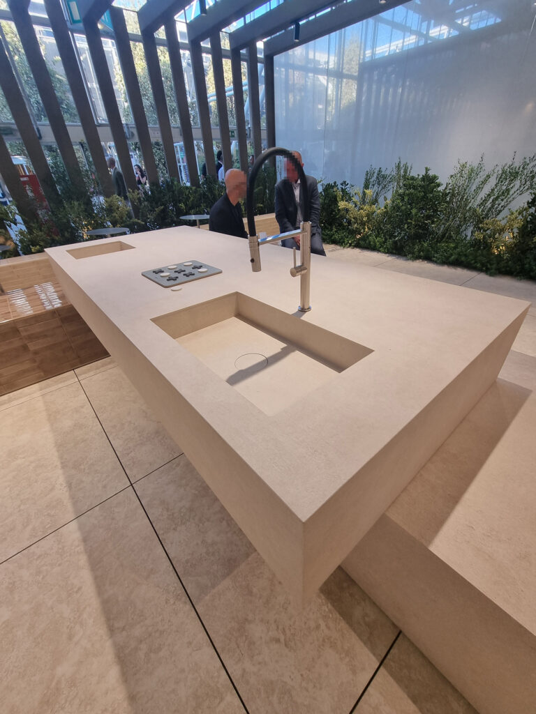
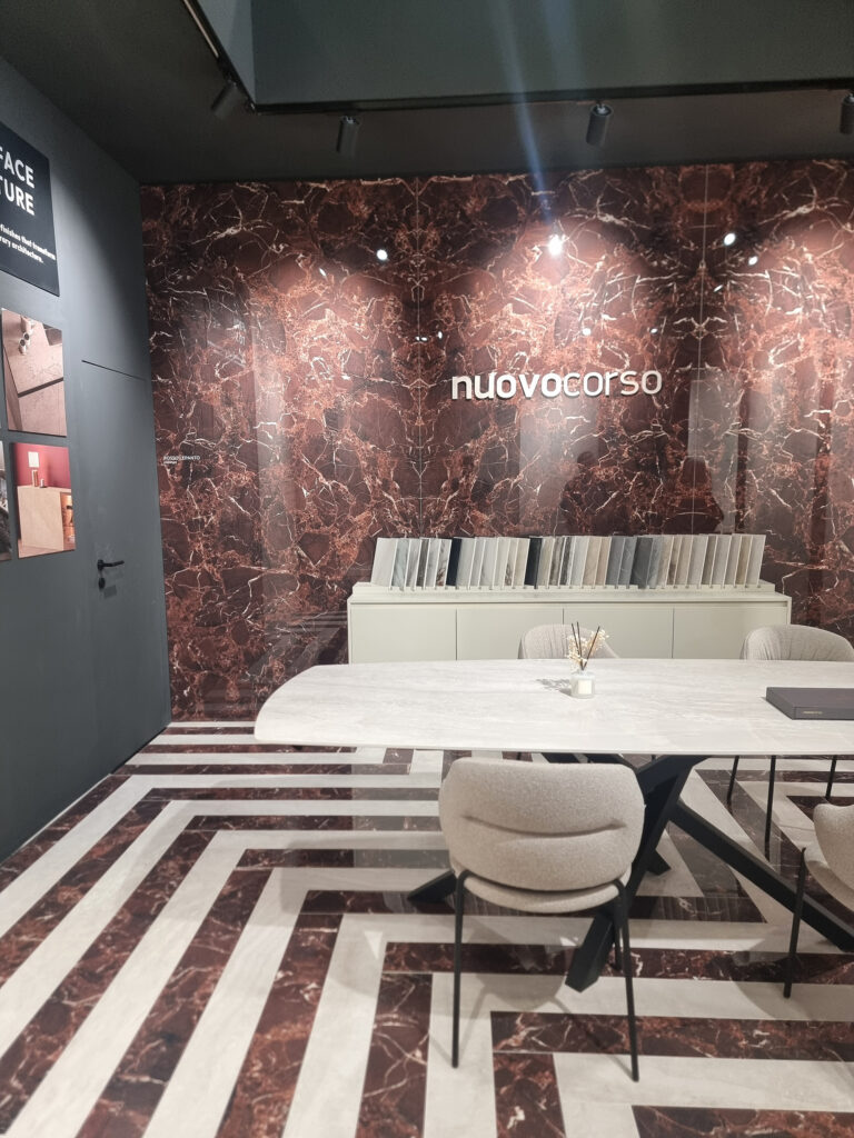
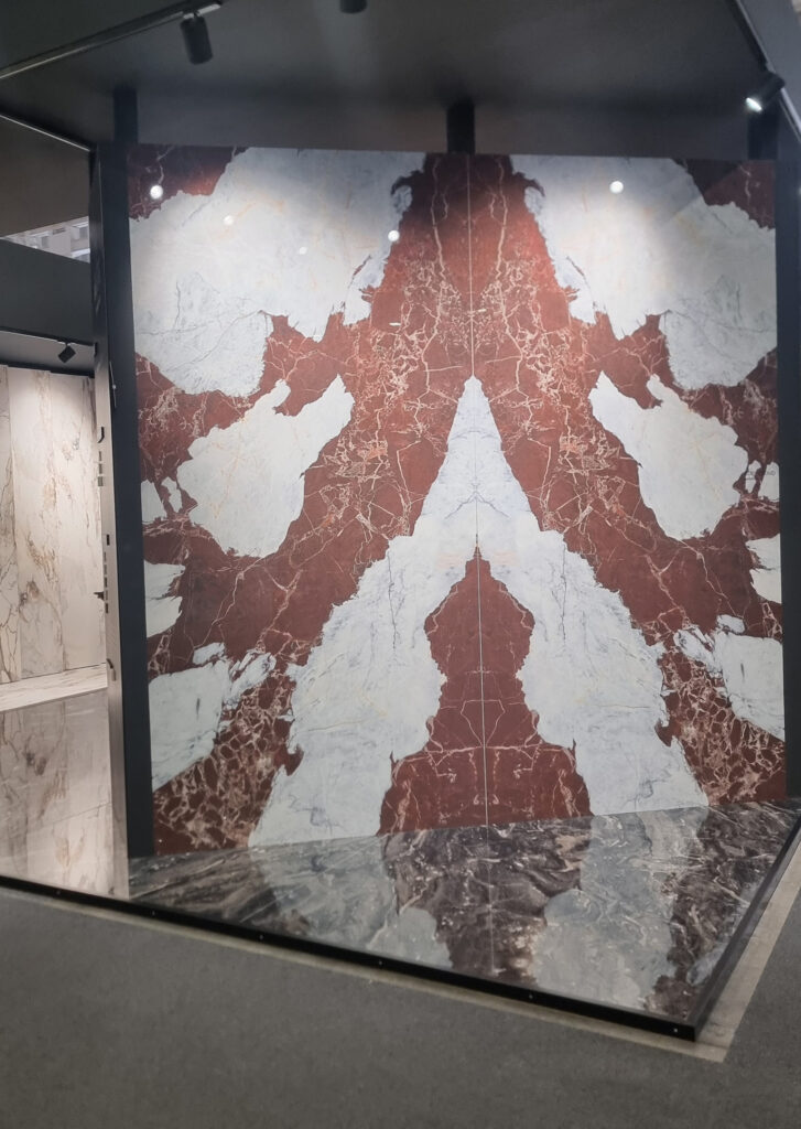
Large slabs. Generalist brands treat them as a complement, for the chic corner or in “furniture” applications that animate the booth: kitchen and bath tops, benches, tables. Nuovo Corso raises the XXXL format to 198×340 cm (about 78×134 in) without too much fanfare. Much pain over installation costs: a weight that puts a damper on retail sales in particular. Tools and techniques have evolved, so installation courses should be pushed as hard as possible. Installer is the new plumber!
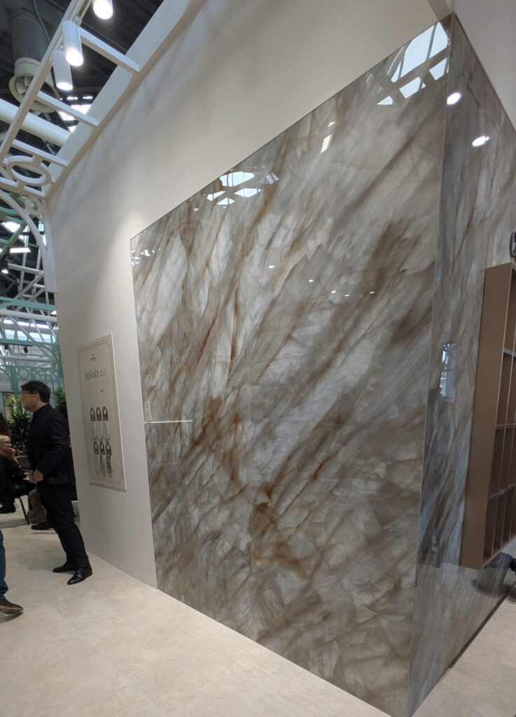
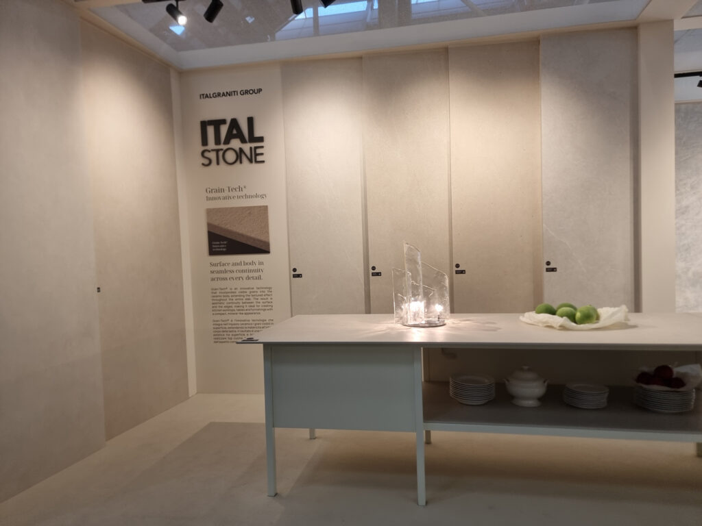
Furniture slabs. Slab brands for furniture are confirmed, like ItalStone, Atlas Plan, and Infinity, which moves up to the uptown, in the front-garden spot abandoned by Iris Group. The aesthetic research goes in various directions, including metallics and designer-signed designs. Lots of work on finishes, with some nods to worked thickness, but that’s no longer news.
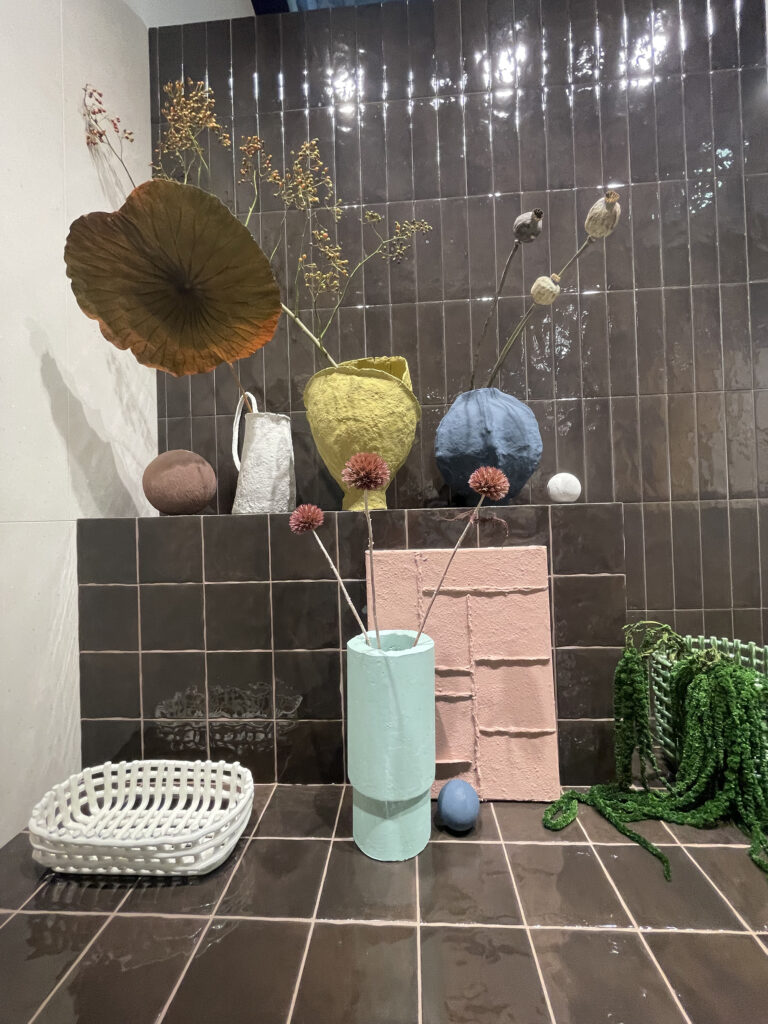
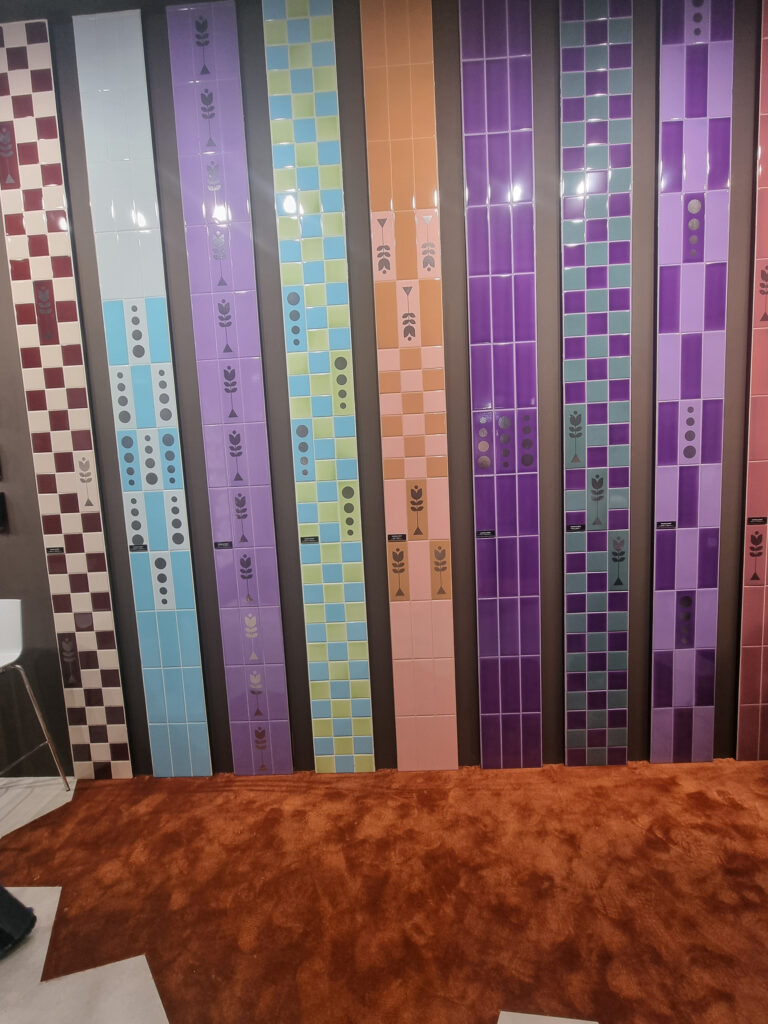
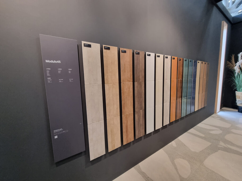
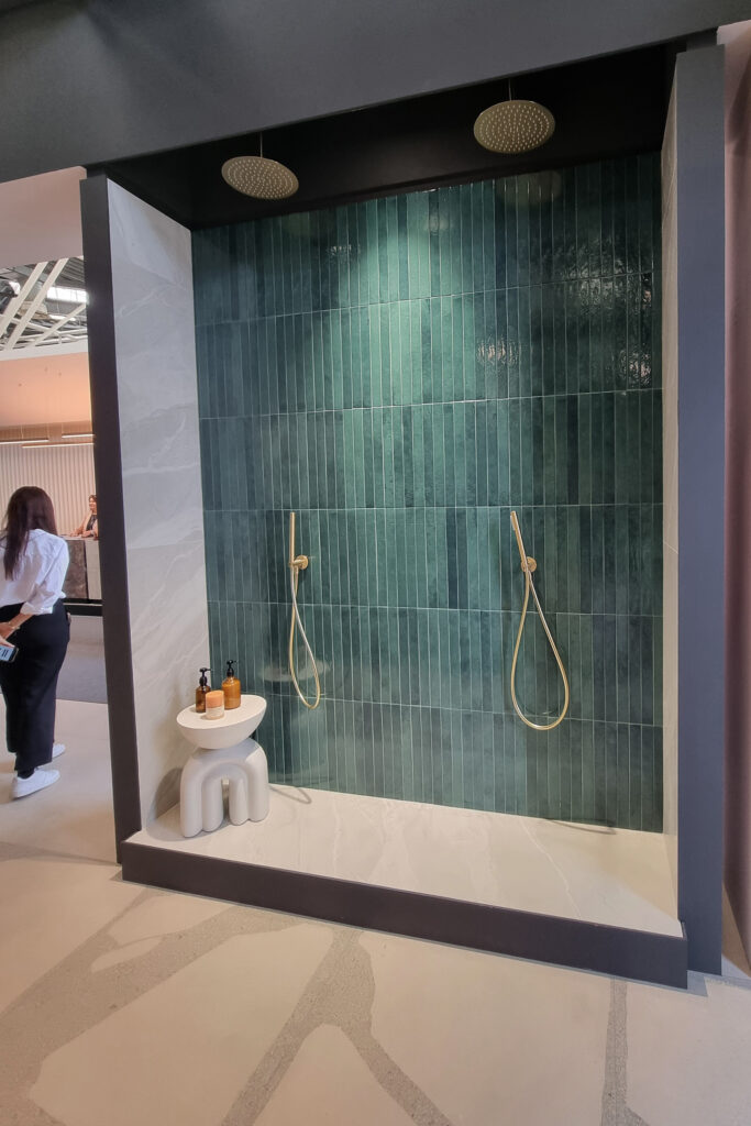
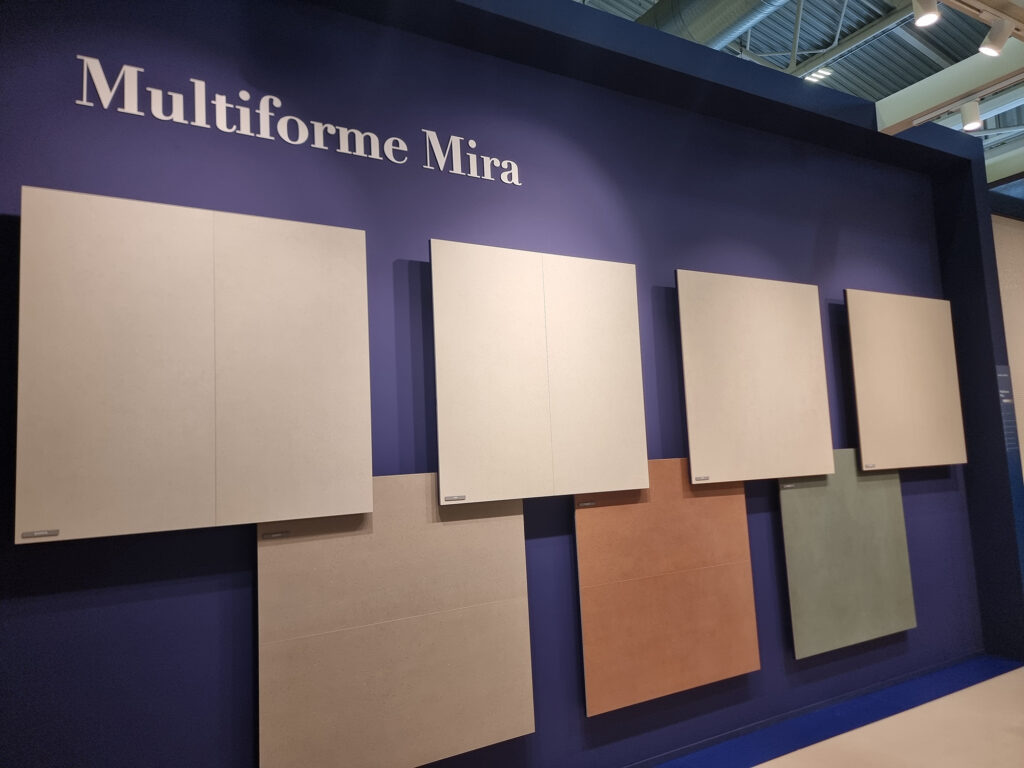
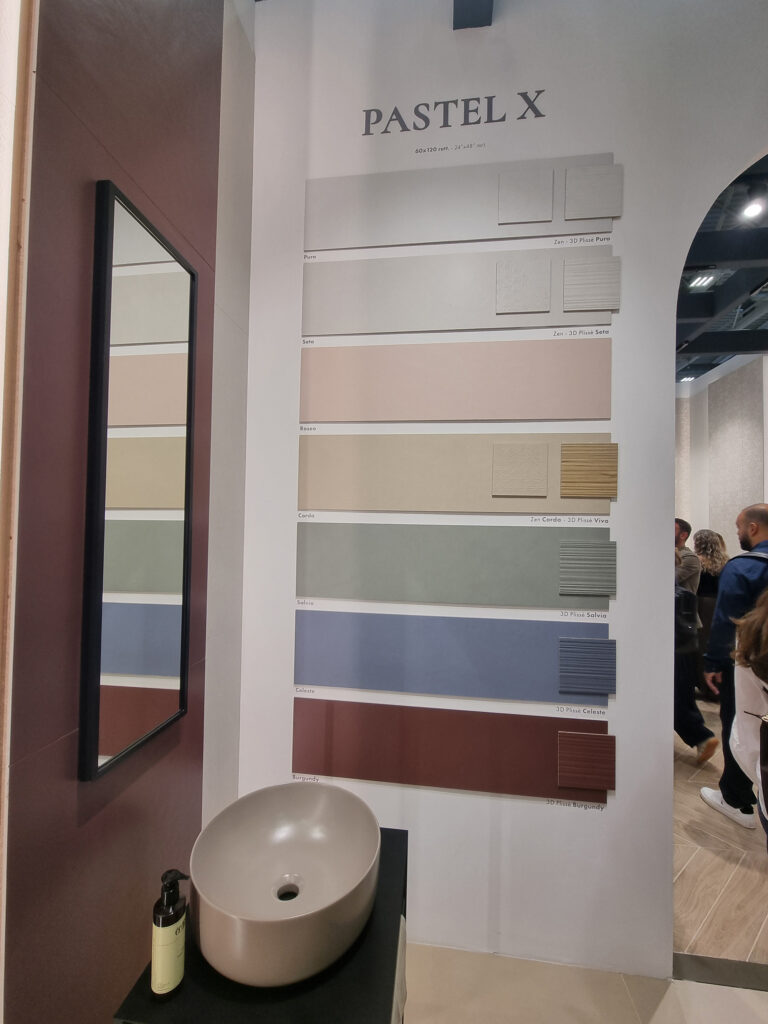
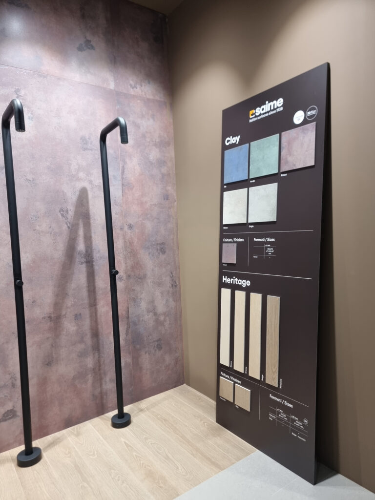
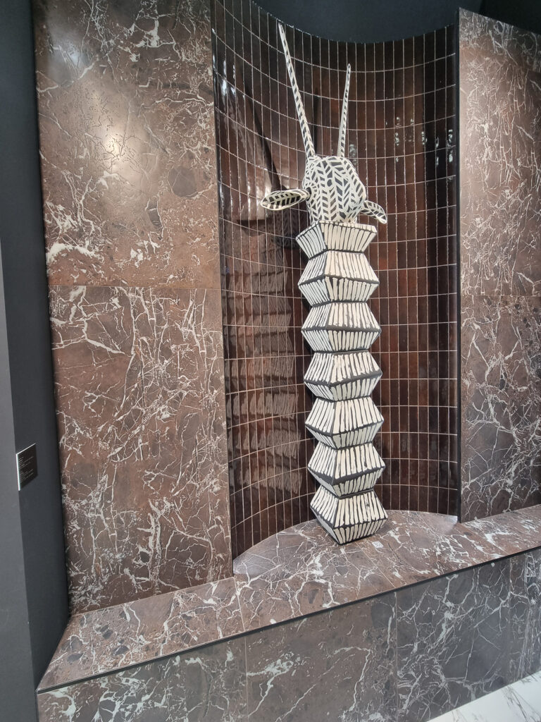
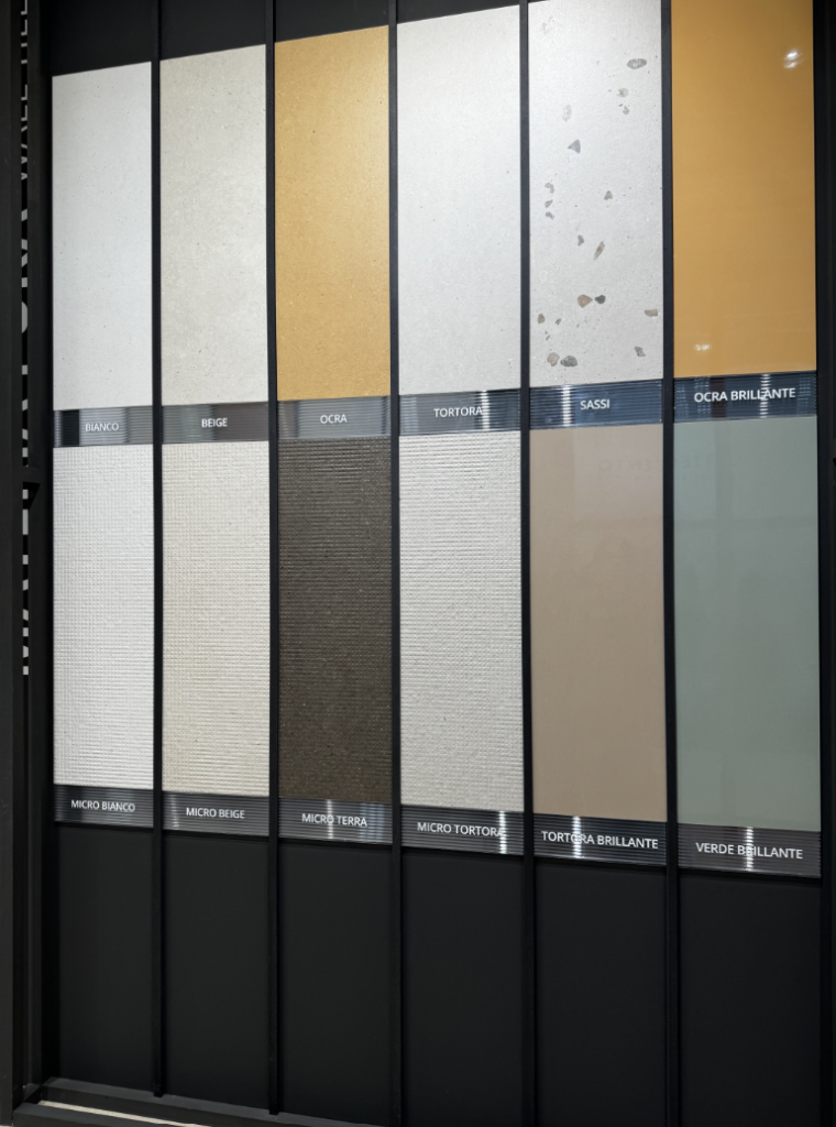
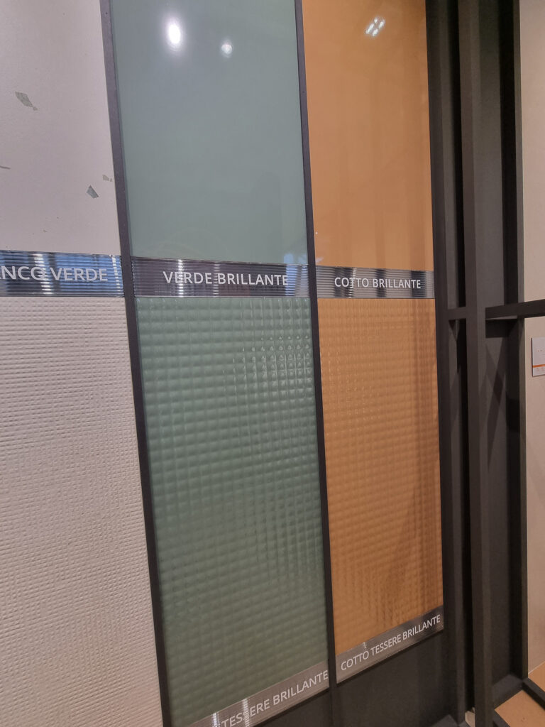
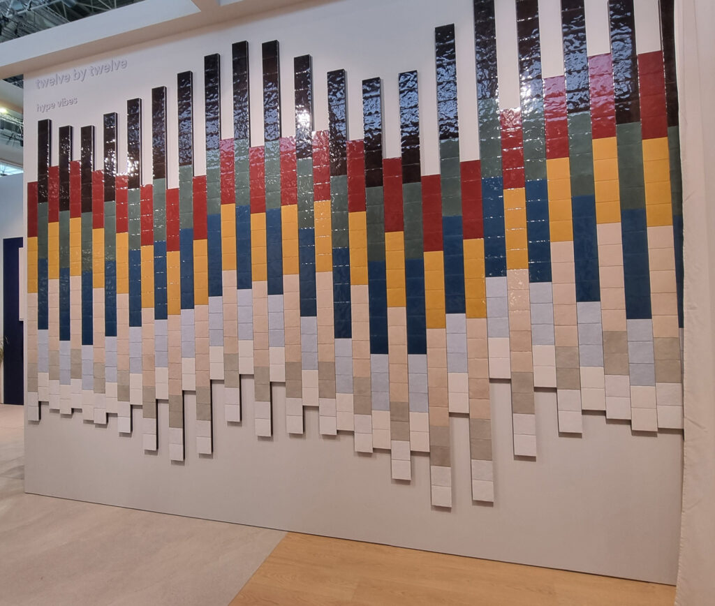
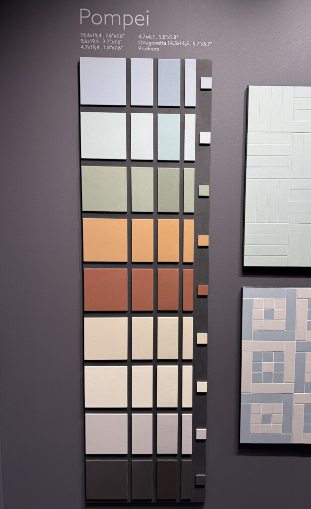
New colors, new sizes. Palettes get refreshed with colorful colors in intriguing shades: mustard/mango yellow, petrol blue, amber and dark Pompeian red, olive/sage green (rehabilitated; for years it was the Voldemort of PMs). Glossy solid color widens its perimeter, not just small format but 24 in. and up. The love affair with warm, earthy tones continues.
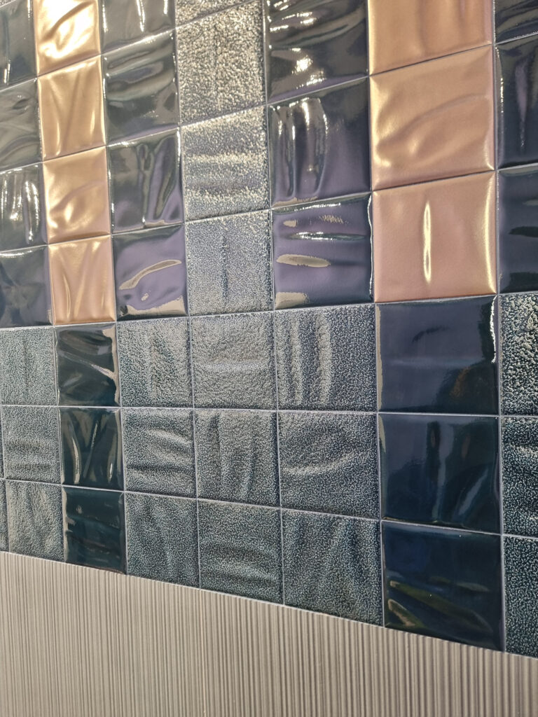
Marca Corona 12×12
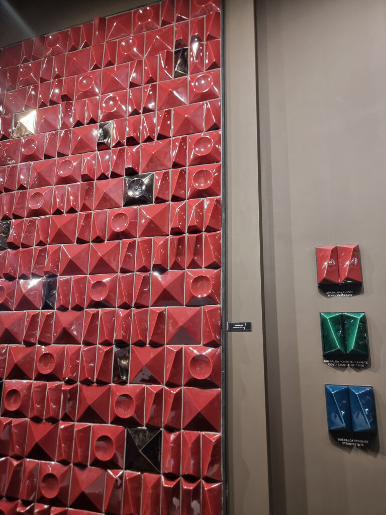
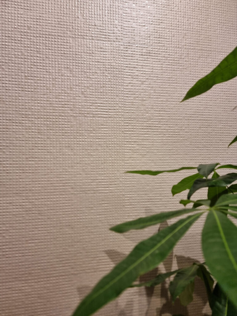
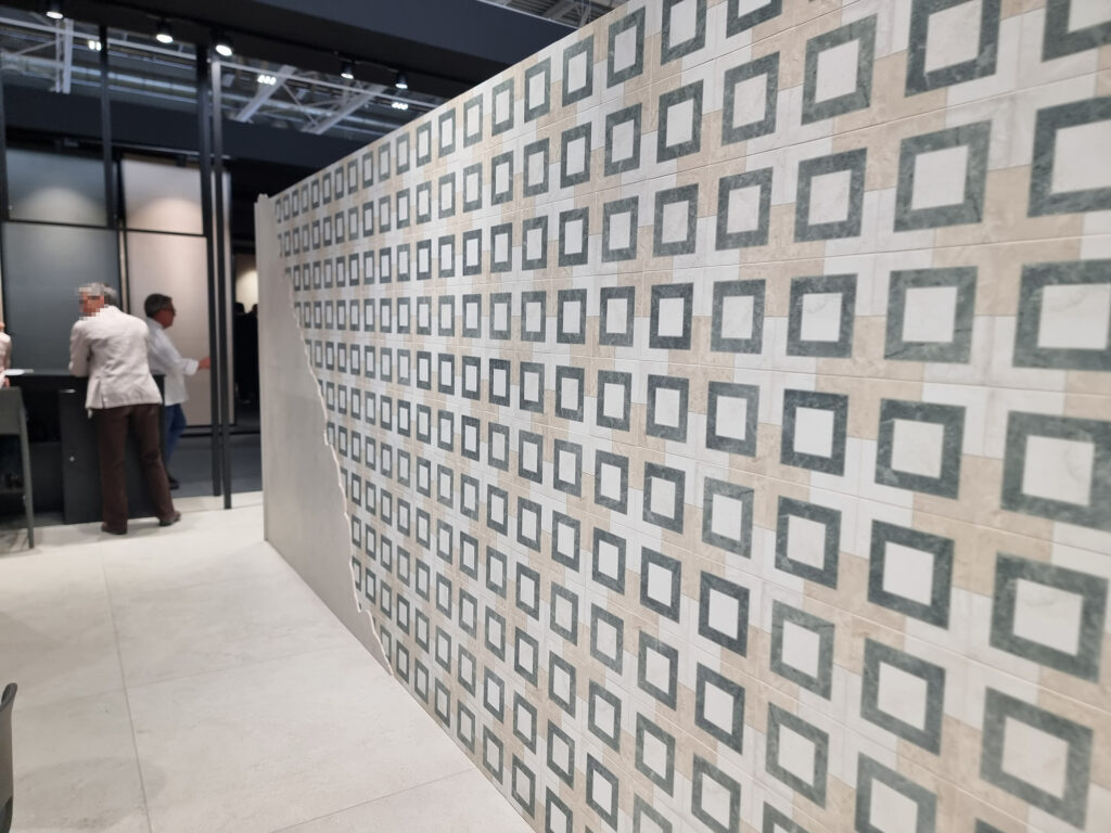
Decors and the like. New offerings to accompany the color series or the new cotto, with measured, modular geometries, vintage-inspired but in a current key, with an eye to interior design (Fap, Marca Corona, Elios). Reliefs: even “molded” wall tile is personalized with bold reliefs (Cerasarda, Fap, Wow) that really enhance the ceramic material. Real and simulated mosaics, micro and medium, with designs of every kind.
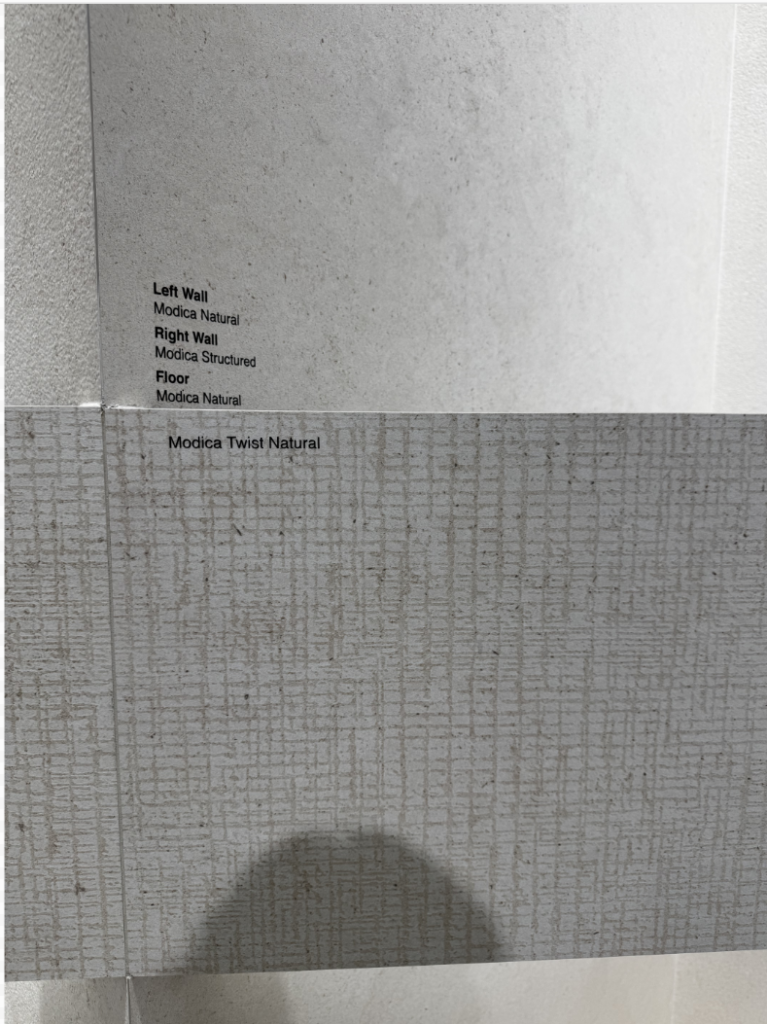
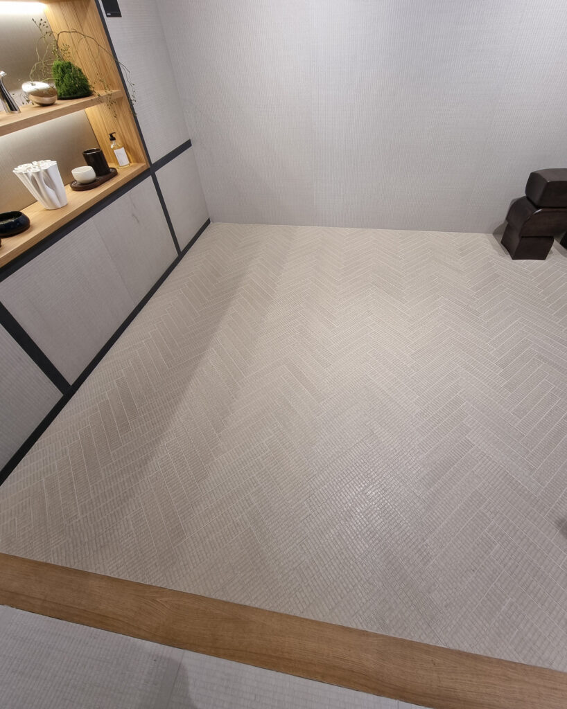
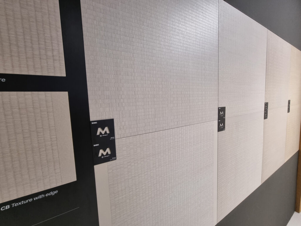
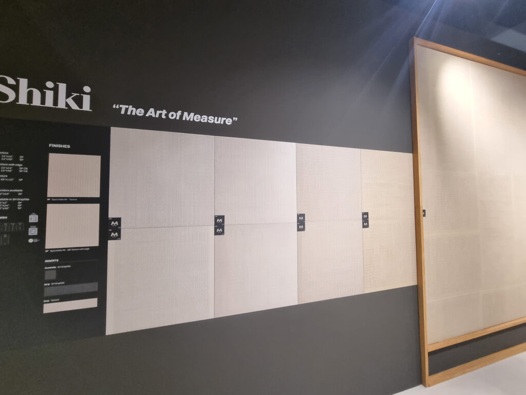
Anything else? Something a little new, pleasant, and maybe sellable: Mirage gives it a shot with a stylized tatami, Shiki. Did it take His Eminence Makio Hasuike? Apparently so, because it works. Japan-themed, but it would suit other contexts too. Coem also presents a nicely textured mat within the Echo collection. Textile references show up in several “accessory” finishes too, with delicate, barely brushed or tessellated reliefs.
Part C –CHATTER FROM THE SHOW FLOOR
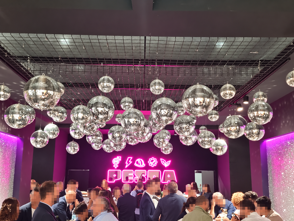
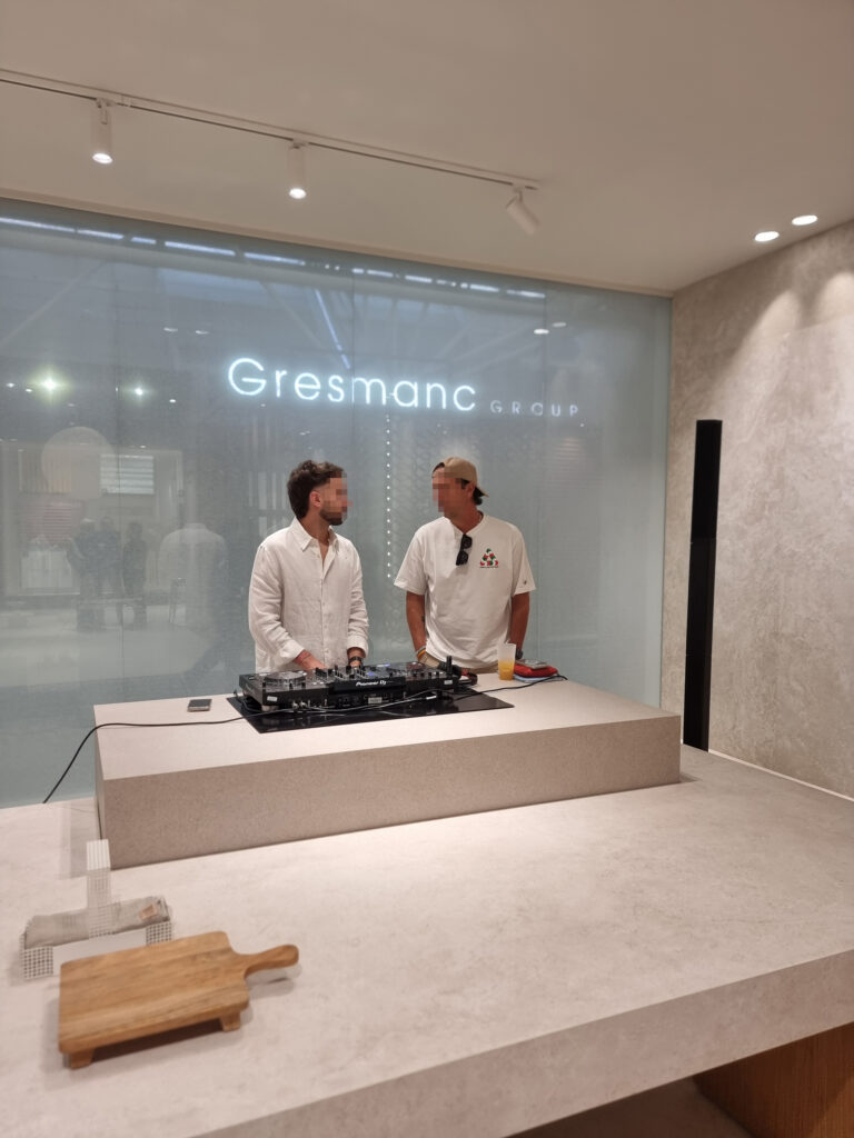
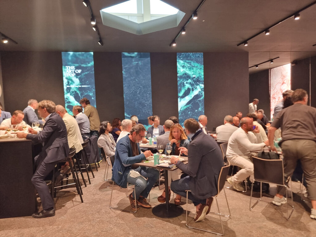
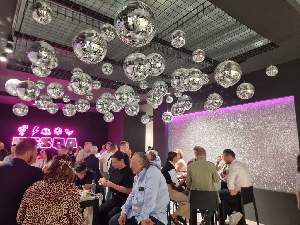
15 DANCING WITH THE STARS The old “bread and circuses” has worked for twenty centuries; the district’s new food & show burns through a percentage of revenue. This time, the evening Oktoberfest in Sassuolo and surroundings (Imola included) is showing signs of slowing down. Maybe to cut costs, maybe because there were simply too many parties competing for the same potential guests. Clients and architects who are in Bologna to work: if they’d wanted to wreck themselves every night, they’d have booked a singles cruise. If, to fill the seats, you invite your cousin or even a few suppliers (they’re available last minute, too), that’s not good. While the super-big brands confirm their daily super-parties with spritz tonics, light dinners and mega-shows (magicians, dancers, fire, cello, and 80s-90s dance), other events ran on odd-even days or were delisted altogether, replaced by pragmatic private dinners, me-versus-you style.
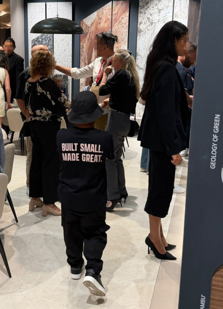
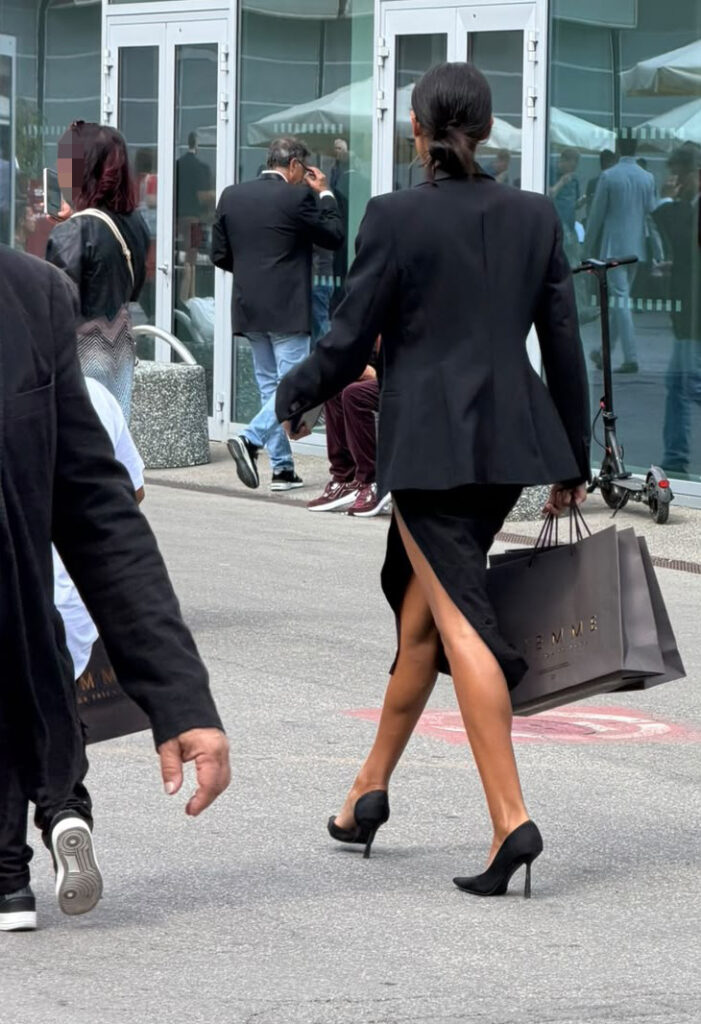
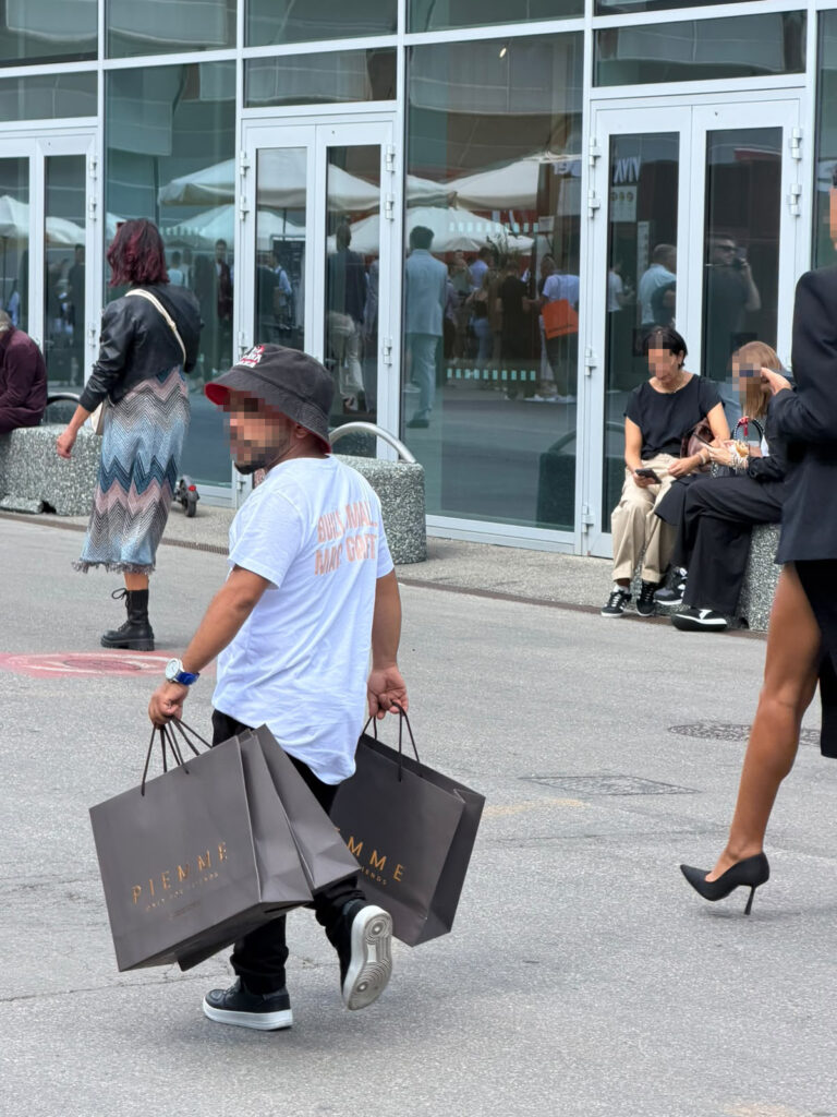
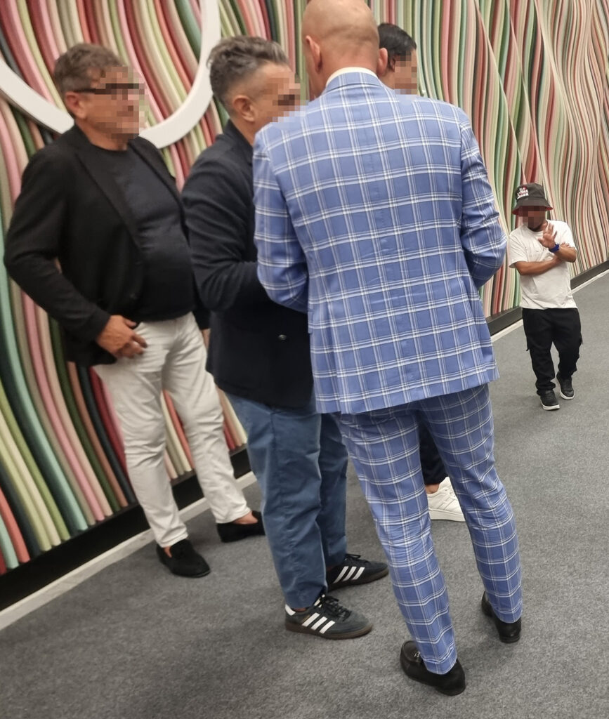
16 LOW BLOW As long as people are talking. The low blow of the dwarf sandwich (T-shirt: “we’re small but we’ll grow”), flanked by cube-hostesses, got the bored Cersaie crowd talking. It’s a sign of the times. There are three phases. 1: receiving the gossip, with disbelief. 2: dwarf-hunting for visual confirmation (or via smartphone). 3: an incredulous little smile, followed by horrified or scandalized comments, depending. Time will tell whether it was spectacular de-marketing or just a “good (unusual?!)” idea in bad taste. Nothing illegal: Tyrion Lannister from Game of Thrones and the dwarf people in The Lord of the Rings made the genre acceptable, and nobody protested. A quick thought: yesterday we were betting on tiny particles in the production line (titanium dioxide, antibacterial and self-cleaning); today we’re betting on tiny people on the show floor. O tempora, o mores! (oh the time, oh the customs)
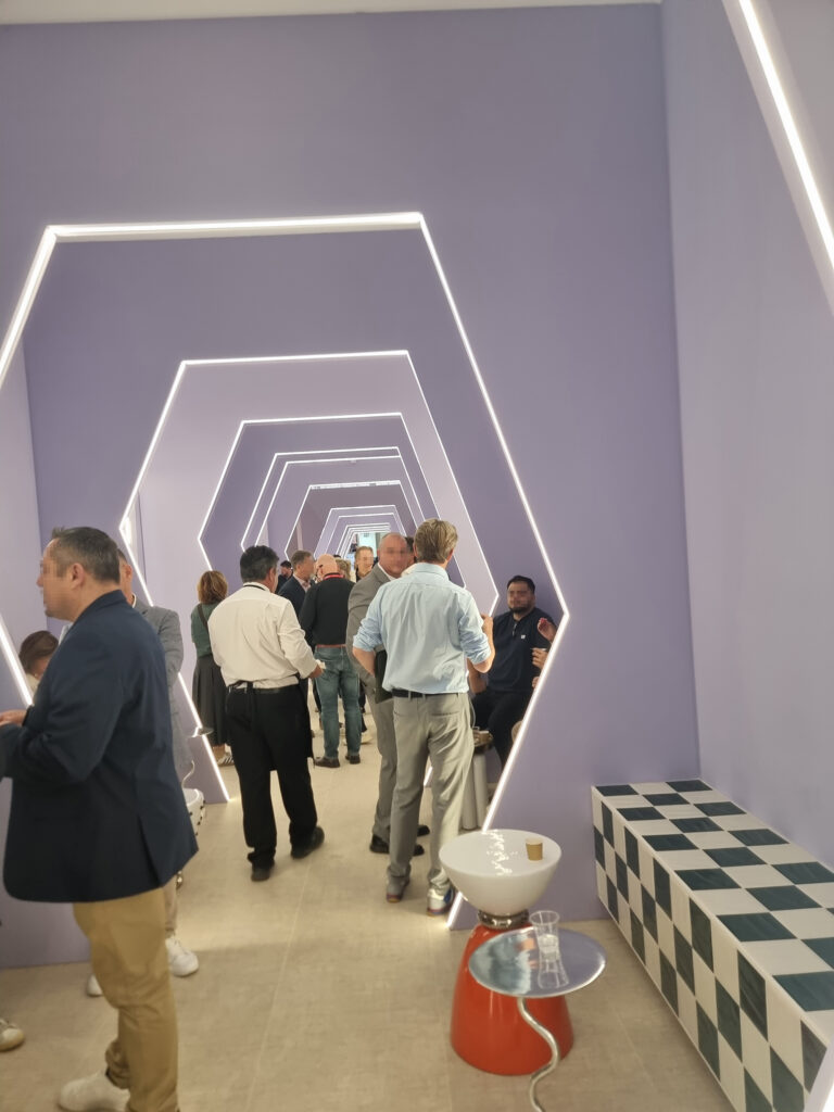
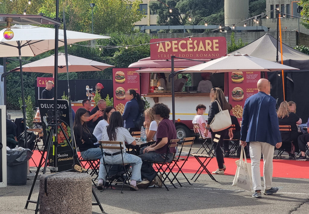
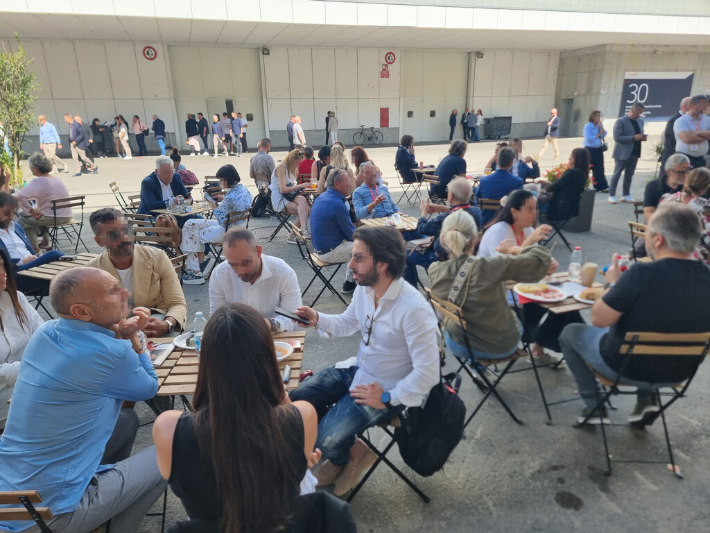
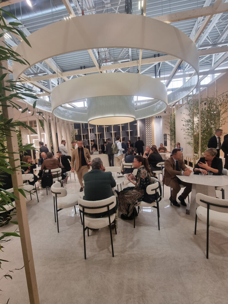
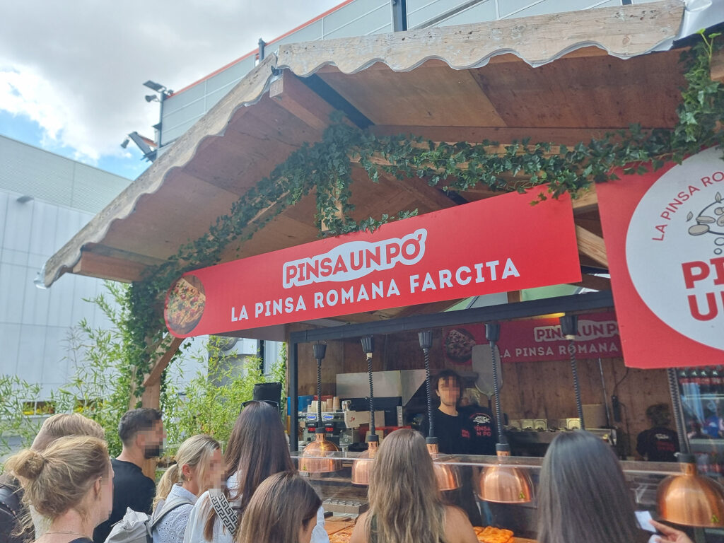
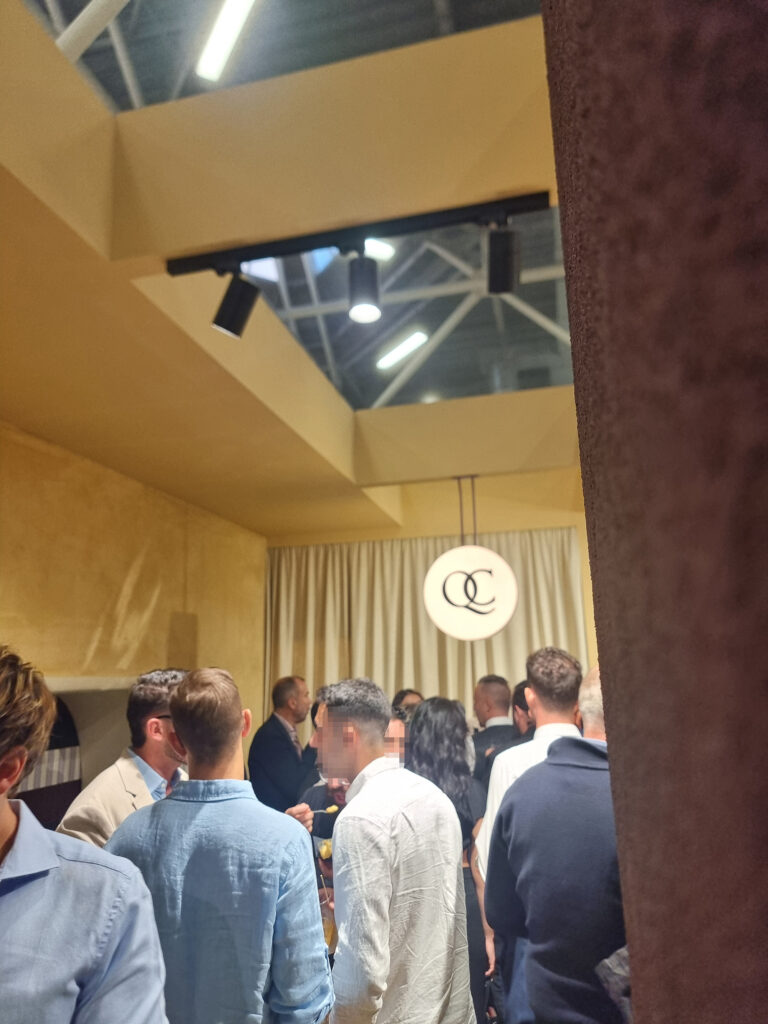
17 THE PROOF IS IN THE PUDDING The booths make room for plazas where you can talk, drink, and eat (wildly, but discreetly), loosening the austerity of the food offering. In the post-post-fair LinkedIn posts, everyone basks in having created “connections” and done “networking” (more net than work). Translation: chitchat. The food trucks’ prices like in Venice San Marco Square suggested road trips to eat at a highway rest stop, where you’d spend much less. Last but not least, high bipartisan approval for the early-evening parties where, since everyone is already connected, you can socialize without overdoing it (at least in the ones we saw). People, smiles, music, spritz. It’s the secret to happiness.
Piazza 41zero42
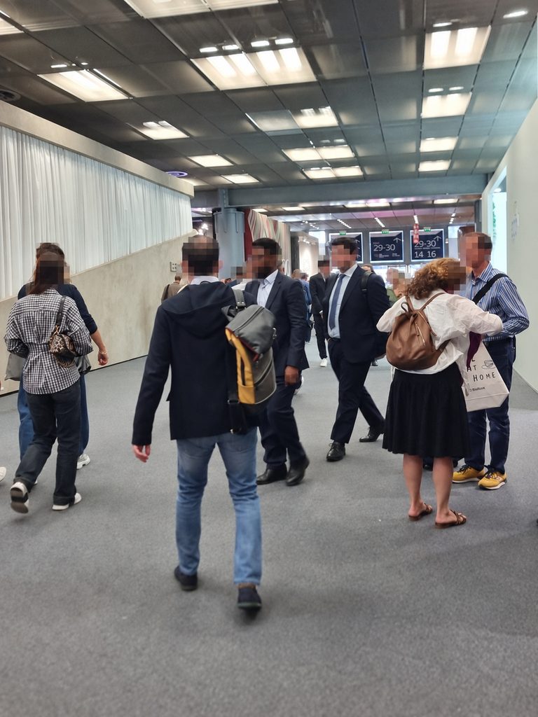
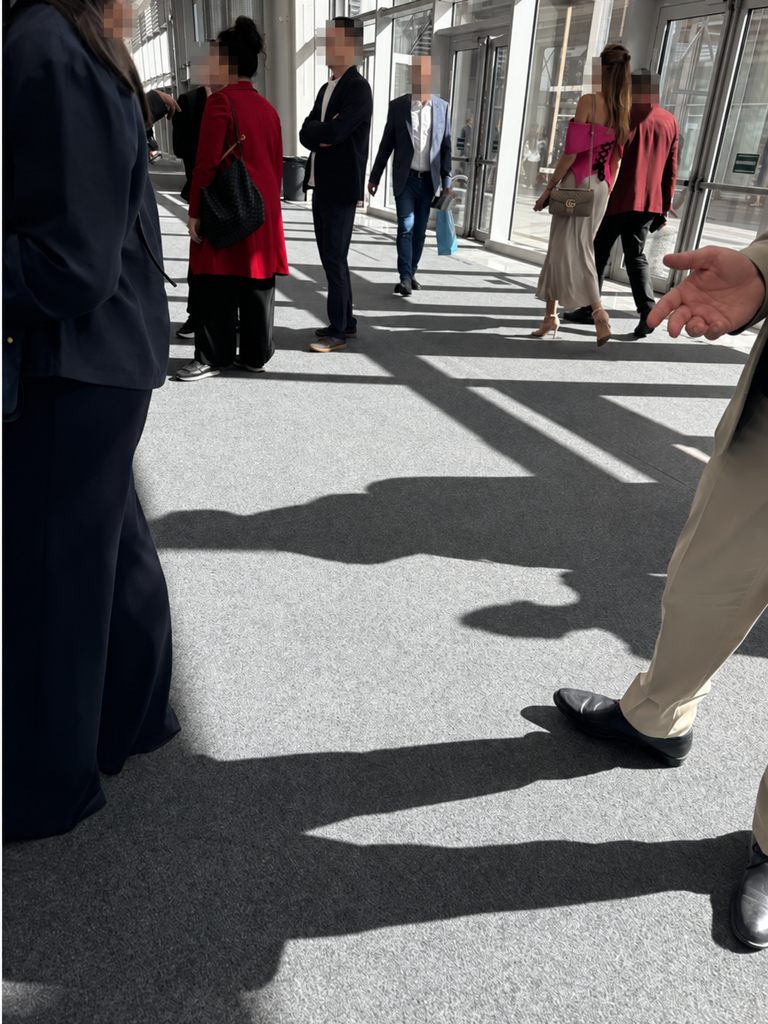
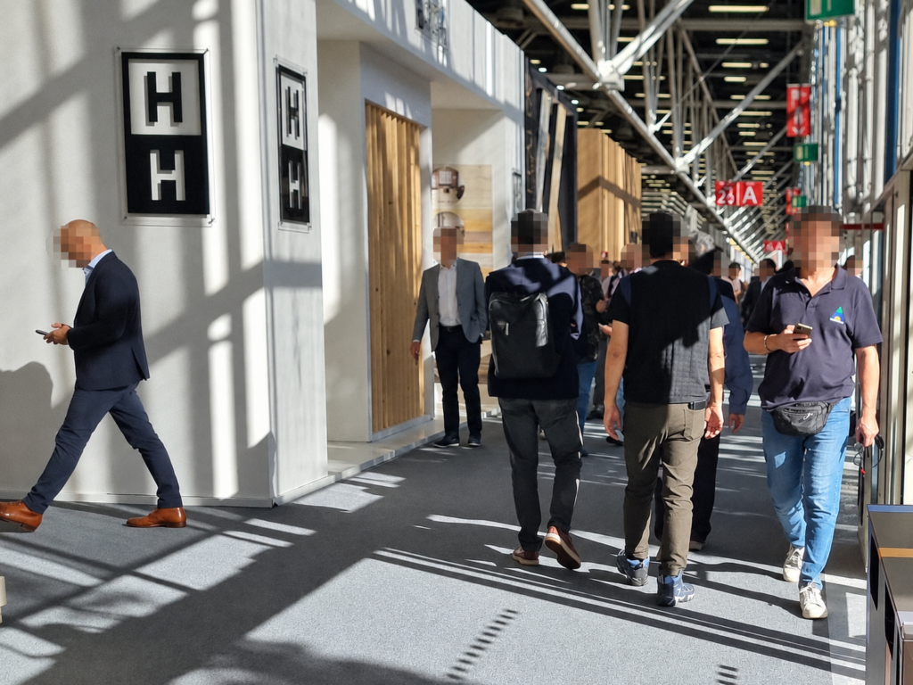
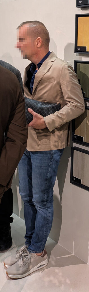
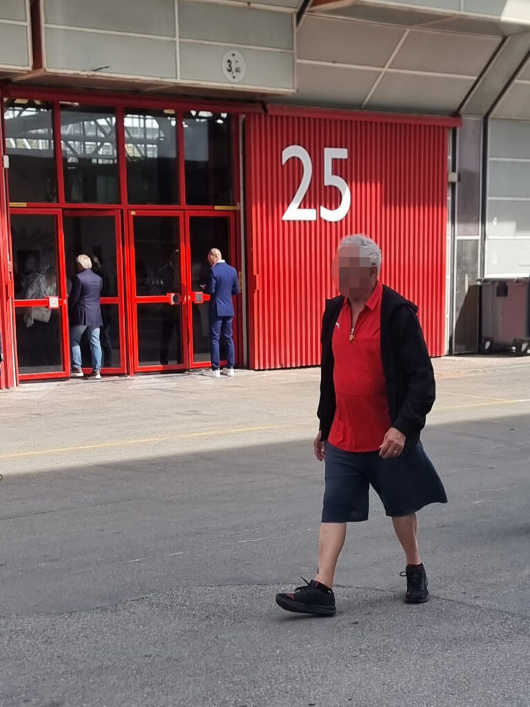
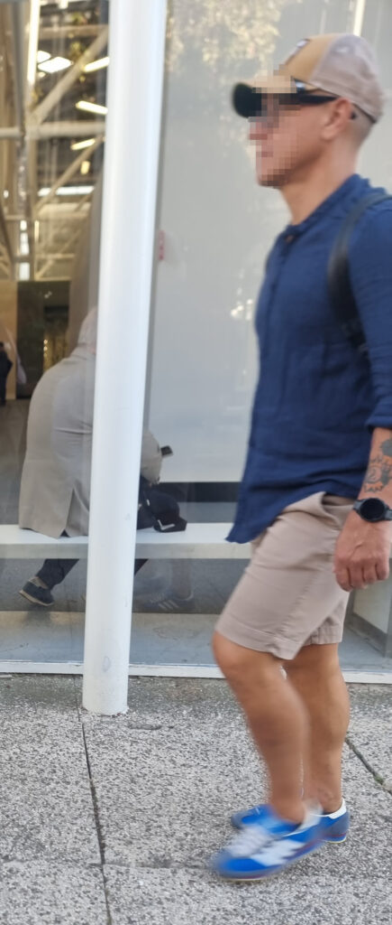
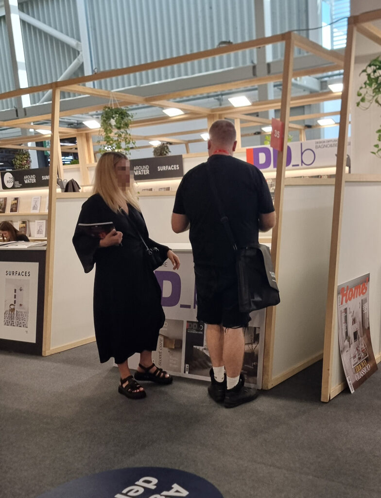
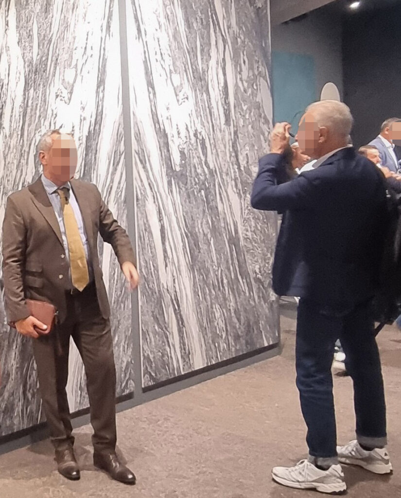
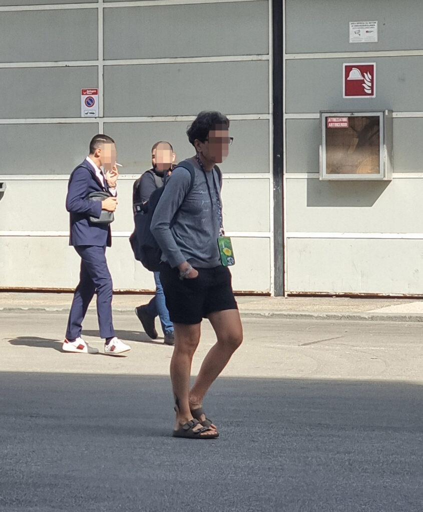
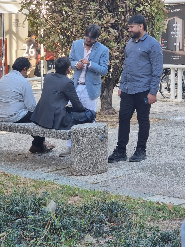
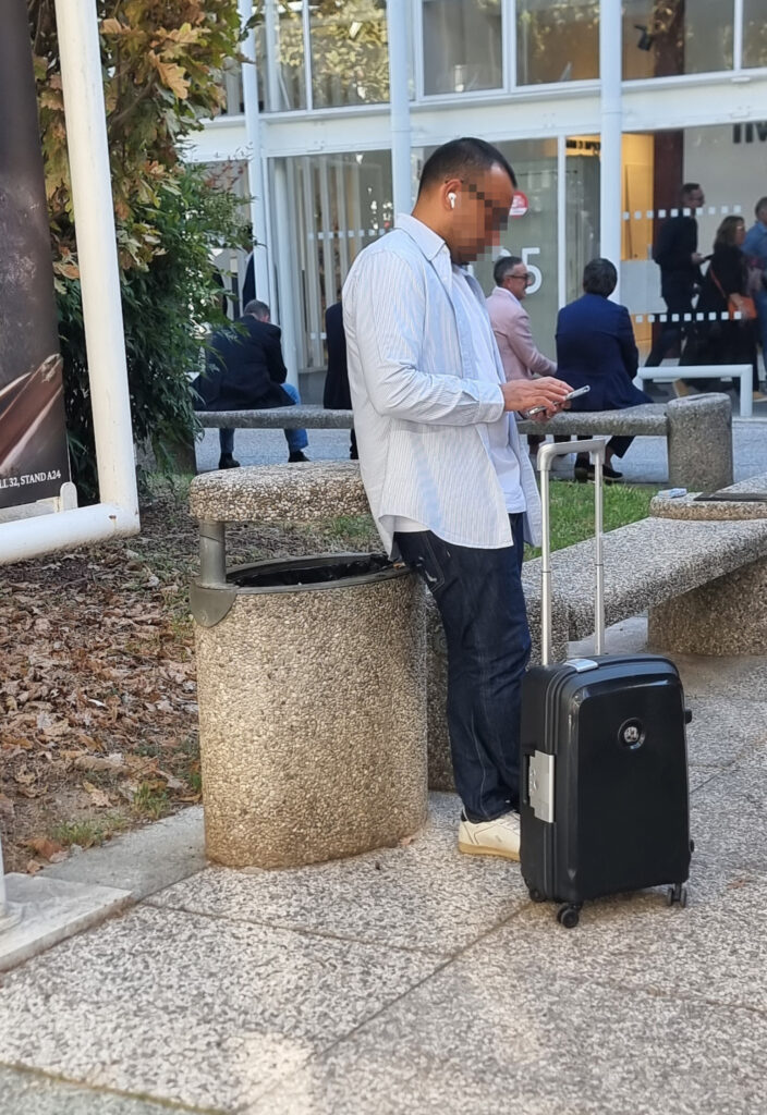
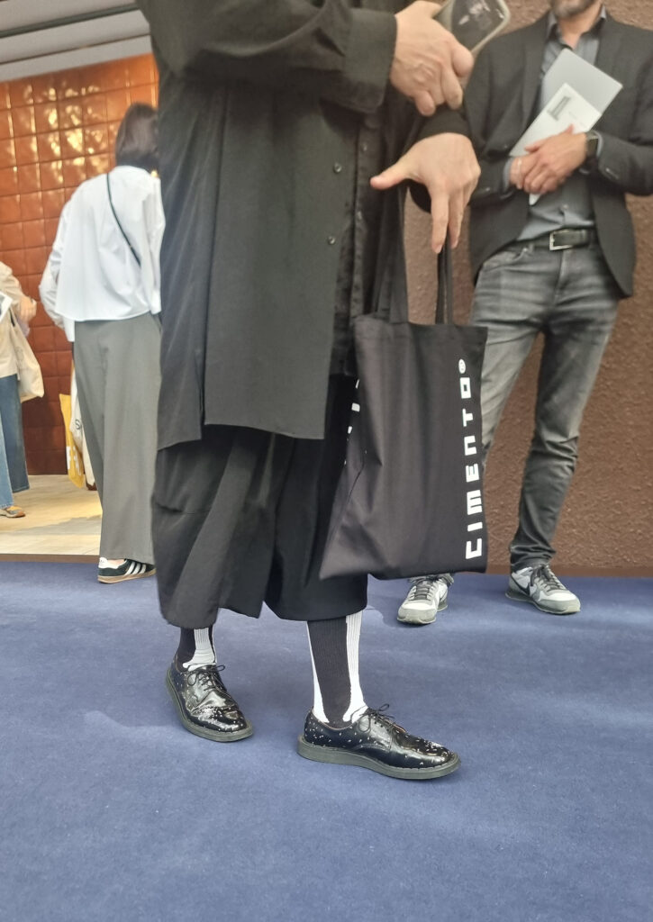
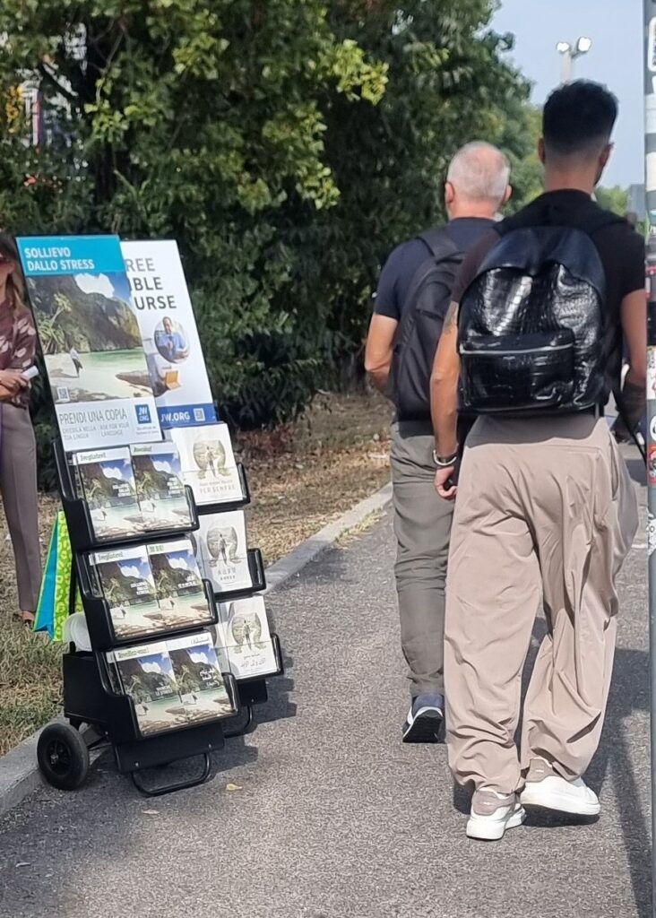
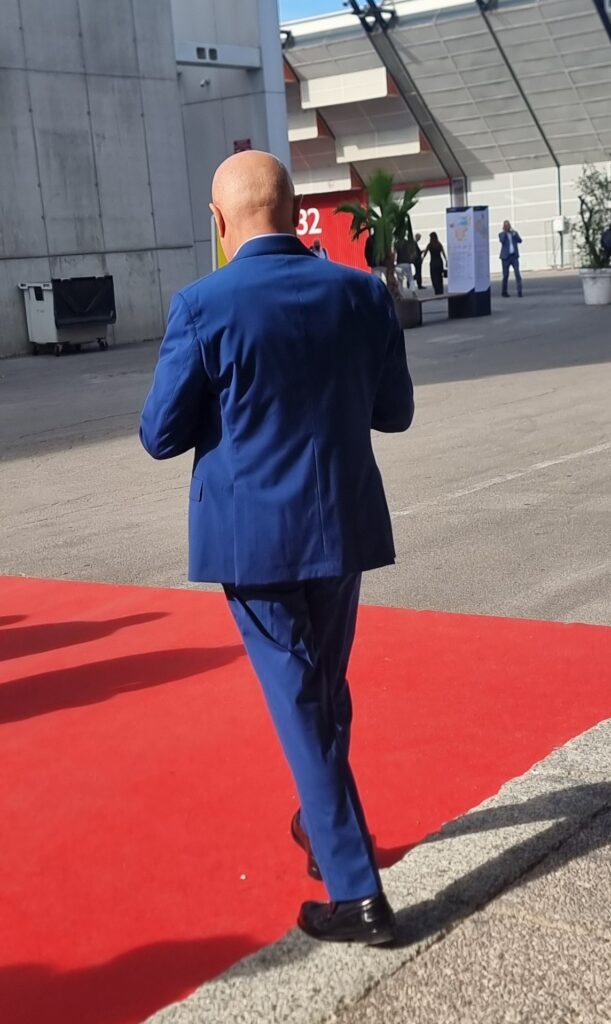
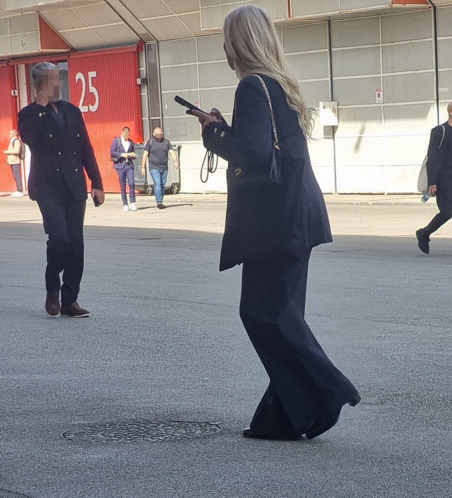
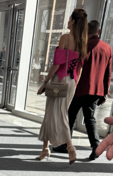
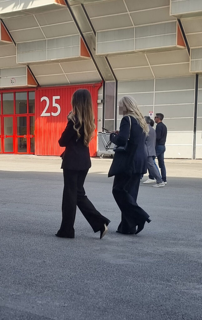
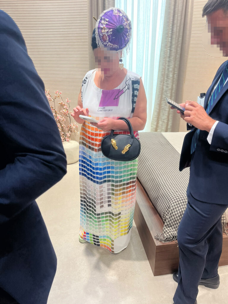
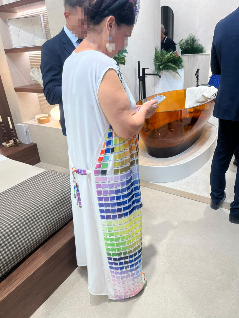
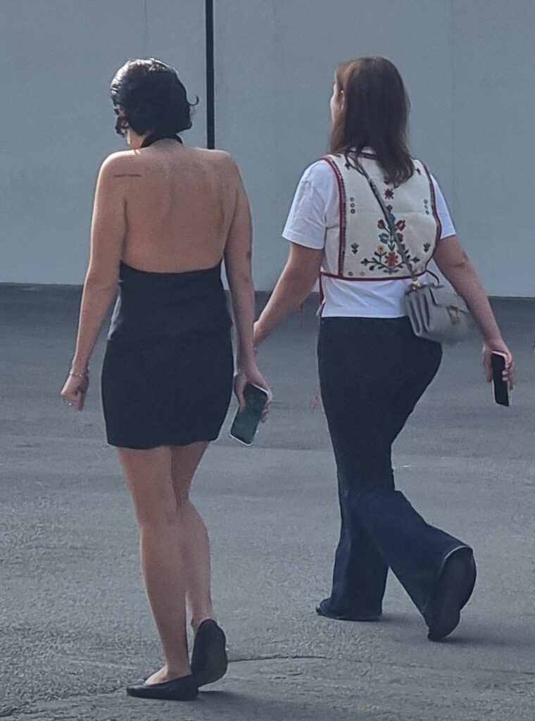
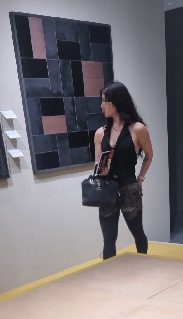
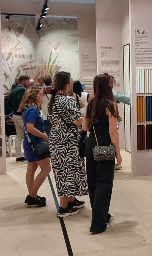
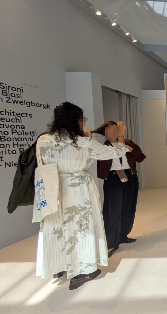
18 MEN AND WOMEN (2026 OUTFITS) Some insights on the 2026 evolution of fair outfits. We regretfully note a progressive flattening. The importance of the look at the fair is no longer, as it once was, comparable to a wedding, a New Year’s party in Paris, or a crazy weekend in Ibiza. Smart casual drains the pathos and glamour from the event, with so many Sunday-barbecue looks. But for the record, a few dynamics in men’s and women’s outfits deserve a mention.
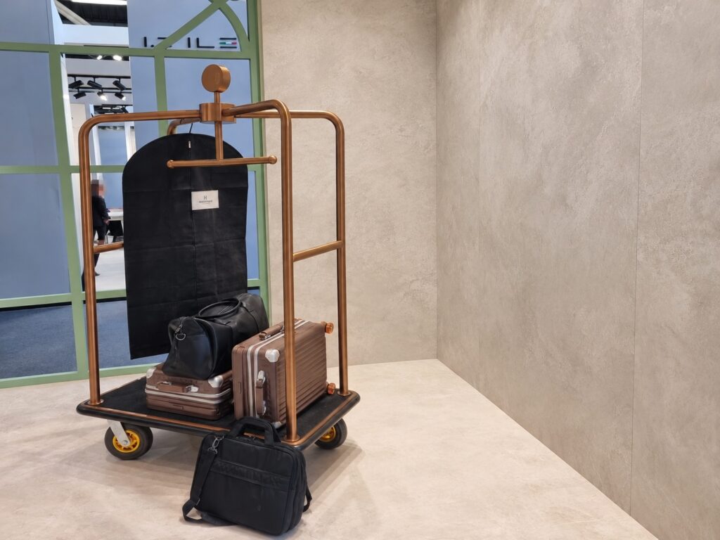
Bermuda man: oversized short pants worn with bold pride. Visitors, but clients too. Birkenstocks. To stand out, installers will show up in swim trunks. Dandy man: bright-blue suit, the colour of former Italianprime minister Giuseppe Conte suit. A megatrend perhaps created bythe glaze makers who steer the trends. Creative man: very wide trousers flapping in the wind. Or capri-length with chic socks. Salesman: dark suit, slim-leg trousers, pointed sockless loafers in matte calfskin, and a tanned ankle. Visitor / senior sales rep: rumpled sport coat and slacks, small backpack, cushioned sneakers Foreigners incognito: shirt untucked, possibly a checked-bag suitcase in tow.
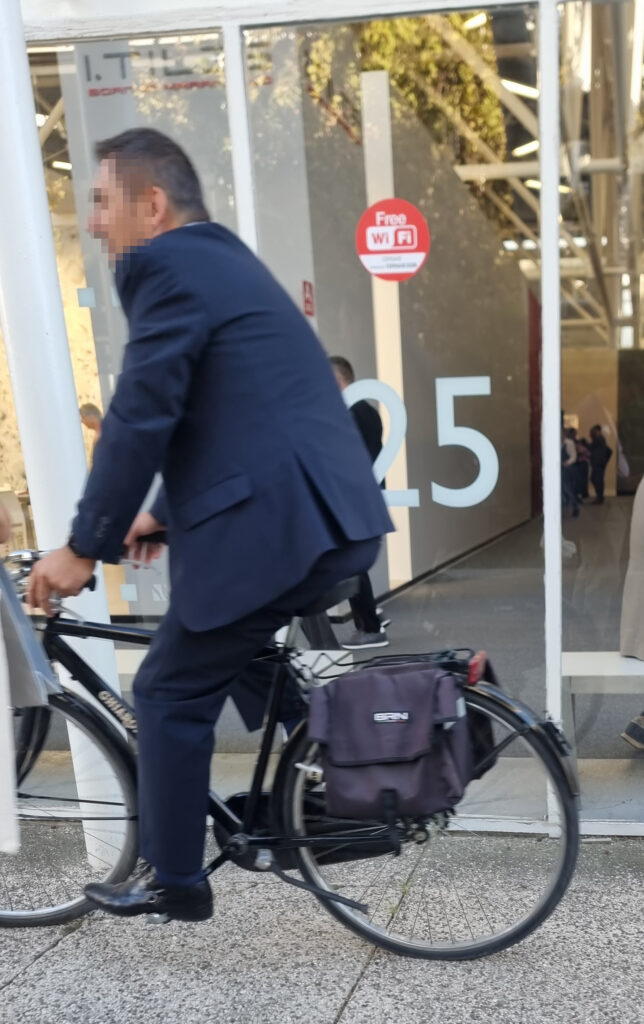
Chic woman: oversized blazer and draped trousers hiding an XL heel. Donna Summer: trouser-dress in tablecloth fabric with a maxi floral print. Glamour woman: mini-dress or faux-leather pants plus a lace tank. Total black. Creative woman: anything out of fashion, and brazenly comfortable shoes. Dog: 13-lb hazel poodle. Sustainable mobility: electric suitcase, Graziella folding bike with a basket, touring bike, little tourist train with 1 passenger.
19 UNKNOWN X Dear unknown reader, thank you for making it all the way here. Good job. In case you didn’t already know, this report is a volunteer exercise that UFO has been happily offering for about 10 years to the ceramic galaxy that feeds and sustains us. And now, our cawl-too-ak-shun: dear known or unknown reader, if you’d like to give us feedback, comment, dissent (without dysentery), and/or share your opinion over a coffee (or a plate of plain rice), you can call us and/or find us on our new sites, ufovisual.studio and tconzero.studio.
Gestisci Consenso
Per fornire le migliori esperienze, utilizziamo tecnologie come i cookie per memorizzare e/o accedere alle informazioni del dispositivo. Il consenso a queste tecnologie ci permetterà di elaborare dati come il comportamento di navigazione o ID unici su questo sito. Non acconsentire o ritirare il consenso può influire negativamente su alcune caratteristiche e funzioni.
Funzionale
Sempre attivo
L'archiviazione tecnica o l'accesso sono strettamente necessari al fine legittimo di consentire l'uso di un servizio specifico esplicitamente richiesto dall'abbonato o dall'utente, o al solo scopo di effettuare la trasmissione di una comunicazione su una rete di comunicazione elettronica.
Preferenze
L'archiviazione tecnica o l'accesso sono necessari per lo scopo legittimo di memorizzare le preferenze che non sono richieste dall'abbonato o dall'utente.
Statistiche
L'archiviazione tecnica o l'accesso che viene utilizzato esclusivamente per scopi statistici.L'archiviazione tecnica o l'accesso che viene utilizzato esclusivamente per scopi statistici anonimi. Senza un mandato di comparizione, una conformità volontaria da parte del vostro Fornitore di Servizi Internet, o ulteriori registrazioni da parte di terzi, le informazioni memorizzate o recuperate per questo scopo da sole non possono di solito essere utilizzate per l'identificazione.
Marketing
L'archiviazione tecnica o l'accesso sono necessari per creare profili di utenti per inviare pubblicità, o per tracciare l'utente su un sito web o su diversi siti web per scopi di marketing simili.
Per fornire le migliori esperienze, utilizziamo tecnologie come i cookie per memorizzare e/o accedere alle informazioni del dispositivo. Il consenso a queste tecnologie ci permetterà di elaborare dati come il comportamento di navigazione o ID unici su questo sito. Non acconsentire o ritirare il consenso può influire negativamente su alcune caratteristiche e funzioni.
Funzionale
Sempre attivo
L'archiviazione tecnica o l'accesso sono strettamente necessari al fine legittimo di consentire l'uso di un servizio specifico esplicitamente richiesto dall'abbonato o dall'utente, o al solo scopo di effettuare la trasmissione di una comunicazione su una rete di comunicazione elettronica.
Preferenze
L'archiviazione tecnica o l'accesso sono necessari per lo scopo legittimo di memorizzare le preferenze che non sono richieste dall'abbonato o dall'utente.
Statistiche
L'archiviazione tecnica o l'accesso che viene utilizzato esclusivamente per scopi statistici.L'archiviazione tecnica o l'accesso che viene utilizzato esclusivamente per scopi statistici anonimi. Senza un mandato di comparizione, una conformità volontaria da parte del vostro Fornitore di Servizi Internet, o ulteriori registrazioni da parte di terzi, le informazioni memorizzate o recuperate per questo scopo da sole non possono di solito essere utilizzate per l'identificazione.
Marketing
L'archiviazione tecnica o l'accesso sono necessari per creare profili di utenti per inviare pubblicità, o per tracciare l'utente su un sito web o su diversi siti web per scopi di marketing simili.